Modern Grotesque Body

Western Distressed + Montreal
Creates crisp high-hierarchy contrast beneath Western Distressed headlines across menus, websites and labels.
Inspect Montreal specimenDisclosure: MakerFileHub may earn a commission from qualifying purchases via paid links on this page. How our links work.
Condensed western display with heavy distress
Western Distressed is a condensed western display in red and white on black: tall narrow caps with wedge serifs, thick stems, and a heavy distress that eats vertical streaks out of the letters so the word reads as a painted sign that has been outdoors for years.
Paid link
Get this fontProject & layout blueprintsAt-a-glance maker compatibility
Fine grain and micro-texture excel in 300 DPI print, sublimation, and screen print rather than small vinyl weeding.
Visual anatomy & craft review
The two words are stacked and share a skeleton: condensed caps with small wedge serifs, heavy stems and a narrow O, so the pair reads as a single family despite the colour change. The distress is the point and it is drawn as vertical streaks and broken edges rather than a uniform speckle, which is why the letters look weathered rather than printed on textured paper. Because the wear is heavy, the counters stay legible only because the stems are thick, and the face would fail at small sizes or in a thin weight. The ground is flat black, which gives the red and the white maximum separation and lets the ragged edges read as the only texture on the page. There is no supporting type, so the specimen is making one claim: that the wear is convincing at poster scale.
Distressed, western, condensed, gritty
Two-font hierarchy recipes
Tested contrast partners — pairing Western Distressed with grounded secondary typography.
Western Distressed + Montreal
Creates crisp high-hierarchy contrast beneath Western Distressed headlines across menus, websites and labels.
Inspect Montreal specimen
Western Distressed + Abigail
Adds a warm human signature touch for 1-to-3-word callouts without competing against structured serif capitals.
Inspect Abigail specimenPractical applications
Concrete hierarchy, scale and production guidance tailored to Western Distressed’s stroke geometry.
A heavily distressed western face makes a seasonal sign look like it has hung at the farm gate for seasons, which is the tone an autumn attraction wants.
Hierarchy & layout recipe
Print 900 by 600 mm on exterior board: the two words at 140 mm cap height, the opening hours in a 30 mm condensed sans, and a 10 mm border. Keep the lettering larger than 100 mm so the streaks do not close the counters, and use red on black for the headline.
Pre-production check
Check the streaks at full size, where the wear can read as damage on a large outdoor board; reduce it for that format. Confirm the 30 mm hours read from eight metres and that the border sits clear of the mounting grommets.
A distressed western word sells the idea of a worn garment without applying a separate texture, and one screen keeps the print cheap for a small run.
Hierarchy & layout recipe
Print a 260 mm chest graphic: the word at 70 mm cap height, the town in a 10 mm condensed sans beneath, and a 2 mm keyline around the pair. Use one ink on a dark shirt so the wear shows as the fabric coming through.
Pre-production check
Check the screen at actual mesh, where heavy distress needs a lower mesh to hold the streaks; confirm the shop's mesh choice. Wash-test one shirt and verify the wear does not grow until the counters close.
A distressed western face sets the setting and the mood in one line, which saves a cover from needing an illustration of a fence or a barn.
Hierarchy & layout recipe
Set the title at 90 pt in two lines on a 178 by 111 mm paperback, the author in 16 pt condensed sans, and a 0.5 pt rule at the head. Keep the type on black and the illustration to a single band at the foot so the wear stays visible.
Pre-production check
Check the title at 90 pt on the paperback stock, where heavy wear combined with a small trim can make the word illegible at thumbnail size; test at 120 px wide. Confirm the 16 pt author reads on the shelf and that the rule does not crowd the top line.
Technical & licence verification
Confirm included OTF/TTF/WOFF formats, full glyph tables and licence coverage on the live store page before batch production.
Closest visual alternatives
Matched across letterform anatomy, stroke behaviour and craft applications.
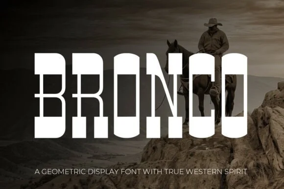
Tall architectural geometric spur-slab Western display
Bronco is a tall, clean-lined geometric Western slab serif pairing crisp rectangular counters with razor-sharp horizontal waist spurs.
Ideas for this font
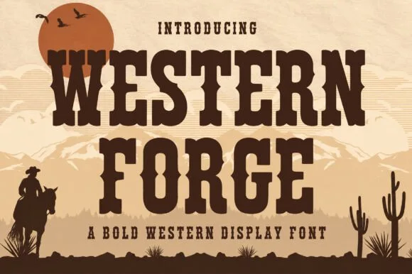
Tuscan western slab display
Western Forge is a tuscan western slab in dark brown on tan: bifurcated serifs, spurred stems, a notched crossbar on the F, and heavy bracketed slabs, set against a desert scene with a low sun, mountains and a rider, so the pair reads as a wood-type poster.
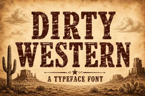
Heavily weathered Wild-West woodtype & saloon slab serif
Dirty Western is a rugged frontier slab serif stamped with coarse woodblock grain, pitted distress, and classic 1880s wanted-poster authority.
Ideas for this font
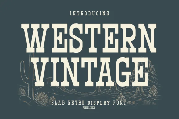
Tall condensed Western saloon slab serif
Western Vintage is a bold, condensed slab serif with crisp bracketed block feet and tall frontier poster proportions.
Ideas for this font
Same independent foundry
Allow optional Google Analytics to measure visits and catalogue actions. Your search words and notes are not included. Privacy & storage