Editorial Serif Anchor

Western + Amor Hadena
Anchors Western's fluid strokes with crisp Roman proportions on wedding suites, headers and packaging.
Inspect Amor Hadena specimenDisclosure: MakerFileHub may earn a commission from qualifying purchases via paid links on this page. How our links work.
Tall brush script with long ascenders
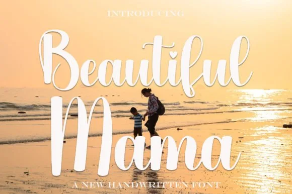
Western is a tall brush script in white over a sunset silhouette: very long ascenders, thick swelled downstrokes, thin joins and a descender that swings below the word, set as one line with small capital lines above and below.
Paid link
Get this fontProject & layout blueprintsAt-a-glance maker compatibility
Weld or Unite overlapping script joins into one continuous vector path before sending to the blade.
Visual anatomy & craft review
The word runs across the middle of the page and the face is a brush script with unusual proportions: the ascenders of the W and the t are drawn very long, almost twice the height of the lowercase, the downstrokes swell and the upstrokes thin to a point, the letters connect with narrow links, and the final n drops a descender that swings left below the baseline. That height is what makes the face work on a tall format, and it also means the word needs a wide measure with room above and below. The brush edge is soft rather than ragged, so the letters read as painted with a loaded round brush, and the contrast is strong enough to show at a distance. Two small capital lines sit above and below in a light serif, and the ground is a sunset silhouette of a rider on a horse, which sets the mood without competing with the white type. Western is a script for posters, apparel, packaging and event graphics with a western theme.
Tall, brushed, dramatic
Two-font hierarchy recipes
Tested contrast partners — pairing Western with grounded secondary typography.
Western + Amor Hadena
Anchors Western's fluid strokes with crisp Roman proportions on wedding suites, headers and packaging.
Inspect Amor Hadena specimen
Western + Bareum
Keeps small-scale dates, URLs, nutrition facts and care instructions crisp and legible below script titles.
Inspect Bareum specimenPractical applications
Concrete hierarchy, scale and production guidance tailored to Western’s stroke geometry.
A tall brush script gives a cover the sweep of a painted poster, and the long ascenders fill a vertical format that a normal script would leave empty.
Hierarchy & layout recipe
Print a 152 by 229 mm cover: set the title at 60 pt on one line, keep 24 mm of clear ground beneath before the author at 11 pt, and hold 14 mm of margin on all four sides.
Pre-production check
Long ascenders need headroom; set the block on the cover artwork and check the top margin before printing.
A painted script reads as a sign made for the place, and the heavy strokes survive being cut or printed on a large board.
Hierarchy & layout recipe
Print a 900 by 400 mm board: set the name at 150 pt on one line, keep 40 mm of clear ground beneath before the hours at 26 pt, and hold 30 mm of margin on all four sides.
Pre-production check
A brush script routed into timber loses its tapers; take one sample cut in the real material first.
A tall script gives a bottle a hand-labelled look, and the heavy downstrokes stay readable on a narrow label that wraps the glass.
Hierarchy & layout recipe
Print a 55 by 90 mm label: set the brand at 15 pt on one line, keep 6 mm of clear ground beneath before the cut at 4.5 pt, and hold 4 mm of margin on all four sides.
Pre-production check
A script on a curved label distorts at the ends; print one on the real bottle and check the joins.
Technical & licence verification
Confirm included OTF/TTF/WOFF formats, full glyph tables and licence coverage on the live store page before batch production.
Closest visual alternatives
Matched across letterform anatomy, stroke behaviour and craft applications.
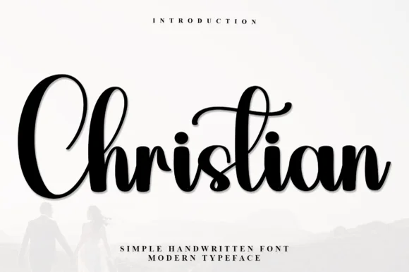
Heavy bouncy brush calligraphy with curled t-canopy
Christian (by Inermedia Studio) is a bold, high-contrast brush calligraphy script featuring thick velvety downstrokes and a curled overhead t-swash.
Ideas for this font
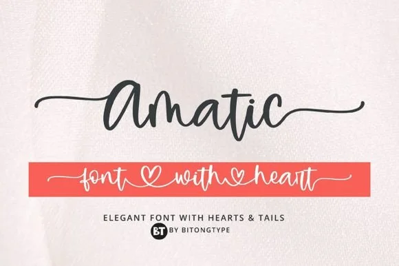
Bouncy monoline cursive with long tails & connecting hearts
Amatic is a lively handwritten monoline script equipped with sweeping horizontal side tails and playful open-heart word connectors.
Ideas for this font
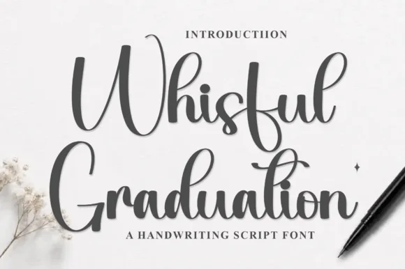
Thick monoline handwriting script
Whisful is a thick monoline handwriting script in dark grey on cream: a slight forward slant, tall looped ascenders on the W and the h, a descender on the g that swings under the word, and joins that stay visible rather than fusing into a solid stroke.
Ideas for this font
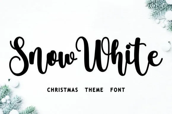
Bouncy Christmas script
Snow White is a Christmas script in black on a snowy white ground: a connected monoline hand with a pronounced bounce, tall loops on the S and the h, and a w in the first word that lifts above the cap line, framed by fir branches and baubles.
Ideas for this font
Same independent foundry
Allow optional Google Analytics to measure visits and catalogue actions. Your search words and notes are not included. Privacy & storage