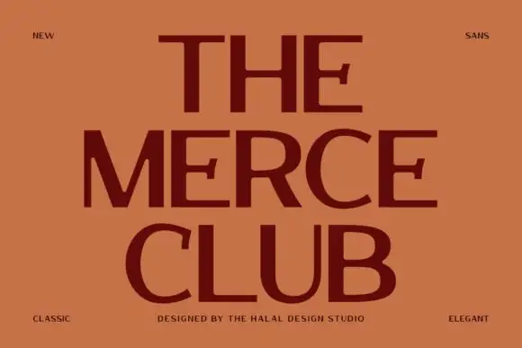
Modern Grotesque Body

Romantic Stardust + Furion
Creates crisp high-hierarchy contrast beneath Romantic Stardust headlines across menus, websites and labels.
Inspect Furion specimenDisclosure: MakerFileHub may earn a commission from qualifying purchases via paid links on this page. How our links work.
Whimsical serif with mixed proportions
Romantic Stardust is a whimsical serif in black on cream inside a postage-stamp frame: tall thin letters with small serifs, mixed proportions where some letters grow into swashy ascenders, and a lowercase that sits high, so the word reads as hand-lettered stationery rather than as set type.
Paid link
Get this fontProject & layout blueprintsAt-a-glance maker compatibility
Sturdy stroke walls and open counters weed cleanly on adhesive vinyl, HTV apparel film, and cut cardstock.
Visual anatomy & craft review
The two words are stacked and the drawing plays with proportion: the R and the D reach well above the cap line and end in curls, the a and the n stay small with wide counters, and the letters alternate between narrow and broad, which gives the line an uneven rhythm that reads as made rather than measured. The stroke contrast is moderate, the serifs are small and lightly bracketed, and the joins between stem and bowl are soft, so the face reads as drawn with a fine nib. Spacing is generous, which keeps the swashy ascenders from tangling. The ground is a cream card inside a scalloped stamp frame on an apricot striped field, and the caption is set in a smaller tracked serif, which fixes the face in the stationery register it was designed for.
Whimsical, serif, handcrafted, charming
Two-font hierarchy recipes
Tested contrast partners — pairing Romantic Stardust with grounded secondary typography.
Romantic Stardust + Furion
Creates crisp high-hierarchy contrast beneath Romantic Stardust headlines across menus, websites and labels.
Inspect Furion specimen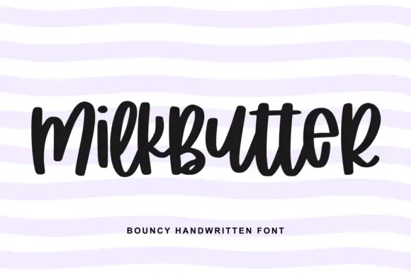
Romantic Stardust + Milkbutter
Adds a warm human signature touch for 1-to-3-word callouts without competing against structured serif capitals.
Inspect Milkbutter specimenPractical applications
Concrete hierarchy, scale and production guidance tailored to Romantic Stardust’s stroke geometry.
A whimsical serif gives a garden wedding a hand-lettered charm without the formality of a didone, and the mixed proportions keep a long name interesting across one line.
Hierarchy & layout recipe
A5 portrait: the names at 30 pt, the details in a 9 pt serif, and a 0.4 pt rule at the head. Keep 22 mm margins so the swashy ascenders have air and print one ink on a cream stock.
Pre-production check
Check the tallest ascenders at 30 pt against the top margin, where a curl can run off the page; raise the type. Confirm the 9 pt details keep a 4.5:1 contrast and that the rule does not touch the highest curl.
A whimsical serif gives a small perfumery a mark that feels drawn rather than bought, and the uneven rhythm holds on a small label where a regular serif looks plain.
Hierarchy & layout recipe
Print a 45 by 80 mm label: the name at 15 pt, the scent in a 7 pt serif, and the volume in 6 pt. Keep 4 mm of clear label inside the die so the tall ascenders are never cut, and print one ink on an off-white stock.
Pre-production check
Check the 15 pt name on the label, where a thin swash can break; thicken the thinnest part for print. Confirm the 6 pt volume reads on the bottle and that the name fits without the ascenders colliding.
A whimsical serif sets a review of illustrated books in a register that matches the subject, and the tall letters hold above a column of text without shouting.
Hierarchy & layout recipe
Set the title at 54 pt across 120 mm, the standfirst in a 10 pt serif beneath, and the byline in 8 pt caps. Keep 18 mm between the title and the standfirst so the ascenders do not touch the smaller text.
Pre-production check
Check the title at 54 pt over a printed page, where a thin serif can look weak beside a photograph; keep it on a plain area. Confirm the 10 pt standfirst reads at arm's length and that the byline does not sit inside a descending curl.
Technical & licence verification
Confirm included OTF/TTF/WOFF formats, full glyph tables and licence coverage on the live store page before batch production.
Closest visual alternatives
Matched across letterform anatomy, stroke behaviour and craft applications.
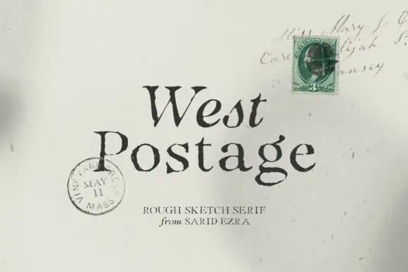
Rough sketch serif
West Postage is a rough sketch serif in near-black on aged cream: uneven stems, sketchy serifs, a drifting baseline and a seeded texture, set on two lines over a period envelope with a green stamp and a postmark, with a small tracked credit beneath.

Tall light capitals with long overlapping crossbars
Beach Dates is a tall light capital face in which the C and D open broad curves, the serifs taper finely and the H crossbar reaches left into the C while the T bar stretches across the row below, so two stacked words lock into one form.
Ideas for this font
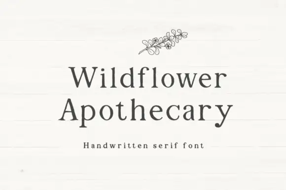
Handwritten serif with slight irregularity
Wildflower Apothecary is a handwritten serif in charcoal on a white board: serif letterforms drawn by hand with a slight wobble, a moderate contrast and open counters, with a fine line drawing of a wildflower sprig above the words.
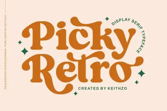
Curved retro serifs with extended terminals
Picky Retro is a chunky retro display serif in burnt orange: fat bracketed strokes, curved serifs that drop below the baseline, and long ball terminals that turn the P and the R into flourishes.
Ideas for this font
Same independent foundry
Allow optional Google Analytics to measure visits and catalogue actions. Your search words and notes are not included. Privacy & storage