Neutral Sans Workhorse

Wavely Groovy + Noar
Lets Wavely Groovy own the focal silhouette while handling secondary copy, sizing and subheads cleanly.
Inspect Noar specimenDisclosure: MakerFileHub may earn a commission from qualifying purchases via paid links on this page. How our links work.
Fat bubbly display with rounded joins
Wavely Groovy is a fat bubbly display face in black on a cream panel: very heavy rounded letters with bulging sides and no contrast, set over a seventies ground of sun rays, waves and daisies in orange and olive.
Paid link
Get this fontProject & layout blueprintsAt-a-glance maker compatibility
Sturdy stroke walls and open counters weed cleanly on adhesive vinyl, HTV apparel film, and cut cardstock.
Visual anatomy & craft review
The two words are stacked and set almost as solid shapes, and the face is a bubbly display: every stem bulges at the waist, the W and the y push rounded lobes past the baseline, the G closes into a swollen ring, the letters touch or nearly touch, and the counters collapse into small ovals and slits. There is no contrast at all, so the word reads as one continuous mass at a distance and only separates into letters up close, which is the effect the sample builds on. The panel sits on a seventies ground of concentric sun rays, wide waving bands in terracotta and olive, and daisies drawn at two sizes, with small tracked badges naming the style and the mood. Wavely Groovy is a display face for retro posters, party goods, labels and album art, and it needs one or two short words at a big size where the bulges can breathe.
Bubbly, bouncy, flower-power
Two-font hierarchy recipes
Tested contrast partners — pairing Wavely Groovy with grounded secondary typography.
Wavely Groovy + Noar
Lets Wavely Groovy own the focal silhouette while handling secondary copy, sizing and subheads cleanly.
Inspect Noar specimen
Wavely Groovy + Orvelia
Grounds bold display lettering with classic typographic authority on posters, badges and apparel.
Inspect Orvelia specimenPractical applications
Concrete hierarchy, scale and production guidance tailored to Wavely Groovy’s stroke geometry.
A bubbly face turns a plain banner into a period object, and the very heavy stroke stays readable across a room where a thin face would disappear.
Hierarchy & layout recipe
Print a 1000 by 400 mm banner: set the greeting at 150 pt over two lines, keep 34 mm of clear ground beneath before the age at 46 pt, and hold 28 mm of border on all four sides.
Pre-production check
Bulging letters can merge into a single blob on fabric; print one section at the final size and check the gaps before the order.
A fat rounded face makes a small pack look generous, and the seventies shapes signal fruit and sunshine without a picture of either.
Hierarchy & layout recipe
Print a 70 by 110 mm wrap label: set the brand at 18 pt on one line, keep 8 mm of clear ground beneath before the flavour at 6 pt, and hold 5 mm of margin on all four sides.
Pre-production check
A tight fit squeezes the label ends on a curved wrap; print one on the real film and check the letters near the seam.
A bubbly mark is easy to spot at a market and reads at the size of a cup lid, where fine type on a small sticker would be lost.
Hierarchy & layout recipe
Print a 75 by 75 mm circle: set the name at 22 pt on two lines, keep 9 mm of clear ground inside the die, and hold the artwork 6 mm clear of the circle edge all round.
Pre-production check
A heavy face at the edge of a die can get trimmed; keep the letters well inside the circle and print one sheet before the batch.
Technical & licence verification
Confirm included OTF/TTF/WOFF formats, full glyph tables and licence coverage on the live store page before batch production.
Closest visual alternatives
Matched across letterform anatomy, stroke behaviour and craft applications.
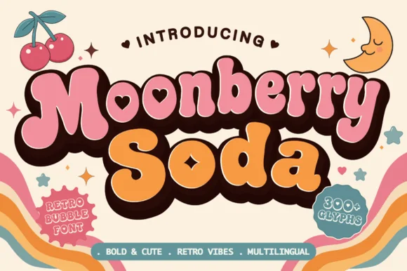
Plump retro bubble with heart-shaped interior counters
Moonberry Soda is a plump retro bubble display in which the round bowls hide heart-shaped counters, the silhouettes stay thick and soft and the alternates add playful variants, so a short word reads as a kawaii sticker.
Ideas for this font
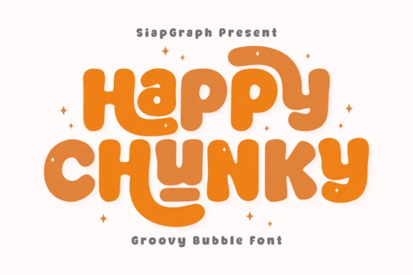
Extra-plump groovy bubble letters with tucked curl terminals
Happy Chunky is an extra-plump bubble display in which the stems balloon, the counters shrink to small openings, the terminals tuck into curls and the letters almost touch, so a short phrase reads as one sticker-ready block.
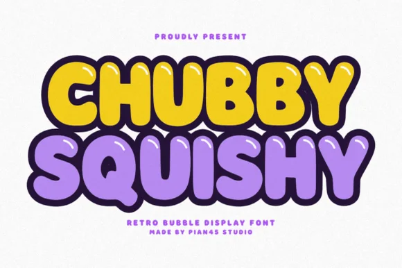
Retro bubble display with glossy highlights and a thick dark outline
Chubby Squishy is a retro bubble display alphabet in which the strokes swell into round cushions, the counters shrink to dots and a thick outline wraps every letter, so a word reads as a rubber sticker.
Ideas for this font
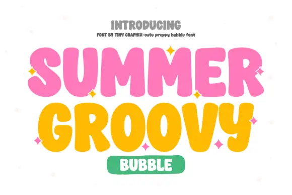
Chunky groovy bubble display
Summer Groovy is a chunky bubble display in pink and yellow on white: fat rounded letters with swelling strokes, alternating heights that wave across the line, sparkle accents between words, and a green pill badge beneath, so the plate reads as a seventies poster rather than a modern sans.
Ideas for this font
Same independent foundry
Allow optional Google Analytics to measure visits and catalogue actions. Your search words and notes are not included. Privacy & storage



