High-Contrast Display Serif

Vitamin + Lumera Editorial
Pairs sculptural editorial warmth with Vitamin's clean modern geometry.
Inspect Lumera Editorial specimenDisclosure: MakerFileHub may earn a commission from qualifying purchases via paid links on this page. How our links work.
Light serif filled with a photograph
Vitamin is a light serif set as a photograph-filled headline over white pills: thin stems with fine serifs, the letters carrying an image inside, with a light sans subtitle beneath and a small registered mark at the side.
Paid link
Get this fontProject & layout blueprintsAt-a-glance maker compatibility
Sturdy stroke walls and open counters weed cleanly on adhesive vinyl, HTV apparel film, and cut cardstock.
Visual anatomy & craft review
The word fills the centre of the page and the face is a light serif with a high contrast: the stems are thin, the serifs are fine flats, the bowls are round and open, and the letters are spaced closely so the word reads as one continuous shape. The headline treatment is the point: instead of a solid ink, each letter is filled with a photograph of fruit and leaves, so the word carries the product inside its own strokes, which is why the ground behind can stay almost white. Beneath the headline a subtitle is set in a light sans at a much smaller size, and a small registered mark sits at the right, completing the packaging look. The ground is a white surface scattered with pale round tablets, all at very low contrast so the filled letters stay the focus. Vitamin is a serif for health and beauty packaging, editorial covers and brand marks, and it needs a large size, a light ground and artwork that works inside thin strokes.
Light, filled, editorial
Two-font hierarchy recipes
Tested contrast partners — pairing Vitamin with grounded secondary typography.
Vitamin + Lumera Editorial
Pairs sculptural editorial warmth with Vitamin's clean modern geometry.
Inspect Lumera Editorial specimen
Vitamin + Welcome
Introduces organic movement on pull-quotes, signatures and gift tags.
Inspect Welcome specimenPractical applications
Concrete hierarchy, scale and production guidance tailored to Vitamin’s stroke geometry.
A light serif filled with an image turns a label into a picture without a separate photograph, and the thin strokes keep a small bottle looking clean.
Hierarchy & layout recipe
Print a 55 by 60 mm label: set the name at 20 pt on one line, keep 6 mm of clear ground beneath before the count at 5 pt, and hold 4 mm of margin on all four sides.
Pre-production check
Photographic fill inside thin strokes needs high resolution; print one label at final size and check the detail.
A filled headline carries the subject of the issue inside the title itself, and the light serif keeps a large cover from feeling heavy.
Hierarchy & layout recipe
Print a 210 by 280 mm cover: set the title at 110 pt on one line, keep 26 mm of clear ground beneath before the coverlines at 10 pt, and hold 16 mm of margin on all four sides.
Pre-production check
A photo fill loses detail at press size; proof one cover and check the darkest and lightest areas.
A filled headline reads as a piece of packaging on a poster, and the white ground lets the fruit colours carry the whole design.
Hierarchy & layout recipe
Print an A2 poster at 420 by 594 mm: set the brand at 160 pt on one line, keep 34 mm of clear ground beneath before the flavour note at 20 pt, and hold 26 mm of margin on all four sides.
Pre-production check
Large flat white areas show every mark; handle the printed sheet with care and proof the first copy.
Technical & licence verification
Confirm included OTF/TTF/WOFF formats, full glyph tables and licence coverage on the live store page before batch production.
Closest visual alternatives
Matched across letterform anatomy, stroke behaviour and craft applications.
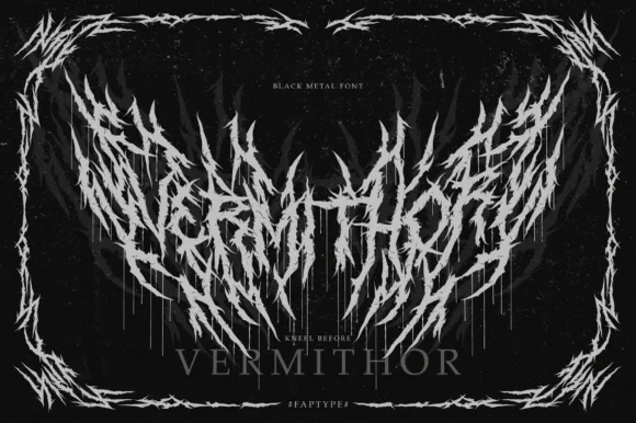
Black metal logo face with thorn spikes
Vermithor is a black metal display in silver on black: letters broken into spiked, thorn-like strokes that fan out and overlap, framed by a thorn border, with a small serif word beneath and tracked capitals in the corners.
Ideas for this font

Heavy geometric condensed display grotesk
Helina is a clean, heavy-weight condensed sans serif with flat-cut terminals, tight vertical rhythm, and bold magazine-masthead authority.
Ideas for this font
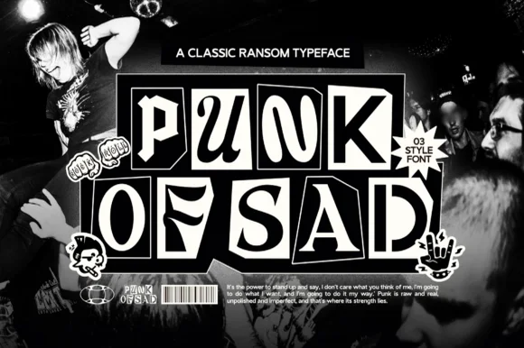
3-style monochrome punk-zine cut-paper ransom font
Punk of Sad is a classic black-and-white punk-zine ransom typeface (3 styles) setting gritty serif/sans letters inside uneven cut-newspaper tiles.
Ideas for this font
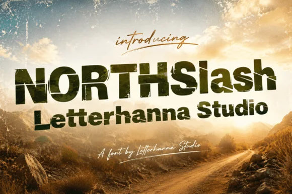
Condensed distressed display with scratched edges
Northslash is a condensed heavy display in olive green on a mountain landscape: narrow capitals with squared corners, flat terminals and a scratched, worn surface, with a script line above and below.
Ideas for this font
Allow optional Google Analytics to measure visits and catalogue actions. Your search words and notes are not included. Privacy & storage