Editorial Serif Anchor

Victory + Lumera Editorial
Anchors Victory's fluid strokes with crisp Roman proportions on wedding suites, headers and packaging.
Inspect Lumera Editorial specimenDisclosure: MakerFileHub may earn a commission from qualifying purchases via paid links on this page. How our links work.
Broad connected hand with tall loops
Victory is a broad connected hand in white over a dark city photograph: heavy strokes, a capital V drawn as a tall loop, and a light join that keeps a seven-letter word moving across the frame.
Paid link
Get this fontProject & layout blueprintsAt-a-glance maker compatibility
Weld or Unite overlapping script joins into one continuous vector path before sending to the blade.
Visual anatomy & craft review
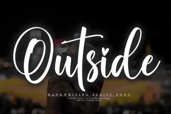
The name runs across the sheet, and the face is a hand rather than a calligraphy: the V opens as a tall narrow loop, the i is a stem with a heavy dot, the c and the t are small, the o is a fat oval and the r and the y connect with short joins, while the final y drops a tail that curls back up. The stroke is heavy and even with soft terminals, the slant is slight and the letters lean a little more towards the end of the word, which is what makes a single line look written rather than set. A small script line above and below the name, in the same face, gives the introduction and the style. Victory is a display hand for signage, apparel and covers, and it is at its best in one word at a large size over a photographic ground.
A confident hand with a big first letter
Two-font hierarchy recipes
Tested contrast partners — pairing Victory with grounded secondary typography.
Victory + Lumera Editorial
Anchors Victory's fluid strokes with crisp Roman proportions on wedding suites, headers and packaging.
Inspect Lumera Editorial specimen
Victory + Clyne Sans
Keeps small-scale dates, URLs, nutrition facts and care instructions crisp and legible below script titles.
Inspect Clyne Sans specimenPractical applications
Concrete hierarchy, scale and production guidance tailored to Victory’s stroke geometry.
A broad hand reads across a hall and looks made by the people running the event, which suits a fundraiser better than a corporate face.
Hierarchy & layout recipe
Print a 600 by 400 mm board: set the word at 120 pt on one line, keep 24 mm of clear ground beneath before the details at 24 pt, and hold 22 mm of border on all four sides.
Pre-production check
A hand with a leaning baseline can look crooked on a board; print one at the final size and check the level before the set.
A bold hand carries a single name across a room, and the thick strokes survive a fabric banner where a hairline script would break up.
Hierarchy & layout recipe
Print a 900 by 400 mm banner: set the name at 150 pt on one line, keep 30 mm of clear ground beneath before the date at 44 pt, and hold 26 mm of border on all four sides.
Pre-production check
Fabric banners stretch and heavy strokes can touch; print one section at the final size and check the gaps before the order.
A confident hand suits a card that says one thing, and the loop of the first letter gives a short word the presence of a headline.
Hierarchy & layout recipe
Print a 120 by 120 mm square card: set the word at 36 pt on one line, keep 16 mm of clear ground beneath before the message at 9.5 pt, and hold 14 mm of margin on all four sides.
Pre-production check
A heavy hand on a small card can feel shouty; print one at the finished size and judge the size before the batch.
Technical & licence verification
Confirm included OTF/TTF/WOFF formats, full glyph tables and licence coverage on the live store page before batch production.
Closest visual alternatives
Matched across letterform anatomy, stroke behaviour and craft applications.
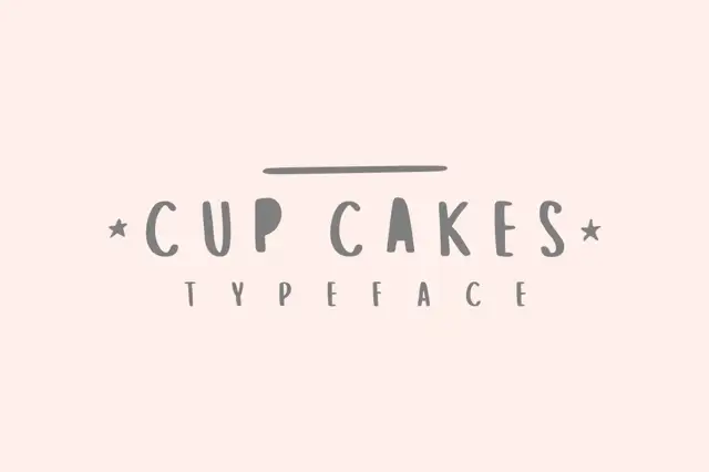
Narrow irregular capitals with filled-looking P and A interiors in the sample
Cup Cakes draws tall skinny capitals by hand, keeps the widths uneven and the strokes slightly bowed, and sets a short word between two small stars on a plain cream ground.
Ideas for this font
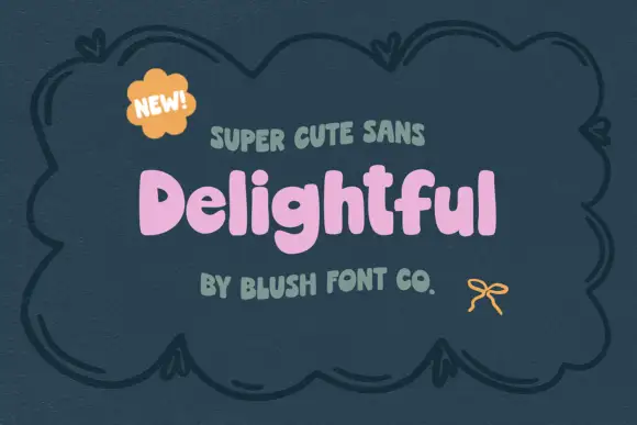
Chunky soft mixed case with uneven shoulders and a rounded g descender
Delightful shows a small pink mixed-case title inside a dark drawn frame, where broad irregular strokes form soft rounded bowls, the e opens compactly and a curved g drops below a lowercase row whose h and l rise above it.
Ideas for this font
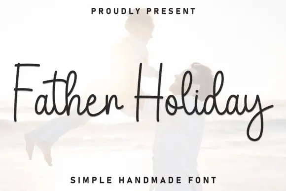
Tall simple connected pen strokes with a flat baseline and a light weight
Father Holiday is simple connected handwriting with tall ascenders, a light even stroke and a flat baseline, so a two-word phrase reads as an ordinary pen signature.
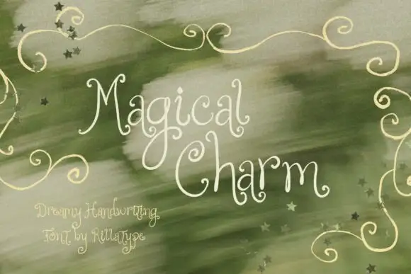
Dreamy thin curled handwriting
Magical Charm is a dreamy handwriting in cream on sage green: very thin monoline strokes, tall curled ascenders, decorative curls on the capitals and small drawn stars scattered through the background.
Same independent foundry
Allow optional Google Analytics to measure visits and catalogue actions. Your search words and notes are not included. Privacy & storage