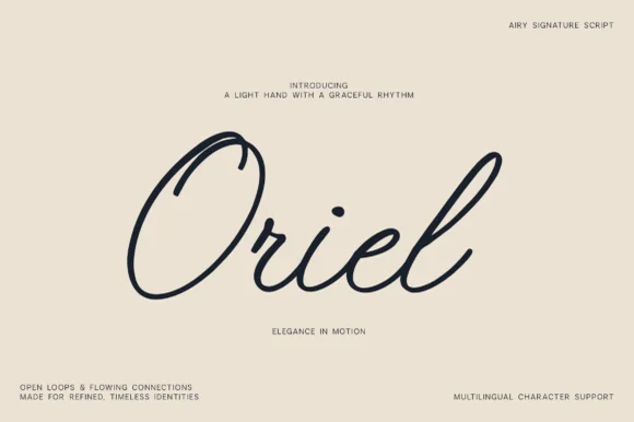
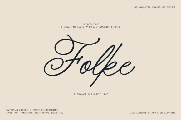
Neutral Sans Workhorse

Varden + Kohilo
Lets Varden own the focal silhouette while handling secondary copy, sizing and subheads cleanly.
Inspect Kohilo specimenDisclosure: MakerFileHub may earn a commission from qualifying purchases via paid links on this page. How our links work.
Geometric capitals with looping flourishes
Varden is a plain geometric capital face in dark navy on cream: even strokes, flat terminals and a circular O, with a pair of fine looping flourishes that spring from the bottom of two letters and swing below the baseline, set as one large word with four small copy blocks at the corners.
Paid link
Get this fontProject & layout blueprintsAt-a-glance maker compatibility
Sturdy stroke walls and open counters weed cleanly on adhesive vinyl, HTV apparel film, and cut cardstock.
Visual anatomy & craft review
The plate is restrained: the word sits alone and the only decoration is the pair of fine loops that drop from the letters and cross beneath the word, so the sheet reads as a controlled piece of art direction rather than as a specimen. The drawing is a geometric capital sans with an even stroke, so the face is neutral, and the flourishes are supplied ornament that a buyer can use or drop. That construction sets a size floor for the flourishes rather than for the letters, since the hairlines break first, and the plain capitals work at almost any size. The corner blocks are product copy that name the style and the language support. It suits a masthead, a mark and a poster.
Display, geometric, flourish, modern
Two-font hierarchy recipes
Tested contrast partners — pairing Varden with grounded secondary typography.
Varden + Kohilo
Lets Varden own the focal silhouette while handling secondary copy, sizing and subheads cleanly.
Inspect Kohilo specimen
Varden + Kernova
Grounds bold display lettering with classic typographic authority on posters, badges and apparel.
Inspect Kernova specimenPractical applications
Concrete hierarchy, scale and production guidance tailored to Varden’s stroke geometry.
A geometric mark reads as a studio, and the flourishes give a short name a drawn flourish without a second typeface. The flourishes give a gesture.
Hierarchy & layout recipe
Set the mark at 18 pt on a card, 95 mm on a wall and 13 pt on a letterhead, using the flourishes only above 22 pt. Keep one colour and clear space equal to the cap height.
Pre-production check
Check the 13 pt letterhead mark, where a flourish would close; drop it there. Confirm the wall mark reads at eight metres and that the loops clear the baseline by 12 mm.
A geometric title with a single flourish reads as editorial restraint, and the loops give the cover one gesture rather than a pattern.
Hierarchy & layout recipe
Set the title at 100 mm cap height across 195 mm, the subtitle in an 8 pt sans, and the issue at 7 pt. Print one ink on a matte stock and keep 24 mm margins at the head.
Pre-production check
Check the title at 100 mm, where a loop can thin out; keep it above 0.3 mm. Confirm the 7 pt issue survives lamination and that the loops clear the trim by 12 mm.
A plain geometric face reads as contemporary formality, and one flourish gives the names a single ornament instead of a script.
Hierarchy & layout recipe
A5 invitation: the names at 24 pt with the flourishes, the request in a 9.5 pt serif, and the date at 8.5 pt caps. Keep 26 mm margins and letterpress one ink on a heavy card.
Pre-production check
Check the 24 pt names in letterpress, where a fine loop can sink; keep it above 0.35 mm. Confirm the request reads at arm's length and that the loops clear the trim.
Technical & licence verification
Confirm included OTF/TTF/WOFF formats, full glyph tables and licence coverage on the live store page before batch production.
Closest visual alternatives
Matched across letterform anatomy, stroke behaviour and craft applications.
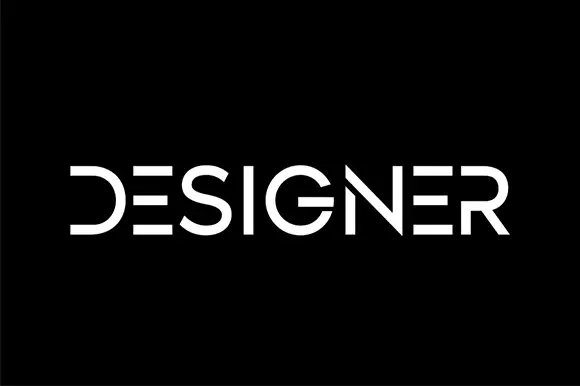
Segmented geometric capitals
Designer shows a thin geometric wordmark in white on black, where the E is reduced to three horizontal bars, the D loses its upright stem, the R opens at the join and the gaps between segments read as part of the drawing rather than as damage.
Ideas for this font
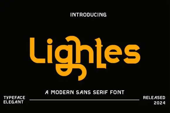
Experimental rounded display
Lightes is an experimental rounded display in amber on black: mixed case in which the g loop drops below the baseline, the h carries a rising curl and the t foot is shortened, with swelled strokes and tight spacing, set as one word with a small line above and two notes at the foot.
Ideas for this font
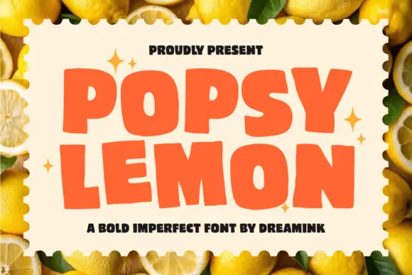
Wide imperfect sans blocks
Popsy Lemon is a fat wide display in a warm orange, built from rounded blocks with deliberately imperfect edges: a wobble in the stems, a nibbled corner and letters that sit at slightly different weights.
Ideas for this font
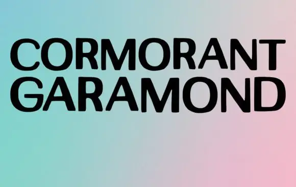
Broad plain capitals in a minimal specimen
Cormorant Garamond shows two long rows of broad black capitals over a soft gradient, where the strokes stay largely even, the joins close tightly and only faint thickenings hint at a serif at this display size rather than the fine detail the family name suggests.
Ideas for this font
Same independent foundry
Allow optional Google Analytics to measure visits and catalogue actions. Your search words and notes are not included. Privacy & storage