Neutral Sans Workhorse

Popsy Lemon + Godthem
Lets Popsy Lemon own the focal silhouette while handling secondary copy, sizing and subheads cleanly.
Inspect Godthem specimenDisclosure: MakerFileHub may earn a commission from qualifying purchases via paid links on this page. How our links work.
Wide imperfect sans blocks
Popsy Lemon is a fat wide display in a warm orange, built from rounded blocks with deliberately imperfect edges: a wobble in the stems, a nibbled corner and letters that sit at slightly different weights.
Paid link
Get this fontProject & layout blueprintsAt-a-glance maker compatibility
Sturdy stroke walls and open counters weed cleanly on adhesive vinyl, HTV apparel film, and cut cardstock.
Visual anatomy & craft review
Popsy stacks above Lemon in two rows of capitals that nearly fill the card, and the letters are wide, blunt and heavy with a soft rounded corner on every terminal. The imperfection is designed in: the P and the O are not quite the same weight, the S leans slightly, and the edges carry small cuts that read as hand-cut paper rather than as damage. The words sit on a cream ticket with a zigzag edge over a photograph of lemons, and drawn sparkles fill the spaces beside the letters. Two lines at the top and bottom in a compact sans name the face and the studio. The construction is a cheerful packaging display: it needs colour and size to work, it holds at poster scale, and the imperfect edges mean it should never be set at a small size or used for a long line.
A fat imperfect cap display with cut-out edges
Two-font hierarchy recipes
Tested contrast partners — pairing Popsy Lemon with grounded secondary typography.
Popsy Lemon + Godthem
Lets Popsy Lemon own the focal silhouette while handling secondary copy, sizing and subheads cleanly.
Inspect Godthem specimen
Popsy Lemon + Raffined
Grounds bold display lettering with classic typographic authority on posters, badges and apparel.
Inspect Raffined specimenPractical applications
Concrete hierarchy, scale and production guidance tailored to Popsy Lemon’s stroke geometry.
The shape and colour say the product before a customer reads the word, which is what a stand needs from five metres away.
Hierarchy & layout recipe
Print a 400 by 300 mm board: set the word at 120 pt on one row, keep 24 mm of clear ground beneath before the price at 18 pt, and hold 20 mm of border on all four sides.
Pre-production check
Flat orange on a home printer loses saturation; print one sign on the actual stock and check the colour before the set.
A blunt, imperfect display reads as a small producer rather than a global brand, and a single colour keeps a short run affordable.
Hierarchy & layout recipe
Print a 50 by 70 mm bottle label: set the flavour at 18 pt on one row, keep 6 mm of clear ground beneath before the volume at 4.5 pt, and hold 4 mm from the widest letter to the die line.
Pre-production check
The cut edges look like a printing fault at small sizes; print one label at the real size and check the edges before the order.
One loud word on a banner is all a garden party needs, and the imperfect edges look right in photographs of a casual event.
Hierarchy & layout recipe
Print a 1000 by 400 mm banner: set the greeting at 200 pt on one row, keep 34 mm of clear ground beneath before the date at 30 pt, and hold 30 mm of border on all four sides.
Pre-production check
Vinyl banners show every wobble in the edges; print one banner at the final size and check the cut before the order.
Technical & licence verification
Confirm included OTF/TTF/WOFF formats, full glyph tables and licence coverage on the live store page before batch production.
Closest visual alternatives
Matched across letterform anatomy, stroke behaviour and craft applications.
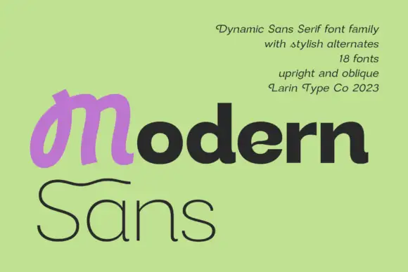
Heavy rounded mixed case paired with a looped M and a fine sweeping S on a second line
Modern Sans is a wide sans family of eighteen fonts, shown with a heavy display cut, a hairline weight and a script alternate that replaces the first letter of a word.
Ideas for this font
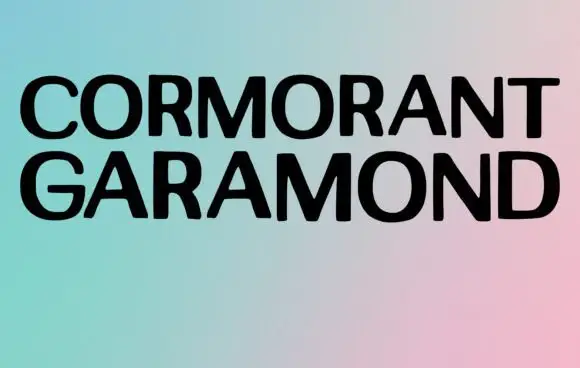
Broad plain capitals in a minimal specimen
Cormorant Garamond shows two long rows of broad black capitals over a soft gradient, where the strokes stay largely even, the joins close tightly and only faint thickenings hint at a serif at this display size rather than the fine detail the family name suggests.
Ideas for this font
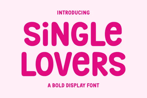
Monoline signature script
Single Lovers is a monoline signature script in near-black on cream: an even stroke, moderate slant, open loops and a soft bounce, set in two words on one line with a long connecting stroke and a small tracked caption beneath.
Ideas for this font
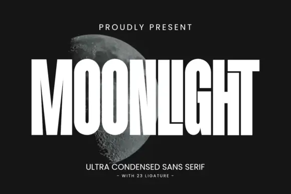
Ultra condensed display sans
Moonlight is an ultra condensed sans in white over a photograph of the moon: very tall narrow caps with square terminals, flat shoulders and tight spacing, with twenty-three ligatures that let letters lock together, so the word reads as a masthead stretched across the frame.
Same independent foundry
Allow optional Google Analytics to measure visits and catalogue actions. Your search words and notes are not included. Privacy & storage