High-Contrast Display Serif

Mr. Stretch & Mr. Stout + Cervelique
Pairs sculptural editorial warmth with Mr. Stretch & Mr. Stout's clean modern geometry.
Inspect Cervelique specimenDisclosure: MakerFileHub may earn a commission from qualifying purchases via paid links on this page. How our links work.
Tall and wide monoline capitals
Mr. Stretch and Mr. Stout is a pair of monoline capital faces in lime green on grey: one very tall and narrow, the other wide and short, presented as an answer to a layout problem rather than as a decorative set.
Paid link
Get this fontProject & layout blueprintsAt-a-glance maker compatibility
Sturdy stroke walls and open counters weed cleanly on adhesive vinyl, HTV apparel film, and cut cardstock.
Visual anatomy & craft review
The two faces share a construction: both are monoline capitals with rounded terminals and a light stroke, but one is drawn at an extreme height and the other at an extreme width, so a designer can hold the same voice while fitting different lines. The tall cut is used for the two upper lines, where a long phrase has to sit in a narrow measure, and the wide cut is used for the caption below, where a short phrase has to fill the same width. That demonstration is the point of the sheet: the same stroke weight and the same letter skeleton, stretched in two directions. Small tracked capitals beneath state that the pair is all-purpose and note the tall and short joke. The bundle suits posters, editorial layouts, packaging and signage where a line has to fill a measure without changing typeface.
Two monoline capitals for tall and short lines
Two-font hierarchy recipes
Tested contrast partners — pairing Mr. Stretch & Mr. Stout with grounded secondary typography.
Mr. Stretch & Mr. Stout + Cervelique
Pairs sculptural editorial warmth with Mr. Stretch & Mr. Stout's clean modern geometry.
Inspect Cervelique specimen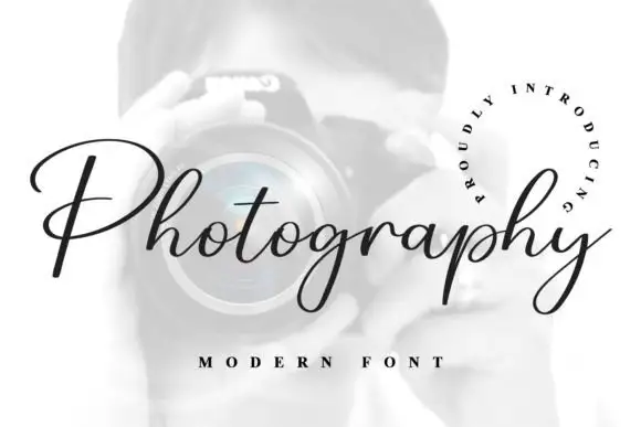
Mr. Stretch & Mr. Stout + Photography Font
Introduces organic movement on pull-quotes, signatures and gift tags.
Inspect Photography Font specimenPractical applications
Concrete hierarchy, scale and production guidance tailored to Mr. Stretch & Mr. Stout’s stroke geometry.
Two cuts of one voice let a chart fill its columns evenly, and the monoline stroke keeps a list of names readable at a distance in a dim room.
Hierarchy & layout recipe
Print a 500 by 700 mm chart: set the table headings at 30 pt in the tall cut, set the names at 12 pt in the wide cut with 5 mm of leading, and hold 20 mm of margin on all four sides.
Pre-production check
Mixing two widths on one chart can look like a mistake; print one chart at the finished size and check the hierarchy before the run.
The pair covers a long product name and a short weight line on one narrow label, and the light monoline suits a clean matte stock.
Hierarchy & layout recipe
Print a 50 by 85 mm label: set the product at 13 pt in the tall cut, set the weight at 8 pt in the wide cut with 5 mm of clear ground, and hold 4 mm of margin on all four sides.
Pre-production check
A wide cut at eight points can look squeezed by the die; print one on the real label stock and check the fitting before the order.
A long title in a narrow measure is exactly what the tall cut solves, and the wide cut lets the date fill the same width beneath it.
Hierarchy & layout recipe
Print an A2 poster: set the title at 60 pt in the tall cut over three lines, set the date at 46 pt in the wide cut beneath, and hold 24 mm of margin on all four sides of the sheet.
Pre-production check
Two extreme widths on one sheet can look unbalanced; print one proof at the final size and check the weight of each block before the run.
Technical & licence verification
Confirm included OTF/TTF/WOFF formats, full glyph tables and licence coverage on the live store page before batch production.
Closest visual alternatives
Matched across letterform anatomy, stroke behaviour and craft applications.
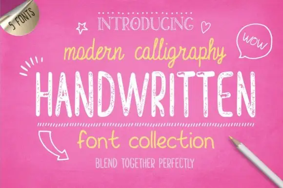
Bundle of five hand-drawn cuts with matching alternates and varied weights
Handwritten Font Collection is a five-cut hand-drawn set in which a slim script, a textured hand and a rounded print share one informal voice, and each cut arrives with an alternate style, so a document can stagger its pages without a second family.
Ideas for this font
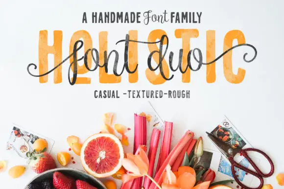
Textured block capitals with a looping script overlay
Holistic pairs tall textured block capitals with a narrow looping script that runs across them, plus a photographic backdrop of fruit and foliage.
Ideas for this font
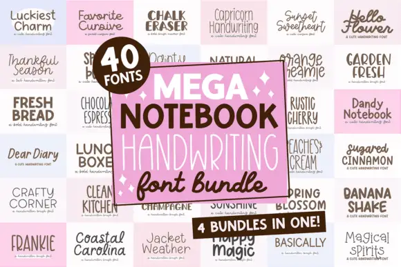
Forty notebook handwriting faces in one set
Mega Notebook Handwriting Bundle is a set of forty handwriting faces laid out on a grid of pale tiles: each tile shows a name in a different hand, from tidy print to looped cursive, with a pink panel in the middle naming the bundle and its contents.
Ideas for this font
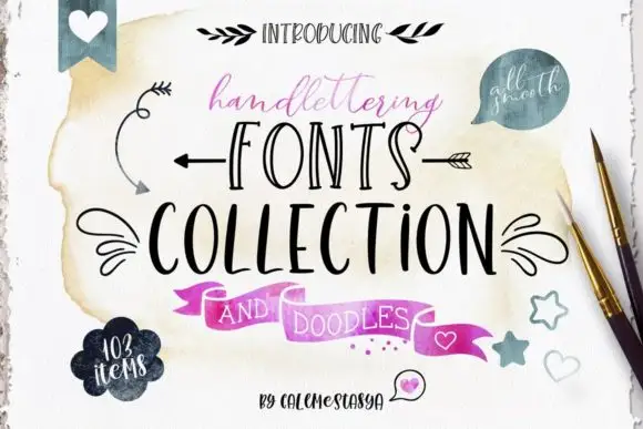
Ten-font hand-lettering bundle with drawn doodle elements
Handlettering Fonts Collection is a ten-font bundle rather than one alphabet: three scripts with italics, two decorative all-caps faces, a serif, a sans and a set of drawn doodles.
Same independent foundry
Allow optional Google Analytics to measure visits and catalogue actions. Your search words and notes are not included. Privacy & storage