Neutral Sans Workhorse

Alpharone + Montreal
Lets Alpharone own the focal silhouette while handling secondary copy, sizing and subheads cleanly.
Inspect Montreal specimenDisclosure: MakerFileHub may earn a commission from qualifying purchases via paid links on this page. How our links work.
Tall narrow decorative letters with curled terminals and long descenders
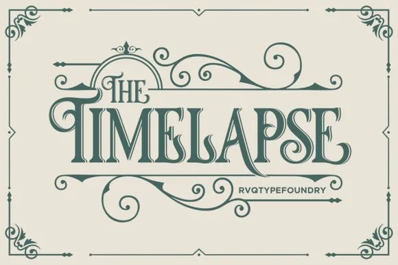
Alpharona is a vintage blackletter with tall narrow capitals, curled spurs and a set of drawn flourishes, framed on the sample by a fine border with corner ornaments.
Paid link
Get this fontProject & layout blueprintsAt-a-glance maker compatibility
Sturdy stroke walls and open counters weed cleanly on adhesive vinyl, HTV apparel film, and cut cardstock.
Visual anatomy & craft review
THE Alpharona sits inside an oval of drawn flourishes on a deep navy ground, and the letters are tall and narrow with heavy vertical stems, thin joins and curled terminals that end in small hooks. The swashes are loose around the word rather than attached, so they can be placed or left out, and the flourishes include scrolls, dots and a small ring ornament. A fine border with corner curls frames the whole composition, and two small panels at the lower right name the foundry and the style. The palette is a single cream on navy, which is how a vintage label actually prints, and the letterforms are the show-card kind of blackletter rather than a textura, which makes the face readable at moderate sizes.
Tall narrow decorative letters with curled terminals and long descenders
Two-font hierarchy recipes
Tested contrast partners — pairing Alpharone with grounded secondary typography.
Alpharone + Montreal
Lets Alpharone own the focal silhouette while handling secondary copy, sizing and subheads cleanly.
Inspect Montreal specimen
Alpharone + Glofi
Grounds bold display lettering with classic typographic authority on posters, badges and apparel.
Inspect Glofi specimenPractical applications
Concrete hierarchy, scale and production guidance tailored to Alpharone’s stroke geometry.
The flourishes and the narrow letters give a bottle the look of a Victorian label, and the single-ink construction keeps a short run affordable.
Hierarchy & layout recipe
Print a 60 by 110 mm label: set the gin name at 22 pt on one row, keep 9 mm of clear ground beneath before the strength at 4.5 pt, and hold 6 mm from the lowest curl to the die line.
Pre-production check
Curls snap on a small curved die and the thin joins break; print one label at the real size and wrap it onto the bottle before the run.
The lettering and the frame are already a period cover, and a single colour holds up on a paperback that will be handled.
Hierarchy & layout recipe
Print a 129 by 198 mm cover: set the title at 46 pt across two rows, keep 20 mm of clear ground beneath before the author at 10 pt, and hold 14 mm from the flourishes to the trim.
Pre-production check
Thin joins break on a cheap paperback stock; print one cover on the intended paper and check the hooks first.
The face gives a formal invitation a period character without a script, and the loose flourishes can be arranged to fill a wide card.
Hierarchy & layout recipe
Print a 130 by 180 mm invitation: set the names at 26 pt on one row, keep 20 mm of clear ground beneath before the venue at 9 pt, and hold 15 mm of margin from the outermost flourish.
Pre-production check
Fine scrolls print light on textured card; print one invitation on the real board and check a curl before the suite.
Technical & licence verification
Confirm included OTF/TTF/WOFF formats, full glyph tables and licence coverage on the live store page before batch production.
Closest visual alternatives
Matched across letterform anatomy, stroke behaviour and craft applications.
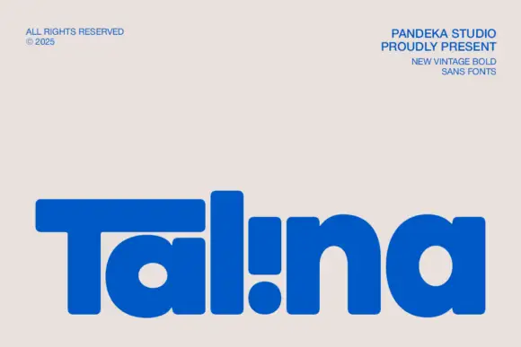
Heavy rounded logo display
Talina is a heavy rounded display in royal blue on a pale sheet: a short name set in very heavy rounded letters with an extended T arm, wide round bowls and an inverted dot-and-stem i that reads as a cut counter, with three small credits in the corners.
Ideas for this font
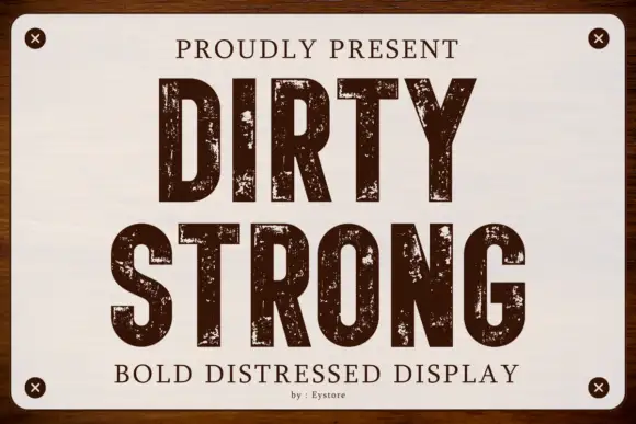
Condensed capitals with coarse scattered erosion and straight stems
Dirty Strong is a condensed industrial display in which the stems run straight and narrow, the bowls stay compact and coarse patches of wear break the fill at several scales, so a heading reads as paint on a warehouse sign.
Ideas for this font
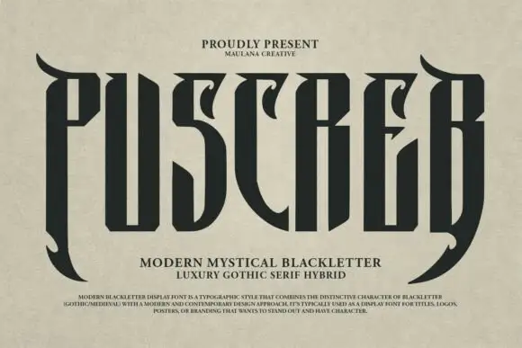
Tall narrow display with curved blades
Puscreb is a very tall narrow display in near-black on an aged paper ground: capitals with curved blades at the outer edges, deep pointed shoulders and narrow bodies, set as one large word above two plain lines and a small paragraph of description.
Ideas for this font
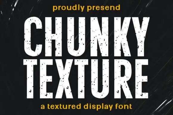
Condensed heavy capitals with sparse chips across pale faces
Chunky Texture is a condensed heavy display in which the stems run straight, the bowls stay compact and fine specks plus occasional larger chips interrupt the faces, so a heading reads as painted stencil with light wear.
Ideas for this font
Same independent foundry
Allow optional Google Analytics to measure visits and catalogue actions. Your search words and notes are not included. Privacy & storage