Neutral Sans Workhorse

Thornville + Lemon Milk Pro FTR
Lets Thornville own the focal silhouette while handling secondary copy, sizing and subheads cleanly.
Inspect Lemon Milk Pro FTR specimenDisclosure: MakerFileHub may earn a commission from qualifying purchases via paid links on this page. How our links work.
Elegant blackletter display
Thornville is an elegant blackletter in white on a pastoral landscape: tall narrow letters with fine joins, long pointed spurs that reach above and below the line, and a diamond-shaped capital T, set with an est. date and a studio credit.
Paid link
Get this fontProject & layout blueprintsAt-a-glance maker compatibility
Sturdy stroke walls and open counters weed cleanly on adhesive vinyl, HTV apparel film, and cut cardstock.
Visual anatomy & craft review
The word runs across the middle of a painted landscape, and the drawing is a blackletter with unusually fine contrast: the verticals are heavy, the joins are hairlines, and the spurs taper to sharp points, which lightens a form that usually reads as dense. The capital T is the most decorative form, drawn with a diamond head and a long descender-like tail, while the lower case keeps a narrow rhythm that stays legible at a distance. Spacing is open compared with a textura, so the thin joins remain visible and the word does not turn into a grey band. The ground is a dark, varnished landscape painting, and the white type reads against the water and the trees, with small tracked credits at the corners and a small ornament above the word.
Blackletter, sharp, stately, historic
Two-font hierarchy recipes
Tested contrast partners — pairing Thornville with grounded secondary typography.
Thornville + Lemon Milk Pro FTR
Lets Thornville own the focal silhouette while handling secondary copy, sizing and subheads cleanly.
Inspect Lemon Milk Pro FTR specimen
Thornville + Vanielst Elegant Serif Display Stylistic
Grounds bold display lettering with classic typographic authority on posters, badges and apparel.
Inspect Vanielst Elegant Serif Display Stylistic specimenPractical applications
Concrete hierarchy, scale and production guidance tailored to Thornville’s stroke geometry.
A light blackletter gives a period novel a title that signals its era without the heaviness of a textura, and the fine joins hold on a paperback cover.
Hierarchy & layout recipe
Set the title at 46 pt on a 198 by 129 mm cover, the author in a 12 pt serif beneath, and a 0.5 pt rule at the foot. Keep the title on a flat dark panel so the thin joins read, and leave 12 mm of clear space above it.
Pre-production check
Check the title at 46 pt on the paperback stock, where thin joins can fill in at small trim sizes; proof the actual cover. Confirm the 12 pt author reads on the shelf and that the title still reads at thumbnail size in an online listing.
A blackletter label suggests an old recipe, and the light drawing keeps the word readable on a bottle that is seen from a metre away on a shelf.
Hierarchy & layout recipe
Print a 70 by 100 mm label: the name at 20 pt, the year in a 7 pt serif, and the strength in 6.5 pt. Keep 5 mm of clear space around the word and print white on a dark label so the fine joins survive the stock.
Pre-production check
Check the 20 pt name on the label, where the pointed spurs can fill; keep the spurs at least 0.3 mm wide. Confirm the 6.5 pt strength reads on the bottle's curve and that the label's edge does not clip the capital's tail.
A light blackletter sets a candlelit concert in a historic register, and the fine drawing reads under low light where a dense gothic would turn into a black block.
Hierarchy & layout recipe
A2 portrait: the title at 110 mm, the performers in a 14 mm serif, and the date at 25 mm. Keep the type one colour on a dark ground and leave 30 mm margins so the spurs have space.
Pre-production check
Check the poster at three metres in low light, where the fine joins can disappear; increase the weight slightly for the poster version. Confirm the 14 mm performers line reads at arm's length and that the date does not sit inside a spur's tail.
Technical & licence verification
Confirm included OTF/TTF/WOFF formats, full glyph tables and licence coverage on the live store page before batch production.
Closest visual alternatives
Matched across letterform anatomy, stroke behaviour and craft applications.
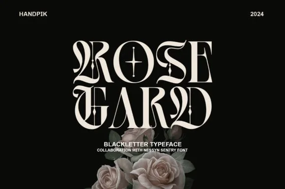
Sharp high-contrast editorial gothic blackletter
Rose Gard is a sleek, high-contrast modern blackletter featuring calligraphic hairline loops, razor-sliced stems, and a star-crossed O.
Ideas for this font
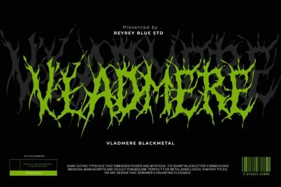
Black-metal jagged logo display
Vladmere is a black-metal logo face in lime green on black: letters built from thin jagged blades that lean and intersect, a mirrored grey copy behind the word, and a barcode-style badge at the foot that gives the specimen the look of a record sleeve.
Ideas for this font
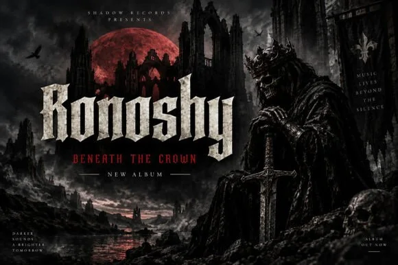
Sharp blackletter with stone texture
Ronoshy is a blackletter display in bone white on a dark gothic scene: tall spiked capitals with hairline joins and sharp terminals, textured like carved stone, set above a red subtitle in a small rounded capital face.
Ideas for this font
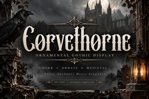
Raven-gothic ornamental blackletter with diamond counter flourishes
Corvethorne is a tall, condensed ornamental gothic display font accented with interior diamond crosshairs and curled medieval spurs.
Ideas for this font
Same independent foundry
Allow optional Google Analytics to measure visits and catalogue actions. Your search words and notes are not included. Privacy & storage