Editorial Serif Anchor

Oldport Script + Augler
Anchors Oldport Script's fluid strokes with crisp Roman proportions on wedding suites, headers and packaging.
Inspect Augler specimenDisclosure: MakerFileHub may earn a commission from qualifying purchases via paid links on this page. How our links work.
Heavy retro brush script
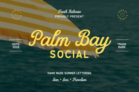
Oldport Script is a heavy retro brush script in yellow over a vintage still life: thick connected strokes, a deep bounce, and flared entries and exits that roll into fat commas, so the phrase reads as a sign painter's script from a dockside shop.
Paid link
Get this fontProject & layout blueprintsAt-a-glance maker compatibility
Weld or Unite overlapping script joins into one continuous vector path before sending to the blade.
Visual anatomy & craft review
The two words are stacked, and the drawing is a brush script at near-maximum weight: the stroke swells through the bowls, thins only at the joins, and the exits flare into long tails that flick up to the right. The bounce is strong, so the baseline ripples and the capitals sit well above the lowercase, which is what gives the lockup its easy rhythm. Connections are drawn rather than implied, so the words hold together as a single mark, and the counters stay open enough for the heavy strokes to read at label size. The specimen sets the yellow type over a photograph of a vintage desk with a television and a typewriter, and the contrast of a hand-painted face against mechanical objects is the point: the script is the only soft form on the page.
Retro, brush, heavy, warm
Two-font hierarchy recipes
Tested contrast partners — pairing Oldport Script with grounded secondary typography.
Oldport Script + Augler
Anchors Oldport Script's fluid strokes with crisp Roman proportions on wedding suites, headers and packaging.
Inspect Augler specimen
Oldport Script + Bareum
Keeps small-scale dates, URLs, nutrition facts and care instructions crisp and legible below script titles.
Inspect Bareum specimenPractical applications
Concrete hierarchy, scale and production guidance tailored to Oldport Script’s stroke geometry.
A heavy brush script reads as a painted sign from a distance, and the thick strokes survive on a wooden board where a thin script would disappear into the grain.
Hierarchy & layout recipe
Paint a 1,200 by 450 mm board: the name at 160 mm cap height in one colour, the menu line in a 30 mm slab serif, and a 6 mm rule beneath. Keep the letters at least 30 mm apart at the joins so the brush does not fill the counters.
Pre-production check
Check the board at 20 m, where the thin joins can break the word into pieces; thicken the connections. Confirm the 30 mm menu line reads at four metres and that the flared exits do not run off the board.
A retro brush script sets a relaxed vintage tone for a wedding by the water, and the heavy stroke prints clearly on a textured card that would swallow a fine script.
Hierarchy & layout recipe
A5 menu: the heading at 40 pt, the courses in a 9.5 pt serif at 14 pt leading, and the date in 8 pt caps. Keep the heading to two words so the flare does not collide with the rule, and print one ink on a cream stock.
Pre-production check
Check the 40 pt heading on the card, where the lower loop of the script can touch the first course line; keep 10 mm of clear space. Confirm the 9.5 pt courses read by candlelight and that the 8 pt date survives the deckle edge.
A retro script gives a fiftieth a warm, nostalgic tone, and the heavy weight reads across a room without needing a second colour to carry the line.
Hierarchy & layout recipe
Print 800 by 400 mm: the name at 140 mm cap height, the age in a 40 mm slab serif, and the date in 20 mm. Keep 25 mm margins, print yellow on a dark ground, and leave 15 mm between the script and the age so the flares stay clear.
Pre-production check
Check the banner at five metres, where the script's joins can close into a blob; keep the letter spacing loose at that size. Confirm the 20 mm date reads at two metres and that the yellow holds against the dark ground in daylight.
Technical & licence verification
Confirm included OTF/TTF/WOFF formats, full glyph tables and licence coverage on the live store page before batch production.
Closest visual alternatives
Matched across letterform anatomy, stroke behaviour and craft applications.
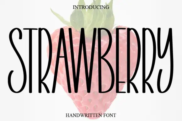
Tall narrow handwritten caps
Strawberry is a tall narrow handwritten face in black over a faded illustration of a strawberry: very condensed capitals with uneven strokes, high ascenders and a light bounce, set as one word with a small serif line above and beneath.
Ideas for this font
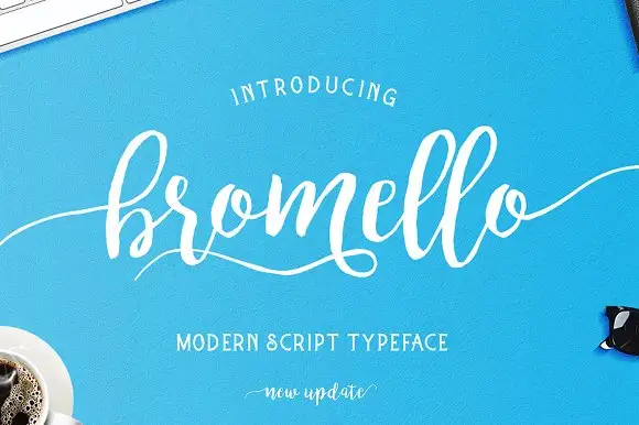
Loose brush script with a light even stroke and long flat entry tails
Bromello is a loose brush script in which the strokes stay light and even, the letters lean forward gently and the entry and exit run out as long flat tails on both sides.
Ideas for this font
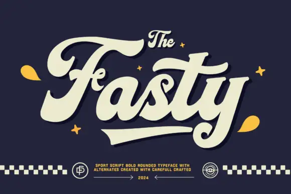
Heavy curled sports-style script with thick strokes and a wide tail
Fasty is a heavy sports-style script with thick uniform strokes, curled terminals and a wide tail that sweeps beneath the word, drawn to fill a garment front.
Ideas for this font
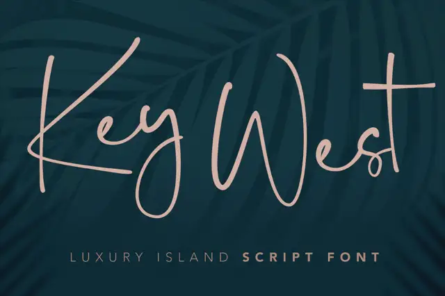
Light large-loop connected script
Key West Script is a light connected script with oversized loops and long horizontal exits, drawn thin enough that the open space between letters reads as part of the word.
Ideas for this font
Same independent foundry
Allow optional Google Analytics to measure visits and catalogue actions. Your search words and notes are not included. Privacy & storage