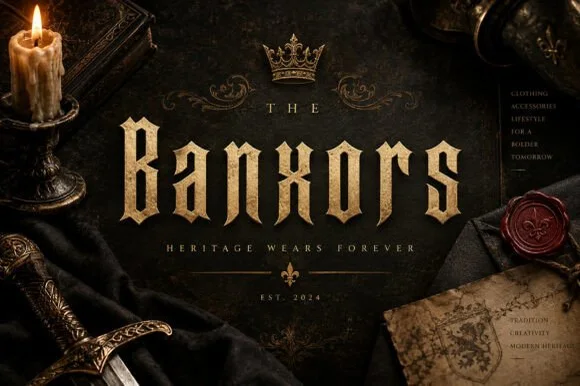
Neutral Sans Workhorse

Ronoshy + Swaraga
Lets Ronoshy own the focal silhouette while handling secondary copy, sizing and subheads cleanly.
Inspect Swaraga specimenDisclosure: MakerFileHub may earn a commission from qualifying purchases via paid links on this page. How our links work.
Sharp blackletter with stone texture
Ronoshy is a blackletter display in bone white on a dark gothic scene: tall spiked capitals with hairline joins and sharp terminals, textured like carved stone, set above a red subtitle in a small rounded capital face.
Paid link
Get this fontProject & layout blueprintsAt-a-glance maker compatibility
Sturdy stroke walls and open counters weed cleanly on adhesive vinyl, HTV apparel film, and cut cardstock.
Visual anatomy & craft review
The word is set large across the middle of the page, and the face is a blackletter built for album artwork: the stems are heavy and vertical, the joins are hairlines, the terminals break into sharp spikes, the R and the h carry pointed finials, and the y drops a descender that ends in a blade. The surface is textured like stone, with a fine speckle inside the strokes rather than a distress pattern, which gives the letters weight without making them noisy. Below the title a subtitle is set in a much smaller rounded capital face in red, which is a deliberate break in style and keeps the information legible away from the ornament. The ground is a dark gothic scene, a red moon behind a ruined castle, with a figure in a crown at the right, and small credits sit in the corners. Ronoshy is a decorative face for music artwork, game titles, event posters and apparel, and it needs one or two short words at a large size on a dark ground.
Blackletter, sharp, epic
Two-font hierarchy recipes
Tested contrast partners — pairing Ronoshy with grounded secondary typography.
Ronoshy + Swaraga
Lets Ronoshy own the focal silhouette while handling secondary copy, sizing and subheads cleanly.
Inspect Swaraga specimen
Ronoshy + Marquis - Elegant Modern Serif
Grounds bold display lettering with classic typographic authority on posters, badges and apparel.
Inspect Marquis - Elegant Modern Serif specimenPractical applications
Concrete hierarchy, scale and production guidance tailored to Ronoshy’s stroke geometry.
A blackletter with sharp terminals sets the genre before the band name is read, and the stone texture holds up at sleeve size.
Hierarchy & layout recipe
Print a 300 mm sleeve: set the title at 90 pt on one line, keep 24 mm of clear ground beneath before the album name at 12 pt, and hold 20 mm of margin on all four sides.
Pre-production check
Fine spikes can break at small sizes; keep the face for the sleeve front and set the spine in a plainer serif.
A sharp blackletter sets the tone of a late show, and bone white on a dark ground reads from the far side of a street at night.
Hierarchy & layout recipe
Print a 420 by 594 mm poster: set the title at 120 pt on one line, keep 34 mm of clear ground beneath before the lineup at 18 pt, and hold 24 mm of margin on all four sides.
Pre-production check
A textured fill on a dark poster can look muddy under street lighting; proof one sheet at night before the run.
A blackletter gives a bottle a ceremonial presence, and the sharp letters hold at the size of a small label with gold foil.
Hierarchy & layout recipe
Print a 55 by 95 mm label: set the brand at 15 pt on one line, keep 6 mm of clear ground beneath before the age at 4.5 pt, and hold 4 mm of margin on all four sides.
Pre-production check
Foil on fine spikes will bridge; order one foil proof on the real stock before approving the label.
Technical & licence verification
Confirm included OTF/TTF/WOFF formats, full glyph tables and licence coverage on the live store page before batch production.
Closest visual alternatives
Matched across letterform anatomy, stroke behaviour and craft applications.
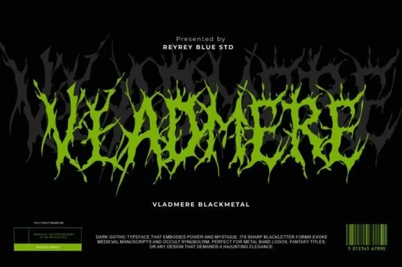
Black-metal jagged logo display
Vladmere is a black-metal logo face in lime green on black: letters built from thin jagged blades that lean and intersect, a mirrored grey copy behind the word, and a barcode-style badge at the foot that gives the specimen the look of a record sleeve.
Ideas for this font
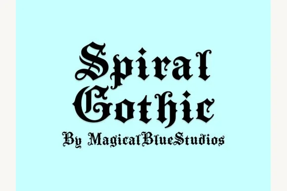
Blackletter with spiral flourishes
Spiral Gothic is a blackletter in black on pale mint: heavy vertical stems, hairline joins and sharp terminals, with spiral flourishes growing out of the S and the G and a small line beneath in the same hand.
Ideas for this font
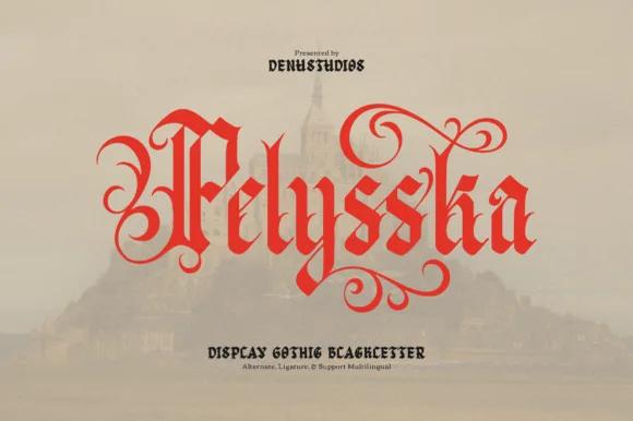
Scroll-flourished scarlet gothic blackletter display
Pelysska is a dramatic gothic blackletter display typeface draped in curling calligraphy vines, looped ascenders, and regal manuscript spurs.
Ideas for this font
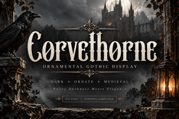
Raven-gothic ornamental blackletter with diamond counter flourishes
Corvethorne is a tall, condensed ornamental gothic display font accented with interior diamond crosshairs and curled medieval spurs.
Ideas for this font
Same independent foundry
Allow optional Google Analytics to measure visits and catalogue actions. Your search words and notes are not included. Privacy & storage