Modern Grotesque Body

Western Junior + Godthem
Creates crisp high-hierarchy contrast beneath Western Junior headlines across menus, websites and labels.
Inspect Godthem specimenDisclosure: MakerFileHub may earn a commission from qualifying purchases via paid links on this page. How our links work.
Vintage western slab with scrollwork frame
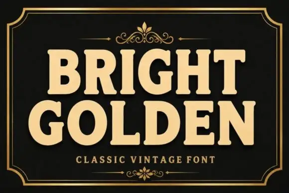
Western Junior is a vintage western display face in cream and gold on black: rounded slab capitals with small spurs and a dusty surface, set inside an elaborate scrollwork frame with stars, a rule and a banner.
Paid link
Get this fontProject & layout blueprintsAt-a-glance maker compatibility
Sturdy stroke walls and open counters weed cleanly on adhesive vinyl, HTV apparel film, and cut cardstock.
Visual anatomy & craft review
Two words are stacked and centred inside a drawn frame, and the face is a vintage western: the letters are wide with rounded slab serifs, small spurs at the joins, a moderate contrast and a dusty texture that reads as aged ink rather than damage. The W splays, the J drops below the baseline, the R carries a curved leg and the S has soft shoulders, while the depth comes from a fine keyline that follows the letters at a distance. Around them an ornate border of curls, leaves and stars is drawn in gold on black, with a rule above and a banner below, so the composition reads as a printed label or a matchbook cover. Two small capital lines name the product at the top and the bottom. Western Junior is a display face for packaging, signage, posters and apparel with a heritage feel, and it needs a short word at a large size inside a frame that matches its ornament.
Vintage, framed, ornamented
Two-font hierarchy recipes
Tested contrast partners — pairing Western Junior with grounded secondary typography.
Western Junior + Godthem
Creates crisp high-hierarchy contrast beneath Western Junior headlines across menus, websites and labels.
Inspect Godthem specimen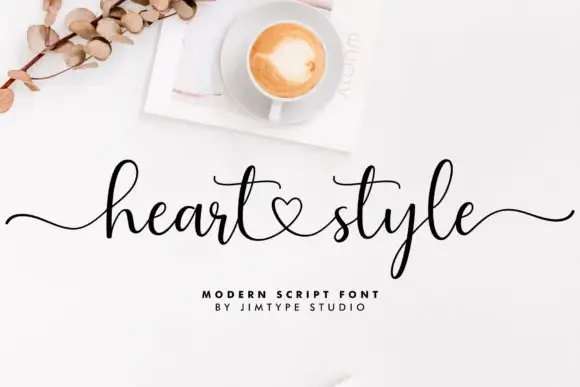
Western Junior + Heart Style
Adds a warm human signature touch for 1-to-3-word callouts without competing against structured serif capitals.
Inspect Heart Style specimenPractical applications
Concrete hierarchy, scale and production guidance tailored to Western Junior’s stroke geometry.
An ornamented western face gives a bottle the look of a heritage label, and the drawn frame keeps a small format from feeling empty.
Hierarchy & layout recipe
Print a 65 by 95 mm label: set the brand at 20 pt on one line, keep 7 mm of clear ground beneath before the proof at 5 pt, and hold 5 mm of margin on all four sides.
Pre-production check
Fine scrollwork can fill in at small sizes; print one label on the real stock and check the frame before the order.
A vintage face with a drawn frame gives a history cover its period without a photograph, and the ornament reads at thumbnail size online.
Hierarchy & layout recipe
Print a 152 by 229 mm cover: set the title at 44 pt over two lines, keep 20 mm of clear ground beneath before the author at 11 pt, and hold 14 mm of margin on all four sides.
Pre-production check
Ornament plus texture at cover size can look busy; proof one cover with the subtitle in place before the print.
A heritage western face suits a seasonal product sold at a farm gate, and the heavy letters read on a board seen from a car.
Hierarchy & layout recipe
Print a 500 by 700 mm board: set the name at 110 pt over two lines, keep 32 mm of clear ground beneath before the hours at 24 pt, and hold 26 mm of margin on all four sides.
Pre-production check
Outdoor boards fade quickly in gold and red; print one board and keep a spare for replacement before the season.
Technical & licence verification
Confirm included OTF/TTF/WOFF formats, full glyph tables and licence coverage on the live store page before batch production.
Closest visual alternatives
Matched across letterform anatomy, stroke behaviour and craft applications.
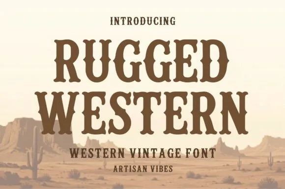
Condensed western serif with spurred stems
Rugged Western is a western display face in warm brown on a pale desert scene: condensed capitals with bracketed slab serifs, small spurs at the joins and a heavy even weight, with cacti and mesas drawn behind the words.
Ideas for this font
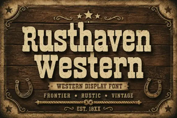
Weathered western slab display
Rusthaven Western is a weathered western slab in cream on dark timber: heavy slabs with softened corners, a chipped edge and a speckled fill, set in two lines with a ribbon banner, stars and horseshoes, so the pair reads as a brand burned into a barn door.
Ideas for this font
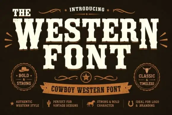
Heavy western capitals with pinched sides
The Western is a heavy western display in cream on dark brown: tall capitals with pinched waists, wedge serifs and a rough printed edge, laid out with a ribbon banner and two round badges.
Ideas for this font
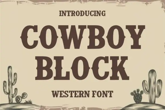
Heavy western serif capitals with middle notches and square slabs
Cowboy Block is a heavy western capital alphabet whose stems and slabs carry small notches cut through the middle, so a word reads like a carved saloon sign rather than a plain slab.
Ideas for this font
Same independent foundry
Allow optional Google Analytics to measure visits and catalogue actions. Your search words and notes are not included. Privacy & storage