High-Contrast Display Serif

Thanksgiving + Lumera Editorial
Pairs sculptural editorial warmth with Thanksgiving's clean modern geometry.
Inspect Lumera Editorial specimenDisclosure: MakerFileHub may earn a commission from qualifying purchases via paid links on this page. How our links work.
Bouncy handwritten display trio
Thanksgiving is a handwritten display in orange and brown on cream: rounded strokes with a heavy bounce, small loops on the ascenders, uneven heights and generous counters, presented as a trio with two lighter companion faces, so the pair reads as lettering drawn for a seasonal card.
Paid link
Get this fontProject & layout blueprintsAt-a-glance maker compatibility
Sturdy stroke walls and open counters weed cleanly on adhesive vinyl, HTV apparel film, and cut cardstock.
Visual anatomy & craft review
The two words are stacked and the drawing is casual handwriting scaled up: the strokes are even and rounded, the letters lean and rise by turns, and the ascenders curl into small loops, which is what makes the pair feel drawn rather than set. The bounce is strong enough that the baseline disappears, so the words read as a composition rather than a line, and the counters stay large, which keeps a heavy weight legible. The specimen surrounds the lockup with a watercolour wreath of oak leaves, berries and a pumpkin, and it also works the words in two companion weights, one for the headline and a lighter one for the caption beneath. The palette is two warm inks on cream, which is the honest setting for a seasonal face of this kind.
Handwritten, bouncy, friendly, seasonal
Two-font hierarchy recipes
Tested contrast partners — pairing Thanksgiving with grounded secondary typography.
Thanksgiving + Lumera Editorial
Pairs sculptural editorial warmth with Thanksgiving's clean modern geometry.
Inspect Lumera Editorial specimen
Thanksgiving + Thick Black
Introduces organic movement on pull-quotes, signatures and gift tags.
Inspect Thick Black specimenPractical applications
Concrete hierarchy, scale and production guidance tailored to Thanksgiving’s stroke geometry.
A bouncy handwritten face reads as a hand-drawn invitation, and the companion weights let one purchase cover the headline and the details without a second typeface.
Hierarchy & layout recipe
A6 card: the greeting at 30 pt in the heavy cut, the details in a 9 pt light cut, and a 3 mm border. Keep 12 mm margins, print two warm inks on a cream card, and leave the corners for a small leaf ornament.
Pre-production check
Check the 30 pt greeting on a home printer, where the loops can fill; use the cleanest cut at that size. Confirm the 9 pt light details keep a 4.5:1 contrast and that the bounce does not push the details off the card.
A handwritten label reads as home-made on a jar, and the light companion weight lets the ingredient list stay readable where a single heavy script would fail.
Hierarchy & layout recipe
Print a 70 mm round label: the preserve at 16 pt in the heavy cut, the ingredients in a 6 pt light cut, and the weight at 5 pt. Keep 5 mm inside the die and print two inks on an uncoated stock.
Pre-production check
Check the 6 pt ingredients on an uncoated label, where a rounded stroke can fill; keep the size above 5 pt and the ink light. Confirm the label reads on a jar in a shop and that the die clears the loop of the ascender.
A friendly handwritten face suits a school fair better than a formal serif, and the bouncy lettering draws the eye on a noticeboard full of plain notices.
Hierarchy & layout recipe
A4 print: the headline at 44 mm, the stalls in a 10 mm light cut, and the times in 12 mm. Keep 20 mm margins and print two colours so the notice stands out among photocopied sheets.
Pre-production check
Check the A4 at two metres, where the bounce can make the times drift; set the small lines in the light cut on a straight baseline. Confirm the 10 mm stalls read at arm's length and that the headline fits the sheet without shrinking.
Technical & licence verification
Confirm included OTF/TTF/WOFF formats, full glyph tables and licence coverage on the live store page before batch production.
Closest visual alternatives
Matched across letterform anatomy, stroke behaviour and craft applications.
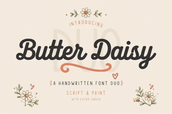
Chunky retro-cottage script & tall narrow print duo (+ swash)
Butter Daisy is a warm cottagecore font duo pairing a thick, rounded monoline brush script (with extra swashes) and a tall narrow print font.
Ideas for this font
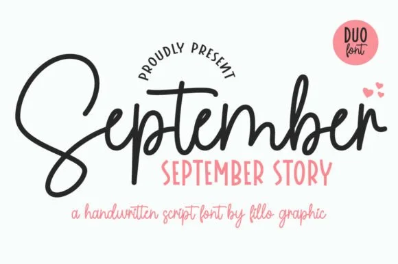
Bouncy monoline cord script + tall skinny farmhouse sans duo (Alternates)
September Story is a sweet handwritten font duo pairing a thick, looped monoline cord script (with swash alternates) and a tall narrow uppercase sans!
Ideas for this font
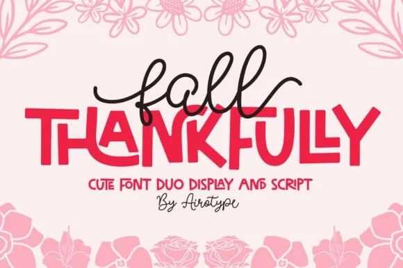
Monoline tail script & bouncy all-caps sans duo
Fall Thankfully pairs a looping monoline cursive script with a heavy, interlocking all-caps sans display face.
Ideas for this font
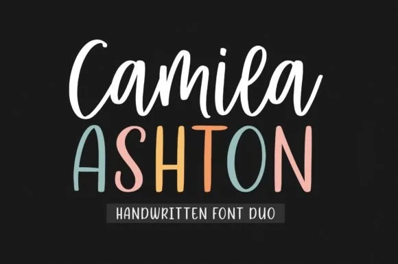
Bouncy crafter brush script + tall pastel farmhouse sans duo
Camila Ashton is a clean, crafter-ready handwritten font duo pairing a thick, smooth upright brush script with a tall rounded print sans!
Ideas for this font
Same independent foundry
Allow optional Google Analytics to measure visits and catalogue actions. Your search words and notes are not included. Privacy & storage