High-Contrast Display Serif

Thankful Mama + Cervelique
Pairs sculptural editorial warmth with Thankful Mama's clean modern geometry.
Inspect Cervelique specimenDisclosure: MakerFileHub may earn a commission from qualifying purchases via paid links on this page. How our links work.
Chunky retro display with a loose script
Thankful Mama is a duo in rust orange on cream: a chunky retro display with heavy flared strokes and a heart cut into the counter of one letter, and a loose quick script above it in the same colour.
Paid link
Get this fontProject & layout blueprintsAt-a-glance maker compatibility
Weld or Unite overlapping script joins into one continuous vector path before sending to the blade.
Visual anatomy & craft review
The pairing moves from quiet to loud: the script sets thankful in a light connected hand with tall loops and a wandering baseline, and the display sets MAMA in fat letters whose stems flare at the foot and whose A carries a heart in the counter, so a plain word reads as a retro badge. Both cuts share one ink, which is what keeps a script and a display from looking like two separate purchases, and the script sits above with a slight lift so the pair reads as one composition rather than two lines. Small four-pointed stars sit between the words, and two captions at the foot name the pair. The duo suits seasonal cards, family gifts, apparel and packaging with a warm retro tone, and it works best with the display large and the script as a quiet line above it.
A fat retro capital over a quick script
Two-font hierarchy recipes
Tested contrast partners — pairing Thankful Mama with grounded secondary typography.
Thankful Mama + Cervelique
Pairs sculptural editorial warmth with Thankful Mama's clean modern geometry.
Inspect Cervelique specimen
Thankful Mama + Hello Honey
Introduces organic movement on pull-quotes, signatures and gift tags.
Inspect Hello Honey specimenPractical applications
Concrete hierarchy, scale and production guidance tailored to Thankful Mama’s stroke geometry.
A retro display with a heart counter and a script above it says the season in one glance, and the pair gives a card two voices for one price.
Hierarchy & layout recipe
Print a 120 by 120 mm square card: set the display word at 40 pt, set the script at 26 pt above with 10 mm of clear ground, and hold 14 mm of margin on all four sides.
Pre-production check
Two warm faces set close can merge; print one card at the finished size and check the gap between the lines before the batch.
The pair fits a small tag because the display stays legible at eighteen points and the script is used for a single word, and the retro tone suits a homemade gift.
Hierarchy & layout recipe
Print a 45 by 70 mm tag: set the display word at 18 pt, set the script at 12 pt with 6 mm of clear ground, and leave 5 mm from the lowest letter to the punch hole.
Pre-production check
A flared stem can reach the punch hole; print one tag, punch it and check the clearance before the order.
The duo carries a shop name and a seasonal line on one board, and the warm palette suits a business that sells what it grows.
Hierarchy & layout recipe
Print a 600 by 400 mm board: set the shop name at 96 pt in the display, set the line at 44 pt in the script with 24 mm of clear ground, and hold 22 mm of border on all four sides.
Pre-production check
A flared display face can look heavy beside a light script; print one at the final size and check the balance before the set.
Technical & licence verification
Confirm included OTF/TTF/WOFF formats, full glyph tables and licence coverage on the live store page before batch production.
Closest visual alternatives
Matched across letterform anatomy, stroke behaviour and craft applications.
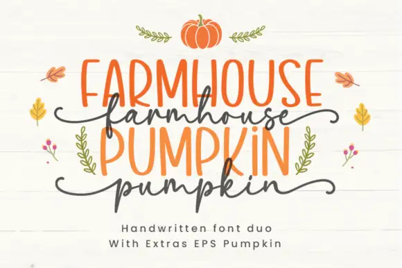
Farmhouse duo pairing irregular marker caps with a wavy script
Farmhouse Pumpkin is a two-cut family in which tall irregular marker capitals sit above a wavy script line, so a two-line design reads as a hand-painted autumn sign rather than as typeset text.
Ideas for this font
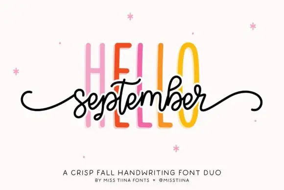
Duo
Hello September Duo shows very tall narrow sans capitals behind a small connected script line, where the script carries looped b and t ascenders and long curled side tails and the cover names it as a fall pairing.
Ideas for this font
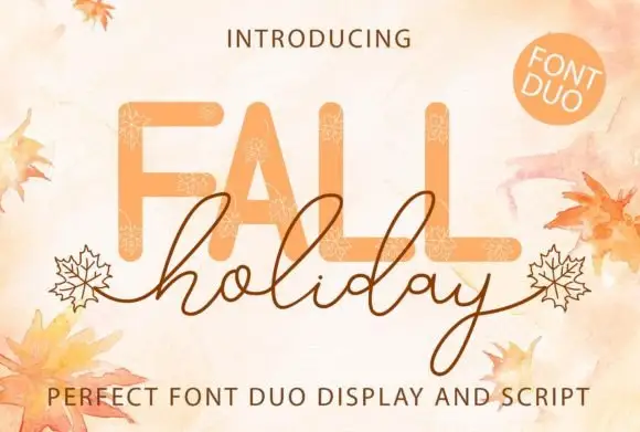
Rounded capitals paired with fine looping script
Fall Holiday places broad rounded FALL above a fine looping holiday line, where tall h, l and d loops rise into the display word's space and the y drops well below it while leaf-ended outer strokes appear in the artwork.
Ideas for this font
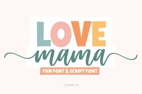
Chunky block sans & tailed cursive duo
Love Mama pairs a bold, slightly tapered block sans with a smooth horizontal-tailed script, presented for custom mom shirts, mugs and baby gifts where the block line sits above a tailed lowercase script line.
Same independent foundry
Allow optional Google Analytics to measure visits and catalogue actions. Your search words and notes are not included. Privacy & storage