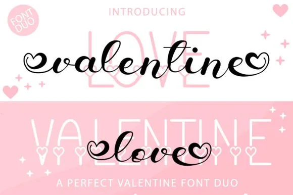
High-Contrast Display Serif

Fall Holiday + Vanielst Elegant Serif Display Stylistic
Pairs sculptural editorial warmth with Fall Holiday's clean modern geometry.
Inspect Vanielst Elegant Serif Display Stylistic specimenDisclosure: MakerFileHub may earn a commission from qualifying purchases via paid links on this page. How our links work.
Rounded capitals paired with fine looping script
Fall Holiday places broad rounded FALL above a fine looping holiday line, where tall h, l and d loops rise into the display word's space and the y drops well below it while leaf-ended outer strokes appear in the artwork.
Paid link
Get this fontProject & layout blueprintsAt-a-glance maker compatibility
Weld or Unite overlapping script joins into one continuous vector path before sending to the blade.
Visual anatomy & craft review
The upper row stays broad and round, the lower line thins to a hairline, the ascenders reach up between the capitals and the outer strokes finish in leaf shapes. That interlock of a heavy cap row with fine loops is the character, and it is why the sample stacks the two members tightly. Because the pairing appears only at cover scale, set your own two lines at 40 pt and 24 pt, check how the fine ascenders meet the cap row, and confirm which file carries the leaf-ended strokes before you copy this arrangement into a card.
Rounded · Fine · Seasonal
Two-font hierarchy recipes
Tested contrast partners — pairing Fall Holiday with grounded secondary typography.
Fall Holiday + Vanielst Elegant Serif Display Stylistic
Pairs sculptural editorial warmth with Fall Holiday's clean modern geometry.
Inspect Vanielst Elegant Serif Display Stylistic specimen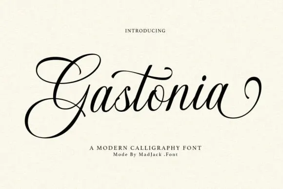
Fall Holiday + Gastonia Script
Introduces organic movement on pull-quotes, signatures and gift tags.
Inspect Gastonia Script specimenPractical applications
Concrete hierarchy, scale and production guidance tailored to Fall Holiday’s stroke geometry.
The rounded caps and fine script suit a seasonal card, and the two voices fit at 34 pt and 24 pt on an A6 sheet, with the loops rising between.
Hierarchy & layout recipe
Print an A6 card: set the top word at 34 pt in the caps, set the phrase at 24 pt in the script beneath with 16 mm of clear ground, and keep 14 mm of margin so the rising loops stay inside.
Pre-production check
Loops that touch the cap row below read as one mass; check the card and open the gap to 18 mm.
The pair gives a jar label a seasonal tone, and the fine script holds a short phrase at 20 pt on a 55 mm panel, above the contents line.
Hierarchy & layout recipe
Print a 55 by 40 mm label: set the word at 20 pt in the caps, set the phrase at 15 pt in the script below, and keep 6 mm of clear ground between the two rows.
Pre-production check
A hairline script at 12 pt closes on a curved label; check the label in place and hold the script at 16 pt.
The duo reads across a fair counter, and the broad caps hold a stall name at 48 pt on a printed board, with the script clear beneath.
Hierarchy & layout recipe
Print a 500 by 250 mm board: set the stall name at 48 pt in the caps, set the phrase at 32 pt in the script beneath with 20 mm of clear ground, and keep 24 mm of border all round.
Pre-production check
A fine script at 30 pt loses its connectors at distance; check the mounted board and keep the script at 34 pt.
Technical & licence verification
Confirm included OTF/TTF/WOFF formats, full glyph tables and licence coverage on the live store page before batch production.
Closest visual alternatives
Matched across letterform anatomy, stroke behaviour and craft applications.
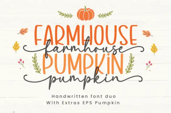
Farmhouse duo pairing irregular marker caps with a wavy script
Farmhouse Pumpkin is a two-cut family in which tall irregular marker capitals sit above a wavy script line, so a two-line design reads as a hand-painted autumn sign rather than as typeset text.
Ideas for this font
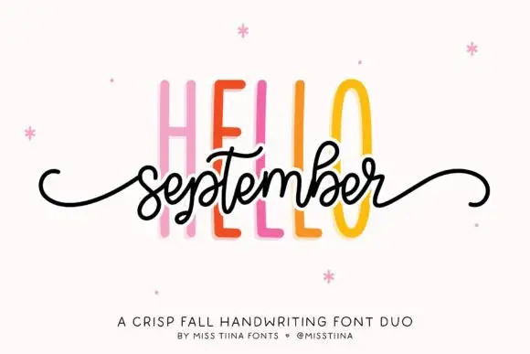
Duo
Hello September Duo shows very tall narrow sans capitals behind a small connected script line, where the script carries looped b and t ascenders and long curled side tails and the cover names it as a fall pairing.
Ideas for this font
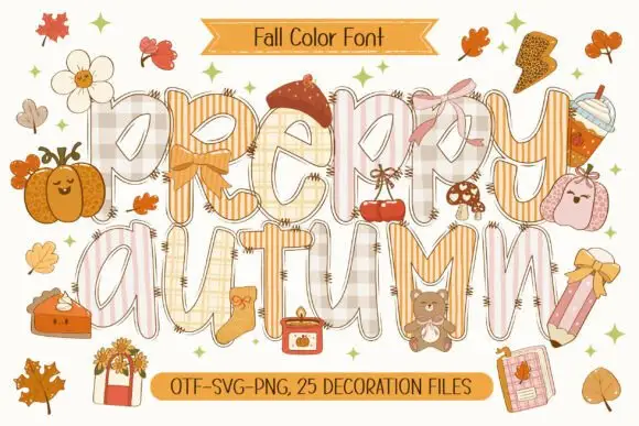
Patchwork colour display
Preppy Autumn is a tall patchwork display on a cream sheet: letters filled with checks, stripes and plaid in soft peach and cream tones, outlined in white with a warm shadow, surrounded by autumn accessories, with two ribbons that name the format list and the count of decoration files.
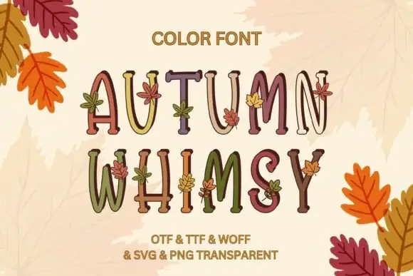
Slim uneven serif capitals with little leaves across muted fills
Autumn Whimsy sets slender rounded colour capitals in a warm autumn palette — mustard, plum, olive, cream — and grows small oak and maple leaves out of the top of each letter.
Ideas for this font
Same independent foundry
Allow optional Google Analytics to measure visits and catalogue actions. Your search words and notes are not included. Privacy & storage