Neutral Sans Workhorse

Teenage Riot + Base Edge
Lets Teenage Riot own the focal silhouette while handling secondary copy, sizing and subheads cleanly.
Inspect Base Edge specimenDisclosure: MakerFileHub may earn a commission from qualifying purchases via paid links on this page. How our links work.
Spiked gothic display
Teenage Riot is a spiked gothic display in white on black: letters built from thin, angular strokes with thorn-like spurs and long downward spikes, a star set inside one letter, and an all-caps rhythm that reads as a metal logo rather than a text face.
Paid link
Get this fontProject & layout blueprintsAt-a-glance maker compatibility
Sturdy stroke walls and open counters weed cleanly on adhesive vinyl, HTV apparel film, and cut cardstock.
Visual anatomy & craft review
The specimen sets four lines at different sizes, and the drawing is a display gothic reduced to outlines: the vertical strokes are thin and the spurs extend into sharp points above and below, so the letters read as a row of thorns. The E and the R break into disconnected strokes with a star filling one junction, and the spacing is tight enough that the words form a dense texture with the counters as thin slits. Because the strokes are thin and the spurs are long, the face only works at large sizes, which the sample acknowledges by setting everything at display scale on a black ground with no other elements. The layout stacks four lines of different widths, which is how a band logo is usually constructed, and the whole thing is monochrome, so the sharpness of the points is the only detail.
Gothic, spiked, sharp, underground
Two-font hierarchy recipes
Tested contrast partners — pairing Teenage Riot with grounded secondary typography.
Teenage Riot + Base Edge
Lets Teenage Riot own the focal silhouette while handling secondary copy, sizing and subheads cleanly.
Inspect Base Edge specimen
Teenage Riot + Augler
Grounds bold display lettering with classic typographic authority on posters, badges and apparel.
Inspect Augler specimenPractical applications
Concrete hierarchy, scale and production guidance tailored to Teenage Riot’s stroke geometry.
A spiked gothic sets an underground tone in one word, and the thin white strokes read on a black poster where a heavy blackletter would become a solid mass.
Hierarchy & layout recipe
A2 portrait: the band name at 160 mm cap height, the line-up in a 12 mm grotesque, and the date at 30 mm. Keep the display in the upper half on flat black and leave 25 mm margins so the spikes do not reach the trim.
Pre-production check
Check the spikes at full size, where points under 1 mm will break off in the print; thicken the tips for the poster version. Confirm the 12 mm line-up reads at two metres and that no spike crosses the safe area.
A spiked display gives a zine cover the immediacy of a photocopied flyer, and the monochrome treatment keeps the small print run affordable.
Hierarchy & layout recipe
Set the title at 110 pt on an A5 cover, the issue number in a 9 pt grotesque at the foot, and a 3 mm border. Keep everything on black with white type and print on a copier so the sharp points are the only texture.
Pre-production check
Check the title at 110 pt after photocopying, where thin strokes and long spikes can drop out entirely; thicken the strokes for that process. Confirm the 9 pt issue number survives the copy and that the border does not close up at the trim.
A spiked gothic gives a student gig poster the look of a real scene flyer, which is more convincing to a teenage audience than a school-designed notice.
Hierarchy & layout recipe
A3 portrait: the event name at 120 mm, the band list in a 14 mm grotesque, and the venue at 10 mm. Keep the display on a black panel and print the rest of the poster on white so the event details stay readable in a corridor.
Pre-production check
Check the display against the white panel boundary, where a thin white stroke on white disappears; keep 15 mm between the two fields. Confirm the 14 mm band list reads at three metres and that the venue line stays outside the black panel.
Technical & licence verification
Confirm included OTF/TTF/WOFF formats, full glyph tables and licence coverage on the live store page before batch production.
Closest visual alternatives
Matched across letterform anatomy, stroke behaviour and craft applications.
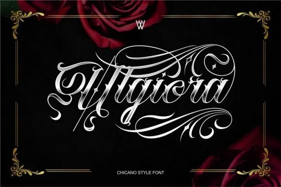
Chicano gothic-script hybrid with heavy flourishes and a shaded inner stroke
Ulgiora is a chicano-style hybrid in which a gothic skeleton is drawn as a connected script, with heavy flourishes that leave the word at both ends and a fine shaded line inside the thick strokes.
Ideas for this font
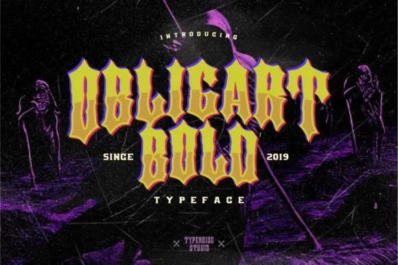
Heavy angular Chicano & street-art block blackletter
Obligart Bold is a heavy, faceted Chicano-tattoo blackletter font (not a cursive script) built from thick chisel blocks and diamond-notched stems.
Ideas for this font
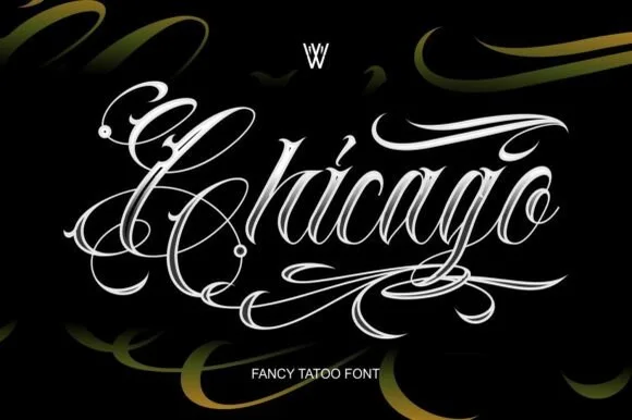
Ornate tattoo script with hatched shading and long capital flourishes
Chicago is an ornate tattoo script in which the capitals throw long flourishes, the stems carry drawn-in shading strokes and the tails curl into hooks, so a single word reads as a piece of lettering rather than as text.
Ideas for this font
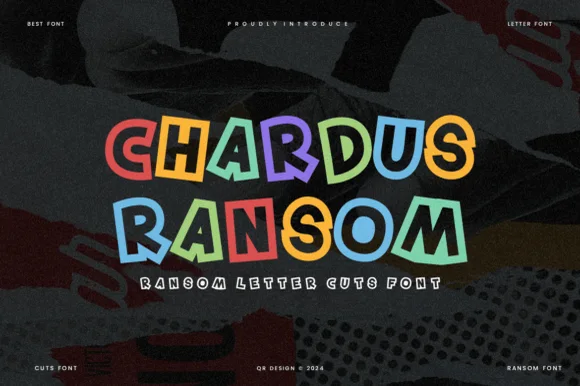
Clean geometric cut-tile ransom display (OTF & TTF)
Chardus Ransom is a crisp, graphic ransom-cut display font alternating solid and outlined letters with tilted geometric rectangle tiles.
Ideas for this font
Same independent foundry
Allow optional Google Analytics to measure visits and catalogue actions. Your search words and notes are not included. Privacy & storage