Editorial Serif Anchor

Rolling Bakery + Vanielst Elegant Serif Display Stylistic
Anchors Rolling Bakery's fluid strokes with crisp Roman proportions on wedding suites, headers and packaging.
Inspect Vanielst Elegant Serif Display Stylistic specimenDisclosure: MakerFileHub may earn a commission from qualifying purchases via paid links on this page. How our links work.
Rough handwritten brush script
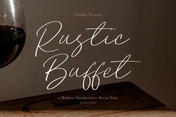
Rolling Bakery is a rough handwritten brush script in warm cream on a dark ground: tilted strokes, a dry brush texture along the edges, tall looping caps and a baseline that wanders just enough to read as written by hand.
Paid link
Get this fontProject & layout blueprintsAt-a-glance maker compatibility
Fine grain and micro-texture excel in 300 DPI print, sublimation, and screen print rather than small vinyl weeding.
Visual anatomy & craft review
The two words are set at a slight upward angle and the letters show the pressure changes of a brush rather than a pen: the R opens with a broad looped arm, the o and the l connect low, and the y of the second line drops a tail that swings under the word. Edges are ragged in places and the strokes vary in width, which is what sells the hand-made reading, and the spacing is deliberately uneven so no two gaps repeat. The ground is a darker photograph with a hand and forearm entering at the left edge, and the cream type sits over it at high contrast, while a small orange circle sticker with the words new font hangs at the right. Beneath the wordmark, a line of small tracked capitals names the style in a matching ochre, which shows the face can be paired with a plain sans for the information the script should not carry.
Rough, handwritten, brushy, casual
Two-font hierarchy recipes
Tested contrast partners — pairing Rolling Bakery with grounded secondary typography.
Rolling Bakery + Vanielst Elegant Serif Display Stylistic
Anchors Rolling Bakery's fluid strokes with crisp Roman proportions on wedding suites, headers and packaging.
Inspect Vanielst Elegant Serif Display Stylistic specimen
Rolling Bakery + Modern Limited
Keeps small-scale dates, URLs, nutrition facts and care instructions crisp and legible below script titles.
Inspect Modern Limited specimenPractical applications
Concrete hierarchy, scale and production guidance tailored to Rolling Bakery’s stroke geometry.
A rough brush script carries the idea of a hand-made product better than any clean face, and the uneven baseline keeps a paper bag from looking like a supermarket print.
Hierarchy & layout recipe
Print a 90 by 60 mm bag stamp: the shop name in the script at 22 pt on one line, the product in a small tracked sans at 7 pt below, leaving 10 mm of clear paper around the lockup. Set the script in one ink colour so the brush edges stay crisp on kraft.
Pre-production check
Check the stamp on kraft stock at actual size, where ink spread thickens the brush edges and can close the gaps between connected letters. Confirm the bag fold does not run through the word and that the 7 pt line is still readable where the paper grain is strongest.
A single handwritten line above a recipe gives the page a voice without pulling attention from the photograph, and a rough script reads as a note in a notebook rather than a headline.
Hierarchy & layout recipe
Place the phrase at 34 pt on the upper left of the spread, rotated two degrees, with the body column starting 14 mm below. Keep the script in the same ink as the folio so it reads as an annotation, and reserve the clean serif for the recipe itself.
Pre-production check
Check that the two-degree rotation does not push the ascenders into the running head at the top of the page, and that the script's ragged edges survive the 175 lpi screen. Read the spread at 100 percent to confirm the phrase does not compete with the food photograph.
An outdoor market sign is read at a glance and from an angle, and a heavy brush script with a wandering baseline survives that better than a thin formal script.
Hierarchy & layout recipe
Cut a 420 by 297 mm board, set the two words at 48 mm cap height in cream on a dark stained ground, and put the price list in a plain grotesque at 20 mm below a hand-drawn rule. Keep 30 mm between the script and the rule so the descenders stay clear.
Pre-production check
Check the sign in the shadow of a stall, where cream on dark reads well but a thin stroke would disappear; look at it from three metres. Confirm the descender of the y does not cross the rule and that the price list stays outside the script's diagonal.
Technical & licence verification
Confirm included OTF/TTF/WOFF formats, full glyph tables and licence coverage on the live store page before batch production.
Closest visual alternatives
Matched across letterform anatomy, stroke behaviour and craft applications.
Upright handwritten brush sans
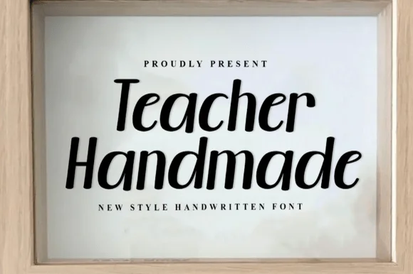
Teacher Handmade is an upright handwritten face in black on white: thick monoline-brush strokes with rounded ends, tall ascenders, an open e and a lower-case g with a straight tail, so the two words read as marker lettering written quickly and confidently.
Ideas for this font
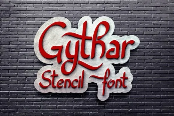
Bold chunkier open-loop stencil brush script for signs & cocoa dusters
Gythar is a bold, chunky handwritten stencil script engineered without closed loops—giving plasma cutters, lasers, and Mylar stencils thick, tear-proof bridges!
Ideas for this font
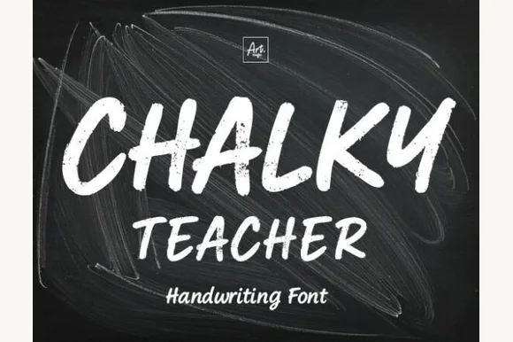
Streaky dust-textured blackboard chalk marker font
Chalky Teacher is an authentic blackboard handwritten font streaked internally with realistic dry-chalk grain across bold slanted strokes.
Ideas for this font
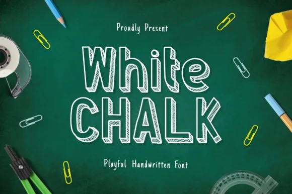
Tall slab-serifed chalkboard font shaded with diagonal chalk hatch
Whitechalk is a tall, structured chalkboard display font pairing crisp slab-serifed outlines with diagonal white-chalk interior shading.
Ideas for this font
Same independent foundry
Allow optional Google Analytics to measure visits and catalogue actions. Your search words and notes are not included. Privacy & storage