High-Contrast Display Serif

Tarevo + Kernova
Pairs sculptural editorial warmth with Tarevo's clean modern geometry.
Inspect Kernova specimenDisclosure: MakerFileHub may earn a commission from qualifying purchases via paid links on this page. How our links work.
Geometric capital sans
Tarevo is a geometric capital sans in cream on a grey architectural ground: wide letters with a rounded A arch, a segmented R and an upturned V bowl, even strokes and flat terminals, with a small tracked line above and a row of coverage notes beneath.
Paid link
Get this fontProject & layout blueprintsAt-a-glance maker compatibility
Sturdy stroke walls and open counters weed cleanly on adhesive vinyl, HTV apparel film, and cut cardstock.
Visual anatomy & craft review
The word spans the plate and the drawing is a geometric sans in caps: the strokes are even, the terminals are flat, and the distinctive decisions sit in the A arch, the R leg and the V bowl, which is what keeps a wide geometric from reading as a default system font. The architectural ground with a diagonal shadow gives the type a scale reference without competing, and the row of notes beneath states the character coverage — uppercase, lowercase, numerals, symbols and punctuation — which is what a buyer checks before licensing a logo face. Because the letters are wide, the face suits a wordmark more than a paragraph, and the plate sets one word at full width to show its proportions honestly.
Sans serif, geometric, modern, wide
Two-font hierarchy recipes
Tested contrast partners — pairing Tarevo with grounded secondary typography.
Tarevo + Kernova
Pairs sculptural editorial warmth with Tarevo's clean modern geometry.
Inspect Kernova specimen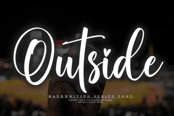
Tarevo + Outside
Introduces organic movement on pull-quotes, signatures and gift tags.
Inspect Outside specimenPractical applications
Concrete hierarchy, scale and production guidance tailored to Tarevo’s stroke geometry.
A wide geometric sans gives a studio a mark that reads as built, and the flat terminals hold on a wall panel in vinyl or on a cut card at any size.
Hierarchy & layout recipe
Set the mark at 20 pt on a card, 100 mm on a wall and 13 pt in a footer, keeping the wide tracking only above 24 pt. Keep one colour and clear space equal to the cap height.
Pre-production check
Check the 13 pt footer, where a wide geometric can look loose; tighten the tracking. Confirm the wall mark reads at ten metres and that the flat terminals survive cutting.
A geometric capital sans gives an annual a cover that reads as a title board, and the wide letters fill the width with one word.
Hierarchy & layout recipe
Set the title at 90 mm cap height across 210 mm, the subtitle in a 10 pt sans, and the year at 8 pt. Print one ink on a matte stock and keep the title in the upper two thirds.
Pre-production check
Check the title at 90 mm, where the wide letters can run past the margin; count the characters first. Confirm the 8 pt year survives lamination and that the title clears the trim.
A geometric sans signals a design course before a reader reaches the copy, and the wide letterforms stop the eye on a busy notice board.
Hierarchy & layout recipe
A2 poster: the course at 80 mm cap height, the dates in a 22 mm sans, and the room at 10 mm. Keep 28 mm margins and print one colour on a light stock.
Pre-production check
Check the poster at four metres, where the even strokes can look thin; keep the weight up. Confirm the 10 mm room reads at arm's length and that the title fits the sheet.
Technical & licence verification
Confirm included OTF/TTF/WOFF formats, full glyph tables and licence coverage on the live store page before batch production.
Closest visual alternatives
Matched across letterform anatomy, stroke behaviour and craft applications.

Light geometric capitals with circular O and broad angular diagonals
Modern Heritage shows black capitals in two closely stacked lines on white, where thin nearly even strokes form a circular O, a broad M and N and a large triangular A, while the G keeps an open right side with a short inner bar.
Ideas for this font

Bold modern geometric sans
Olline is a bold geometric sans in red on black: circular counters, a heavy even stroke, a lowercase with a straight-sided o and a dot that floats away from the i, presented at extreme size with small tracked captions in the corners, so the plate reads as a contemporary identity study.
Ideas for this font

Open rounded mixed case with a tall t and broad circular bowls
Cultivo shows a large black title-case name across the lower part of a pale beige cover, where light to moderate nearly even strokes form an open C, a broad u and near-circular bowls, the t finishes with a rounded lower turn and the v opens a clean diagonal.
Ideas for this font
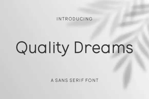
Plain rounded neutral sans
Quality Dreams is a plain rounded sans in charcoal on a pale ground with a soft leaf shadow: mixed case with a short diagonal Q tail, an open e, even strokes and rounded terminals, set as one line with a small tracked line above and a plain line beneath.
Ideas for this font
Same independent foundry
Allow optional Google Analytics to measure visits and catalogue actions. Your search words and notes are not included. Privacy & storage