High-Contrast Display Serif

Kortax + Worldstar
Pairs sculptural editorial warmth with Kortax's clean modern geometry.
Inspect Worldstar specimenDisclosure: MakerFileHub may earn a commission from qualifying purchases via paid links on this page. How our links work.
Dense block capitals with squared bowls and sharply cut diagonal joins
Kortax appears across a grid of red, cream and black poster examples, where thick compact capitals carry rounded-square counters, broad flat ends and sharp internal diagonal cuts, the O opens almost rectangular and the K and X add the strongest diagonal breaks.
Paid link
Get this fontProject & layout blueprintsAt-a-glance maker compatibility
Sturdy stroke walls and open counters weed cleanly on adhesive vinyl, HTV apparel film, and cut cardstock.
Visual anatomy & craft review
The blocks stay dense and compact, the counters square off, the ends flatten and the diagonals cut deep. That cut is the character: the face reads as a stencil without bridges, which is why the sample repeats it across a grid of poster sizes. The grid shows layouts rather than how the letters behave at small sizes, so test your own caption scale, keep 34 pt before the cuts merge and check the K and X in the words you actually need.
Dense block capitals with squared bowls and sharply cut diagonal joins
Two-font hierarchy recipes
Tested contrast partners — pairing Kortax with grounded secondary typography.
Kortax + Worldstar
Pairs sculptural editorial warmth with Kortax's clean modern geometry.
Inspect Worldstar specimen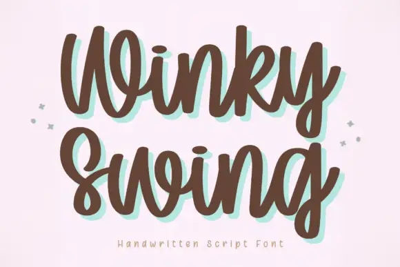
Kortax + Winky Swing
Introduces organic movement on pull-quotes, signatures and gift tags.
Inspect Winky Swing specimenPractical applications
Concrete hierarchy, scale and production guidance tailored to Kortax’s stroke geometry.
The dense blocks give a bag weight, and the squared bowls hold a two-word name at 22 pt on a 65 by 95 mm bag, where the diagonal cuts stay crisp on kraft.
Hierarchy & layout recipe
Print a 65 by 95 mm kraft bag label: set the roaster name at 22 pt on one row, keep 11 mm of clear ground beneath before the origin at 7 pt, and keep one flat ink so the cuts do not fill.
Pre-production check
Deep cuts printed at 14 pt read as damage; check the plate proof and hold the name at 20 pt or above.
The blocks set a modular poster, and the flat ends hold a two-word title at 56 pt inside a grid cell, where the squared counters keep the block dense.
Hierarchy & layout recipe
Print an A2 poster: set the title at 56 pt on one row inside the upper cell, keep 22 mm of clear ground beneath before the speaker line at 14 pt, and keep the grid rules thinner than the letters.
Pre-production check
Grid rules as heavy as the letters flatten the hierarchy; check the proof and thin the rules.
The squared caps read on a street sign, and the heavy forms hold a two-word name at 54 mm on a painted panel, where the K diagonal gives the row its movement.
Hierarchy & layout recipe
Paint a 600 by 300 mm panel: set the shop name at 54 mm on one row, keep 22 mm of clear ground beneath before the hours at 15 pt, and keep 24 mm of border so the flat ends stay whole.
Pre-production check
The diagonal cuts need a clean mask; check the artwork before the painter traces it freehand.
Technical & licence verification
Confirm included OTF/TTF/WOFF formats, full glyph tables and licence coverage on the live store page before batch production.
Closest visual alternatives
Matched across letterform anatomy, stroke behaviour and craft applications.
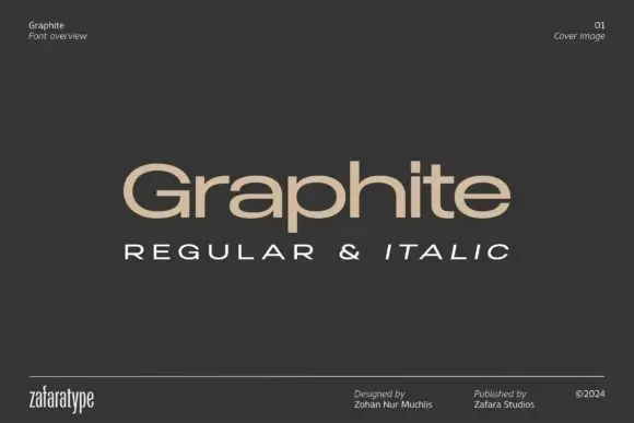
Low wide mixed case with flattened bowls and a long horizontal t bar
Graphite is a wide geometric sans with flattened bowls and a very long horizontal t bar, set here in warm beige on charcoal so the letterforms do the talking and the page stays quiet.
Ideas for this font
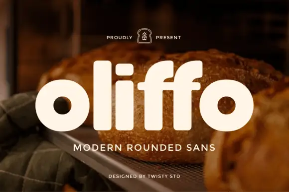
Modern rounded geometric sans
Oliffo is a modern rounded sans in cream over a photograph of bread: lowercase letterforms with almost circular bowls, a dot-less i, a shortened f, and soft terminals, so the word reads as a bakery brand mark rather than as a neutral text face.
Ideas for this font
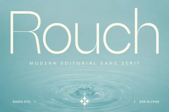
Light circular editorial sans
Rouch is a light circular sans in cream over a photograph of a water surface: mixed case with tall ascenders, near-circular bowls, an R with a fine bowl division and even hairline strokes, set as one word with a tracked line beneath and two credits at the foot.
Ideas for this font
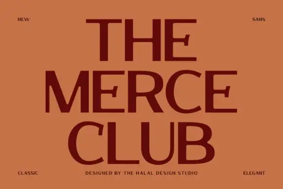
Broad contrast capitals
The Merce Club is a broad contrast sans in maroon on terracotta: wide capitals with heavy horizontal arms, thin uprights, flared arm ends and open curved bowls, set on three stacked lines with small tracked notes in the corners naming the style and the studio.
Ideas for this font
Same independent foundry
Allow optional Google Analytics to measure visits and catalogue actions. Your search words and notes are not included. Privacy & storage