Modern Grotesque Body

Sweet August + Bargain Condensed
Creates crisp high-hierarchy contrast beneath Sweet August headlines across menus, websites and labels.
Inspect Bargain Condensed specimenDisclosure: MakerFileHub may earn a commission from qualifying purchases via paid links on this page. How our links work.
Playful tall mixed-case slab
Sweet August is a playful tall mixed-case slab in cream on pink: narrow stems with soft baked slabs, high ascenders, round bowls and a slight bounce, set on two lines inside a soft cloud-shaped panel with two drawn hearts and a tracked line beneath that names the style and the cut files.
Paid link
Get this fontProject & layout blueprintsAt-a-glance maker compatibility
Sturdy stroke walls and open counters weed cleanly on adhesive vinyl, HTV apparel film, and cut cardstock.
Visual anatomy & craft review
The two words are stacked inside a cloud panel, which is the frame this kind of product is sold in, and the drawing is a playful slab: the stems are narrow, the slabs are rounded, and the letters bounce slightly off a common baseline, which keeps a tall face from looking formal. That bounce and the high ascenders set a size floor for small work, and the plate sets the words large enough that the slabs read as soft shapes. The two drawn hearts and the cloud panel are staging, and the tracked line beneath is the only plain text on the sheet. Because the strokes are moderate, the face works at label sizes as well as display, and the plate shows the cut-file formats at the foot, which is the practical information a crafter needs.
Slab, playful, mixed case, friendly
Two-font hierarchy recipes
Tested contrast partners — pairing Sweet August with grounded secondary typography.
Sweet August + Bargain Condensed
Creates crisp high-hierarchy contrast beneath Sweet August headlines across menus, websites and labels.
Inspect Bargain Condensed specimen
Sweet August + Esmeralda
Adds a warm human signature touch for 1-to-3-word callouts without competing against structured serif capitals.
Inspect Esmeralda specimenPractical applications
Concrete hierarchy, scale and production guidance tailored to Sweet August’s stroke geometry.
A playful slab sets a party card in a warm voice, and the moderate strokes survive a home inkjet printer at nine point without clogging.
Hierarchy & layout recipe
A6 card: the greeting at 26 pt, the details at 9 pt, and the date at 8 pt. Keep 14 mm margins and print two colours on a white card with a soft panel.
Pre-production check
Check the 26 pt greeting at home-print resolution, where a slab can fill; keep the counters above 0.6 mm. Confirm the 9 pt details keep a 4.5:1 contrast and that the card folds flat.
A playful slab reads as a small bakery, and the tall letters fit a long product name on a narrow label without wrapping.
Hierarchy & layout recipe
Print a 55 by 85 mm label: the shop at 14 pt, the product at 8 pt, and the weight at 6 pt. Keep 4 mm inside the die and print two colours on a cream stock.
Pre-production check
Check the 14 pt shop on a curved bag, where the outer letters distort; reduce the width. Confirm the 6 pt weight reads on the shelf and that the label peels cleanly.
A friendly slab turns a plain gift tag into something made, and the even weight holds on a small die where a script would break up.
Hierarchy & layout recipe
Print 45 by 70 mm tags: the name at 12 pt, the date at 7 pt, and two colours on a cream card. Keep 4 mm inside the die and punch a 3 mm hole clear of the letters.
Pre-production check
Check the 12 pt name on a 45 mm tag, where the tall ascenders can reach the hole; keep 6 mm clearance. Confirm the tags tie cleanly and that the ink holds on a textured card.
Technical & licence verification
Confirm included OTF/TTF/WOFF formats, full glyph tables and licence coverage on the live store page before batch production.
Closest visual alternatives
Matched across letterform anatomy, stroke behaviour and craft applications.
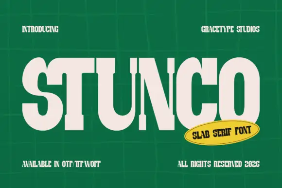
Compressed high contrast slab
Stunco is a compressed slab display in cream on a green tiled wall: very narrow capitals with heavy stems, high contrast, rounded outer curves and slab serifs, set as one large word with a credit above and three notes at the foot, beside a yellow oval naming the style.
Ideas for this font
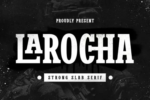
Tall contrast slab with extended foot
Larocha is a tall contrasting slab in white on a dark grainy ground: capitals with narrow oval bowls, heavy stems, thin horizontals and an extended foot on the L, set as one large word with a small tracked line above and a boxed line beneath that names the style.
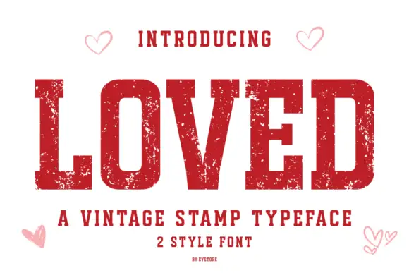
Vintage stamp slab
Loved is a vintage stamp slab in deep red on white: heavy caps with block serifs, a chipped, uneven outline that reads as a rubber stamp, and small open hearts in the corners, with a tracked line beneath naming the category and the two styles.
Ideas for this font
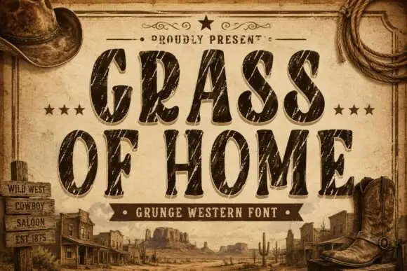
Condensed rounded Western capitals crossed by long diagonal scratches
Grass of Home is a condensed rounded slab in which tall oval bowls and soft curved ends give a Western tone, while long pale diagonal scratches and smaller chips cut through the thick strokes of a two-row title.
Ideas for this font
Same independent foundry
Allow optional Google Analytics to measure visits and catalogue actions. Your search words and notes are not included. Privacy & storage