Modern Grotesque Body

Larocha + Prime Nordic
Creates crisp high-hierarchy contrast beneath Larocha headlines across menus, websites and labels.
Inspect Prime Nordic specimenDisclosure: MakerFileHub may earn a commission from qualifying purchases via paid links on this page. How our links work.
Tall contrast slab with extended foot
Larocha is a tall contrasting slab in white on a dark grainy ground: capitals with narrow oval bowls, heavy stems, thin horizontals and an extended foot on the L, set as one large word with a small tracked line above and a boxed line beneath that names the style.
Paid link
Get this fontProject & layout blueprintsAt-a-glance maker compatibility
Open counter bridges hold interior islands intact on laser-cut wood, acrylic, and mylar stencils.
Visual anatomy & craft review
The word fills the plate and the drawing is a tall slab with strong contrast: the stems are heavy, the horizontals are thin, the bowls are narrow ovals, and the L extends its foot well past the stem, which gives the block a poster-like asymmetry. That construction sets a moderate size floor, because the thin horizontals close first, and the grainy dark ground is a useful test, because the white holds over the texture where a light face would break up. The tracked line above and the boxed line beneath are product copy that name the studio and the style. Because the letters are tall and contrasting, the face suits a poster, a sleeve and a shop sign rather than a paragraph.
Slab, tall, bold, dramatic
Two-font hierarchy recipes
Tested contrast partners — pairing Larocha with grounded secondary typography.
Larocha + Prime Nordic
Creates crisp high-hierarchy contrast beneath Larocha headlines across menus, websites and labels.
Inspect Prime Nordic specimen
Larocha + Hello Honey
Adds a warm human signature touch for 1-to-3-word callouts without competing against structured serif capitals.
Inspect Hello Honey specimenPractical applications
Concrete hierarchy, scale and production guidance tailored to Larocha’s stroke geometry.
A tall contrasting slab reads as a printed fight bill, and the extended L foot gives the block an asymmetry that carries a poster.
Hierarchy & layout recipe
A1 poster: the night at 220 mm cap height, the card in a 24 mm slab, and the venue at 12 mm. Keep 30 mm margins and print two colours on a light stock so the white stays clean.
Pre-production check
Check the A1 at five metres, where a thin horizontal can break up; keep it above 3 mm. Confirm the 12 mm venue reads at two metres and that the extended foot clears the margin.
A tall slab gives a sleeve a title with weight, and the contrast holds against a grainy image where a monoline face would disappear.
Hierarchy & layout recipe
Set the title at 100 mm cap height across 170 mm, the artist in a 10 pt sans, and the catalogue number at 7 pt. Print one ink on a coated stock and keep 20 mm margins at the head.
Pre-production check
Check the title at 100 mm, where a thin horizontal can fill on coated stock; proof it. Confirm the 7 pt catalogue number survives lamination and that the title clears the trim.
A tall slab reads as a painted sign, and the heavy stems hold under a light box where the thin horizontals stay quiet. It reads at night.
Hierarchy & layout recipe
Fabricate a 1,000 by 340 mm sign: the bar at 120 mm cap height, the hours in a 22 mm slab, and a 4 mm rule. Keep 22 mm margins and specify an even backlight behind the panel.
Pre-production check
Check the sign at 120 mm, where a thin horizontal can fill with light; keep it above 5 mm. Confirm the 22 mm hours read at three metres and that the rule clears the fixings.
Technical & licence verification
Confirm included OTF/TTF/WOFF formats, full glyph tables and licence coverage on the live store page before batch production.
Closest visual alternatives
Matched across letterform anatomy, stroke behaviour and craft applications.
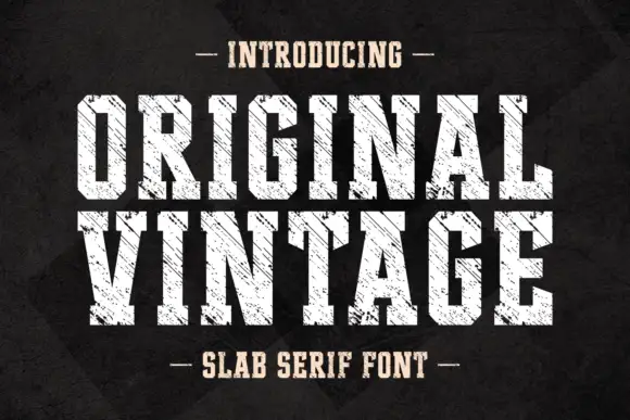
Tall angular slabs covered by diagonal scratches
Original Vintage uses tall white slab capitals with clipped corners and dense diagonal cuts. The scratch direction crosses both rows with a consistent angle, producing a striated surface rather than scattered chip damage, while the black charcoal background stays separate from the letter texture.
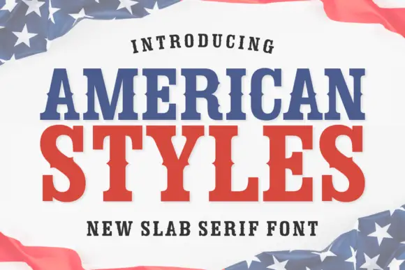
Bold slab serif with bracketed slabs and a wide even colour
American Styles is a bold slab serif in which the slabs bracket into the stems, the weight stays even and the fit runs wide, so a two-word title reads as a printed pennant rather than as a headline.
Ideas for this font
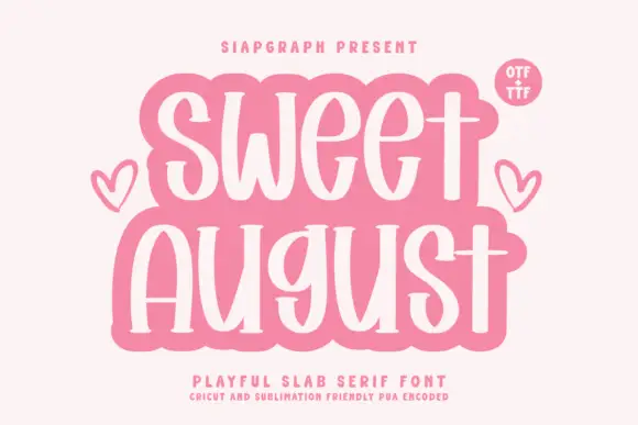
Playful tall mixed-case slab
Sweet August is a playful tall mixed-case slab in cream on pink: narrow stems with soft baked slabs, high ascenders, round bowls and a slight bounce, set on two lines inside a soft cloud-shaped panel with two drawn hearts and a tracked line beneath that names the style and the cut files.
Ideas for this font
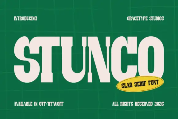
Compressed high contrast slab
Stunco is a compressed slab display in cream on a green tiled wall: very narrow capitals with heavy stems, high contrast, rounded outer curves and slab serifs, set as one large word with a credit above and three notes at the foot, beside a yellow oval naming the style.
Ideas for this font
Same independent foundry
Allow optional Google Analytics to measure visits and catalogue actions. Your search words and notes are not included. Privacy & storage