Editorial Serif Anchor

The Louise + Evoire
Anchors The Louise's fluid strokes with crisp Roman proportions on wedding suites, headers and packaging.
Inspect Evoire specimenDisclosure: MakerFileHub may earn a commission from qualifying purchases via paid links on this page. How our links work.
Whimsical handwritten script
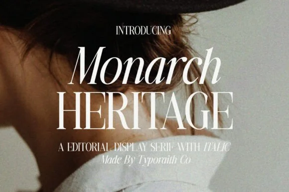
The Louise Script is a whimsical handwritten script in white over a grainy black-and-white photograph: a thin even stroke, uneven letter heights, loops that overshoot on the h and the s, and a spacing wide enough that the word reads as written by hand on a whim.
Paid link
Get this fontProject & layout blueprintsAt-a-glance maker compatibility
Weld or Unite overlapping script joins into one continuous vector path before sending to the blade.
Visual anatomy & craft review
The two lines are set at the centre and the drawing is deliberately irregular: the T opens with a wide flat arm, the h rises into a loop taller than the rest, and the s in the second word is drawn larger than its neighbours, so the line has a hand-made rhythm rather than a mechanical one. The stroke is monoline and thin, which keeps the face airy on a photograph, and the joins are short and sometimes visibly separate, which is what makes it read as quick handwriting. The words sit on a slight rise and the second line is inset from the first, so the lockup looks like two lines of a note rather than a designed block. The ground is a soft monochrome photograph with visible grain, and the two caption lines are set in the same script at a much smaller size, which is exactly how a photographer or a stationer would use it.
Whimsical, handwritten, airy, quirky
Two-font hierarchy recipes
Tested contrast partners — pairing The Louise with grounded secondary typography.
The Louise + Evoire
Anchors The Louise's fluid strokes with crisp Roman proportions on wedding suites, headers and packaging.
Inspect Evoire specimen
The Louise + Bareum
Keeps small-scale dates, URLs, nutrition facts and care instructions crisp and legible below script titles.
Inspect Bareum specimenPractical applications
Concrete hierarchy, scale and production guidance tailored to The Louise’s stroke geometry.
A thin whimsical script writes a name without the formality of calligraphy, which suits a wedding suite built on white space and a single photograph.
Hierarchy & layout recipe
A5 card: the names at 24 pt, the details in a 9 pt sans at 12 mm beneath, and 30 mm margins on all sides. Keep the script as the only decorative element and let the white space do the rest of the work.
Pre-production check
Check the names at 24 pt on the card stock, where a thin monoline stroke can break under too little ink; proof at the actual weight. Confirm the 9 pt details keep a 4.5:1 contrast and that the taller h loop clears the margin by 6 mm.
A handwritten script signs a portfolio page the way a photographer signs a print, and the thin stroke stays quiet over an image instead of competing with it.
Hierarchy & layout recipe
Place the mark at 20 pt in the lower right of a hero image, in white with a 30 percent scrim behind it, and set the studio line in a 7 pt sans caps beneath. Keep 20 px of clear space around the mark at every breakpoint.
Pre-production check
Check the mark over the brightest image in the portfolio, where white on a pale sky will disappear; the scrim must be dark enough to hold a 4.5:1 contrast. Confirm the mark stays legible at 320 px wide and that it does not sit over a face in any crop.
A handwritten note line makes an online order feel like a shop purchase, and a monoline script prints reliably on the small insert card a boutique packs.
Hierarchy & layout recipe
Print a 70 by 100 mm insert: the phrase at 20 pt at the top, three lines of 8.5 pt serif beneath, and the shop name in 7 pt caps at the foot. Keep 10 mm margins and print one ink on the same stock as the business card.
Pre-production check
Check the 20 pt phrase on uncoated stock, where a 0.2 pt stroke can break; thicken slightly for that paper. Confirm the 7 pt name stays legible and that the insert fits the envelope without folding across the script.
Technical & licence verification
Confirm included OTF/TTF/WOFF formats, full glyph tables and licence coverage on the live store page before batch production.
Closest visual alternatives
Matched across letterform anatomy, stroke behaviour and craft applications.
Monoline signature script
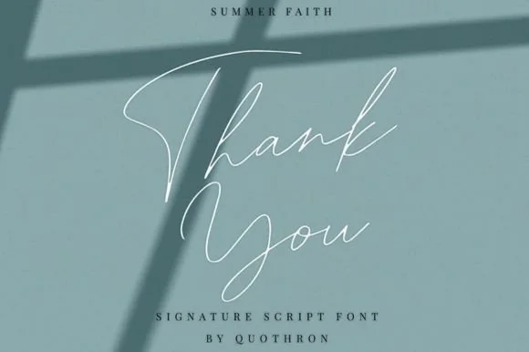
Summer Faith is a thin monoline signature script in white on a muted blue-green ground: a single stroke weight, long flowing crossbars, a looped S and a T whose arm crosses far past the letter, set under a shadow of window bars.
Ideas for this font
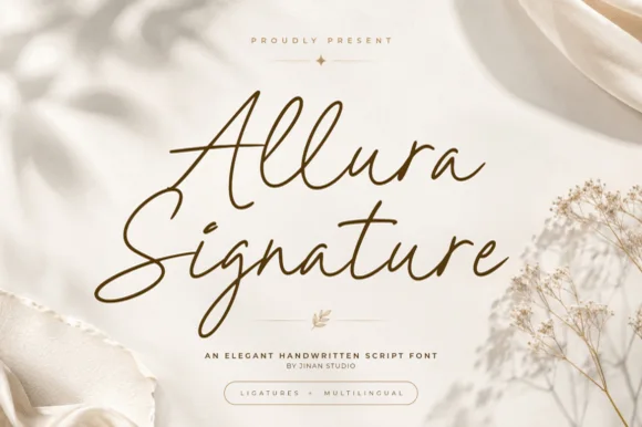
Tall-looped slanted fine-pen wedding signature script
Allura Signature is a slender, slanted handwritten signature script with tall twin-looped capitals/ascenders and fluid ligature flow.
Ideas for this font
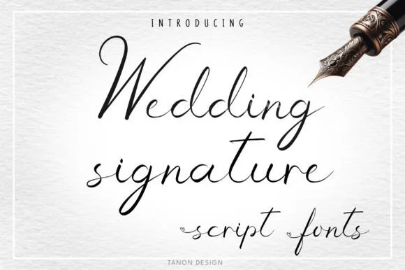
Airy fountain-pen wedding signature script
Wedding Signature is a light, airy fountain-pen cursive script with tall narrow loops and natural, unhurried handwritten spacing.
Ideas for this font
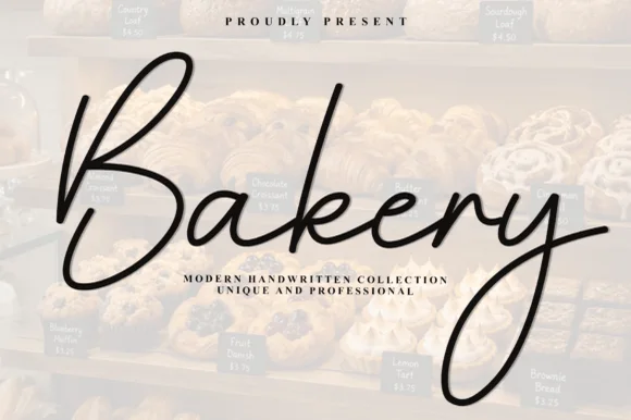
Airy elongated patisserie signature calligraphy script
Bakery (by Plafont store) is an airy, graceful fine-pen signature script sweeping tall 'B/k' loops and elongated 'y' descenders.
Ideas for this font
Same independent foundry
Allow optional Google Analytics to measure visits and catalogue actions. Your search words and notes are not included. Privacy & storage