Editorial Serif Anchor

Study Buddy + Stanza
Anchors Study Buddy's fluid strokes with crisp Roman proportions on wedding suites, headers and packaging.
Inspect Stanza specimenDisclosure: MakerFileHub may earn a commission from qualifying purchases via paid links on this page. How our links work.
Soft rounded handwriting
Study Buddy is a soft handwritten face in bright green over a pale sky: broad rounded letters with uneven shoulders, a large x-height and curling y descenders that loop below the baseline, set on two lines with a small script note above and a tracked label at the left.
Paid link
Get this fontProject & layout blueprintsAt-a-glance maker compatibility
Weld or Unite overlapping script joins into one continuous vector path before sending to the blade.
Visual anatomy & craft review
The two words are set on a diagonal rather than in a straight stack, which is the useful way to show a friendly face: the bounce is part of the drawing, and the eye can see that the pair is meant to feel casual rather than typeset. The letters have uneven shoulders, the bowls are broad and the y descends in a curl, so the face reads as a marker pen rather than a brush. The small script note above names the product and the tracked label at the left describes it, and the illustrated figures along the bottom are staging that sets the school context. Because the strokes are soft and thick, the face works at small sizes and on classroom material, and the pale ground keeps the green readable.
Handwritten, soft, friendly, playful
Two-font hierarchy recipes
Tested contrast partners — pairing Study Buddy with grounded secondary typography.
Study Buddy + Stanza
Anchors Study Buddy's fluid strokes with crisp Roman proportions on wedding suites, headers and packaging.
Inspect Stanza specimen
Study Buddy + One More
Keeps small-scale dates, URLs, nutrition facts and care instructions crisp and legible below script titles.
Inspect One More specimenPractical applications
Concrete hierarchy, scale and production guidance tailored to Study Buddy’s stroke geometry.
A soft handwriting face makes a worksheet look friendly, and the thick even stroke survives a school copier where a fine script would break.
Hierarchy & layout recipe
A4 worksheet: the heading at 26 pt, the tasks at 12 pt with 17 pt leading, and the name field at 10 pt. Keep 20 mm margins and print one colour on white.
Pre-production check
Check the 12 pt tasks on a copier, where a rounded stroke can thicken; keep the leading at 17 pt. Confirm the heading reads at two metres and that the fields line up across the page.
A rounded handwriting face reads as made for children, and the thick strokes stay open on a small label where a thin script would fill.
Hierarchy & layout recipe
Print a 60 by 45 mm label: the brand at 15 pt, the product at 8 pt, and the size at 6 pt. Keep 4 mm inside the die and print two colours on a white stock.
Pre-production check
Check the 15 pt brand on a curved bottle, where the outer letters distort; reduce the width. Confirm the 6 pt size reads on the shelf and that the label peels cleanly.
A soft face sets a party invitation in a friendly voice, and the thick strokes read at a glance on a card pinned to a fridge.
Hierarchy & layout recipe
A6 card: the greeting at 24 pt, the details at 9.5 pt, and the party address at 8 pt. Keep 14 mm margins, print two colours on a white card, and leave room for a hand-written name.
Pre-production check
Check the 24 pt greeting at home-print resolution, where a curl can fill; keep the descender above 0.8 mm. Confirm the 9.5 pt details keep a 4.5:1 contrast and that the card folds flat.
Technical & licence verification
Confirm included OTF/TTF/WOFF formats, full glyph tables and licence coverage on the live store page before batch production.
Closest visual alternatives
Matched across letterform anatomy, stroke behaviour and craft applications.
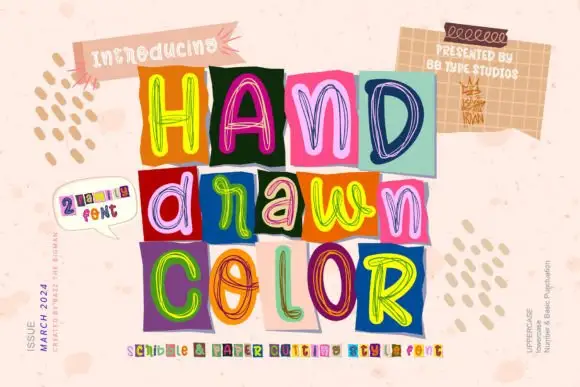
Loose multicolour scribble outlines on contrasting rectangular tiles
Hand Drawn Color builds each word out of separate squares of coloured paper, every tile carrying one letter drawn in loose multicolour scribble outlines, so a headline reads as a pile of marker sketches rather than one even typeface.
Ideas for this font
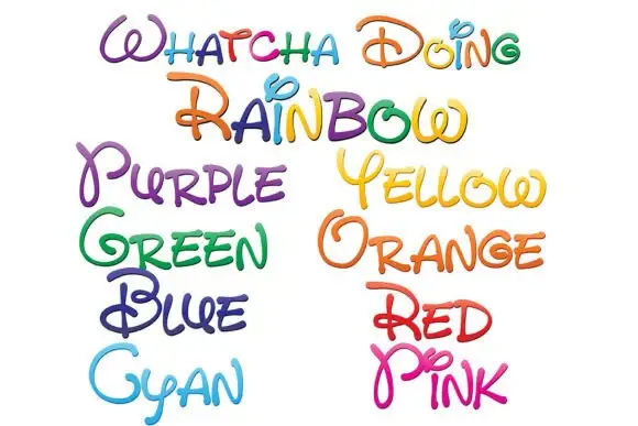
Loose rounded handwriting with loops and shaded rainbow colours
Whatcha Doing is a playful curled script in which each letter carries a decorative loop or tail, and the sample sets the set's name plus a colour word in each of eight colour variants.
Ideas for this font
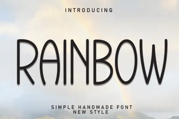
Tall handmade rounded caps
Rainbow is a tall handmade sans in black on a sky photograph: narrow capitals with rounded terminals, slightly uneven stems, a bowed W and an open R, so the word reads as lettering cut by hand rather than as a geometric grotesque.
Ideas for this font
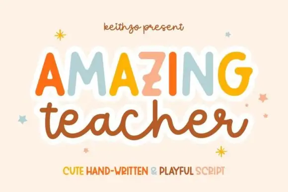
Mixed handwritten display
Amazing Teacher places broad separate capitals in mixed warm colours above a connected lowercase sample in brown, where the top line has blunt rounded ends and the lower t and h rise above the joined rhythm on a cream field with small star marks around the words.
Same independent foundry
Allow optional Google Analytics to measure visits and catalogue actions. Your search words and notes are not included. Privacy & storage