Editorial Serif Anchor

Amazing Teacher + Flowsky Editorial
Anchors Amazing Teacher's fluid strokes with crisp Roman proportions on wedding suites, headers and packaging.
Inspect Flowsky Editorial specimenDisclosure: MakerFileHub may earn a commission from qualifying purchases via paid links on this page. How our links work.
Mixed handwritten display
Amazing Teacher places broad separate capitals in mixed warm colours above a connected lowercase sample in brown, where the top line has blunt rounded ends and the lower t and h rise above the joined rhythm on a cream field with small star marks around the words.
Paid link
Get this fontProject & layout blueprintsAt-a-glance maker compatibility
Weld or Unite overlapping script joins into one continuous vector path before sending to the blade.
Visual anatomy & craft review
The caps stay broad and blunt, each letter takes its own colour, the lowercase joins continuously and two ascenders lift out of the joined line. That two-register block is the character: the sample reads as a teacher's handwritten poster, which is why the lower line stays one colour while the caps change. The stars and the pale outlines are cover treatment. Check whether the joined style is a second file, keep 30 pt for the lowercase so the joins stay open and set the caps in one colour if the print needs a single ink.
Chunky capitals paired with rounded joined lowercase
Two-font hierarchy recipes
Tested contrast partners — pairing Amazing Teacher with grounded secondary typography.
Amazing Teacher + Flowsky Editorial
Anchors Amazing Teacher's fluid strokes with crisp Roman proportions on wedding suites, headers and packaging.
Inspect Flowsky Editorial specimen
Amazing Teacher + Nyxar
Keeps small-scale dates, URLs, nutrition facts and care instructions crisp and legible below script titles.
Inspect Nyxar specimenPractical applications
Concrete hierarchy, scale and production guidance tailored to Amazing Teacher’s stroke geometry.
The paired handwriting suits a note from a class, and the joined lowercase carries the message in the same voice as the headline.
Hierarchy & layout recipe
Print a 105 by 148 mm card: set the greeting in the caps at 26 pt, place the message in the joined style at 14 pt beneath with 10 mm of clear ground, and keep 15 mm of margin at each side.
Pre-production check
The joined line needs open spacing; check the printed row and keep the message at 13 pt or above.
The broad caps read at a door and the blunt ends survive a simple one-colour print, which is what a classroom label needs.
Hierarchy & layout recipe
Print a 300 by 150 mm plate: set the room name in the caps at 44 pt, set the teacher line in the joined style at 16 pt beneath, keep 14 mm of clear ground between them, and keep 18 mm of margin for the fixings.
Pre-production check
The joined style thickens when printed on card stock; check a proof and keep 14 pt or above.
The warm paired handwriting gives a small gift a personal note, which is most of what a hand-lettered pair is bought for.
Hierarchy & layout recipe
Print a 45 by 70 mm tag: set the first word in the caps at 20 pt, set the second in the joined style at 11 pt beneath, keep 8 mm of clear ground, and keep 7 mm to the punch hole.
Pre-production check
Two colours per line need manual work; check the artwork time before promising a rainbow set.
Technical & licence verification
Confirm included OTF/TTF/WOFF formats, full glyph tables and licence coverage on the live store page before batch production.
Closest visual alternatives
Matched across letterform anatomy, stroke behaviour and craft applications.
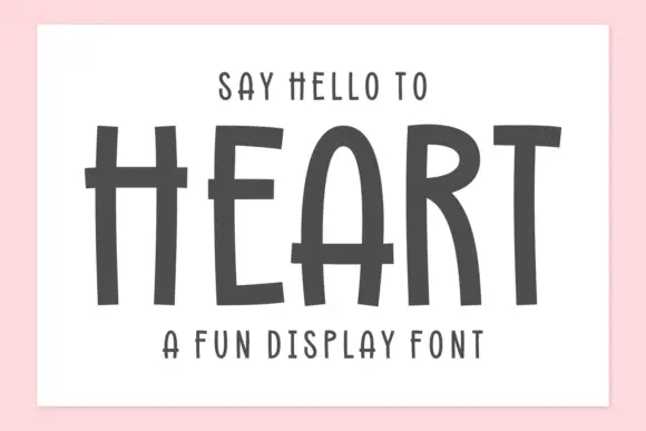
Tall hand-drawn capitals with rough edges and thin raised crossbars
Heart is a tall hand-drawn capital alphabet in which the strokes are narrow and rough-edged, the crossbars sit high and thin, and every letter leans a little, so a word reads as something brushed on a wall.
Ideas for this font
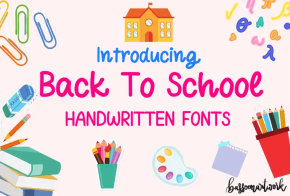
Rounded informal school handwriting with soft curved terminals
Back to School Handwritten is a rounded informal hand in which the letters stay unjoined, the terminals curve softly and the weight sits between a pen and a marker, so a note reads as written on lined paper rather than as a script.
Ideas for this font
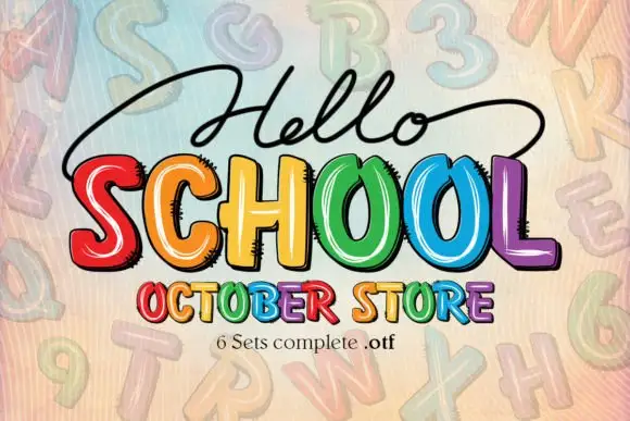
Bright irregular capitals with pale curved highlights and rough dark offsets
Hello School shows chunky irregular capitals in red, orange, yellow, green, blue and violet, where pale curved strokes sit inside the faces, dark rough-edged offsets create a drawn shadow and the large SCHOOL row has tall open counters with uneven widths.
Ideas for this font
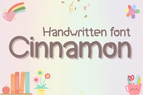
Rounded uneven mixed case with broad n arches and an inward-turning o stroke
Cinnamon shows grey-brown mixed case on a pale pastel field, where rounded substantial strokes form an open C and a tall narrow i, repeated n letters rise through broad uneven arches, the o turns inward at its upper stroke and the m spreads across two soft shoulders on a gently irregular baseline.
Ideas for this font
Same independent foundry
Allow optional Google Analytics to measure visits and catalogue actions. Your search words and notes are not included. Privacy & storage



