Editorial Serif Anchor

Hand Drawn Color + Rosemode
Anchors Hand Drawn Color's fluid strokes with crisp Roman proportions on wedding suites, headers and packaging.
Inspect Rosemode specimenDisclosure: MakerFileHub may earn a commission from qualifying purchases via paid links on this page. How our links work.
Loose multicolour scribble outlines on contrasting rectangular tiles
Hand Drawn Color builds each word out of separate squares of coloured paper, every tile carrying one letter drawn in loose multicolour scribble outlines, so a headline reads as a pile of marker sketches rather than one even typeface.
Paid link
Get this fontProject & layout blueprintsAt-a-glance maker compatibility
Weld or Unite overlapping script joins into one continuous vector path before sending to the blade.
Visual anatomy & craft review
The cover stacks the tiles on a cream speckled ground: orange, black, red, purple, teal and pink squares, some tilted a few degrees, each holding a letter traced two or three times in a second colour the way a marker repeats when the ink thins. Capitals and lowercase arrive as two different fonts in the pack, so a word can mix a tall H with a squat rounded a without breaking the style. The tagline sits underneath in tiny multicolour capitals and the corner notes list uppercase, lowercase, numbers and basic punctuation. Nothing about the letters is geometric, so the tile edge does the aligning work that a baseline would do in a normal face.
Loose multicolour scribble outlines on contrasting rectangular tiles
Two-font hierarchy recipes
Tested contrast partners — pairing Hand Drawn Color with grounded secondary typography.
Hand Drawn Color + Rosemode
Anchors Hand Drawn Color's fluid strokes with crisp Roman proportions on wedding suites, headers and packaging.
Inspect Rosemode specimen
Hand Drawn Color + Clyne Sans
Keeps small-scale dates, URLs, nutrition facts and care instructions crisp and legible below script titles.
Inspect Clyne Sans specimenPractical applications
Concrete hierarchy, scale and production guidance tailored to Hand Drawn Color’s stroke geometry.
The tiles make a worksheet heading look drawn by hand rather than typed by the teacher, and the two fonts let a short title mix capitals with rounded lowercase.
Hierarchy & layout recipe
Print an A4 worksheet: set the title at 44 pt on one row, keep 18 mm of clear ground beneath before the instructions at 12 pt, and keep 16 mm of margin so the tilted tiles stay inside the trim.
Pre-production check
Scribble outlines thin out below 24 pt; check the proof and keep the heading at 36 pt or above on paper.
The patchwork reads as party bunting before anyone hangs a flag, and the separate letter squares cut cleanly along straight edges for a banner.
Hierarchy & layout recipe
Print a 900 by 300 mm banner: set the name at 120 pt across one row, keep 30 mm of clear ground beneath before the age line at 24 pt, and keep 30 mm of border so each tile keeps its own edge.
Pre-production check
Tiles tilt in the sample; check the file before planning a rigid grid of letters on the banner.
The marker repeats give a crayon-and-paint brand a mark that matches what it sells, and the flat tiles keep a short name readable on a small carton.
Hierarchy & layout recipe
Print a 120 by 180 mm carton face: set the brand at 30 pt on one row, keep 14 mm of clear ground beneath before the count at 8 pt, and keep 10 mm to the fold so no tile crosses a crease.
Pre-production check
Each letter carries its own colour; check the separations before promising a spot-colour print of the pack.
Technical & licence verification
Confirm included OTF/TTF/WOFF formats, full glyph tables and licence coverage on the live store page before batch production.
Closest visual alternatives
Matched across letterform anatomy, stroke behaviour and craft applications.
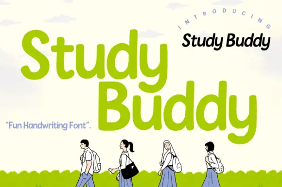
Soft rounded handwriting
Study Buddy is a soft handwritten face in bright green over a pale sky: broad rounded letters with uneven shoulders, a large x-height and curling y descenders that loop below the baseline, set on two lines with a small script note above and a tracked label at the left.
Ideas for this font
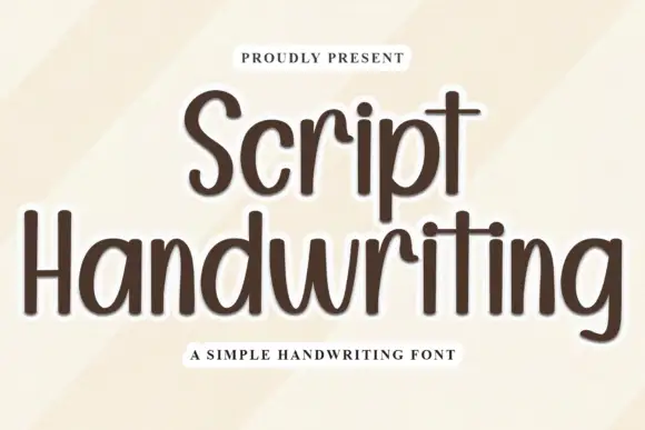
Tall rounded separate handwriting
Script Handwriting is a tall rounded handwriting in brown on cream: narrow letters with a high x-height, a light monoline stroke, fully rounded ends and short ascenders, set as an unjoined hand rather than a script.
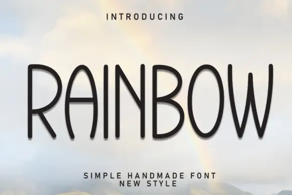
Tall handmade rounded caps
Rainbow is a tall handmade sans in black on a sky photograph: narrow capitals with rounded terminals, slightly uneven stems, a bowed W and an open R, so the word reads as lettering cut by hand rather than as a geometric grotesque.
Ideas for this font
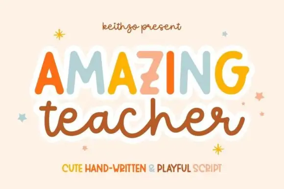
Mixed handwritten display
Amazing Teacher places broad separate capitals in mixed warm colours above a connected lowercase sample in brown, where the top line has blunt rounded ends and the lower t and h rise above the joined rhythm on a cream field with small star marks around the words.
Same independent foundry
Allow optional Google Analytics to measure visits and catalogue actions. Your search words and notes are not included. Privacy & storage