Modern Grotesque Body

Sport Distressed + Saltriver Grotesk
Creates crisp high-hierarchy contrast beneath Sport Distressed headlines across menus, websites and labels.
Inspect Saltriver Grotesk specimenDisclosure: MakerFileHub may earn a commission from qualifying purchases via paid links on this page. How our links work.
College slab block in layered grunge cuts
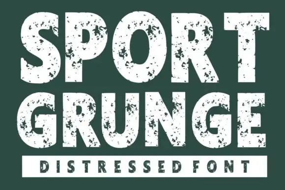
Sport Distressed is a college slab block shown in two treatments on one page: a tan filled cap with a thin keyline, and a white outline cap with a worn, speckled fill, both built on the same squared athletic skeleton.
Paid link
Get this fontProject & layout blueprintsAt-a-glance maker compatibility
Fine grain and micro-texture excel in 300 DPI print, sublimation, and screen print rather than small vinyl weeding.
Visual anatomy & craft review
The uppermost line is a heavy college block in tan with a narrow inner keyline that follows the letter shape at a constant offset, and the second line uses the same skeleton in outline, with the fills replaced by a stipple of missing bits that reads as a worn screen print rather than a filter. The letters are wide with flat shoulders, the S and the R have short angled spurs, and the O stays nearly square, which is the classic varsity construction. The supporting lines are tracked capitals in the same tan, one above and one below, and the ground is a flat dark brown, so both treatments read at their intended value. The pairing on one sheet is the useful information: the filled cut for the legible layer, the distressed cut for the texture layer, and the two printed together give depth without a third asset.
Athletic, grunge, layered, worn
Two-font hierarchy recipes
Tested contrast partners — pairing Sport Distressed with grounded secondary typography.
Sport Distressed + Saltriver Grotesk
Creates crisp high-hierarchy contrast beneath Sport Distressed headlines across menus, websites and labels.
Inspect Saltriver Grotesk specimen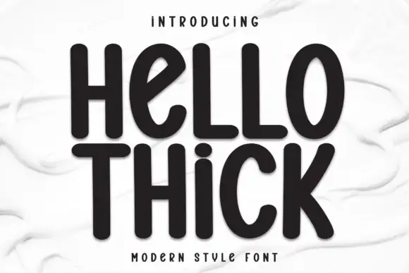
Sport Distressed + Hello Thick
Adds a warm human signature touch for 1-to-3-word callouts without competing against structured serif capitals.
Inspect Hello Thick specimenPractical applications
Concrete hierarchy, scale and production guidance tailored to Sport Distressed’s stroke geometry.
A college block reads as school sport at a glance, and a worn cut makes a vinyl banner look like a screen-printed pennant rather than a sign printed from a template.
Hierarchy & layout recipe
Print 1,200 by 600 mm: the word at 200 mm cap height in the distressed cut, one flat tan on dark brown, with the team line in the filled cut at 40 mm beneath and the fixture list at 20 mm. Keep the texture layer at least 300 mm from the banner's eyelets.
Pre-production check
Check the file at 25 percent on screen: the speckle must stay sparse enough that the counters of the O and the R do not break up, and the fill must not read as dirt at reading distance. Confirm the eyelets clear the type by 60 mm.
A worn athletic block gives a garment the look of an old team shirt without a photographic texture, and one flat ink keeps the print cost at a single screen.
Hierarchy & layout recipe
On a 300 mm chest print, set the word at 55 mm in the distressed cut, 8 mm tracked, with a small filled-cut line at 8 mm beneath and a 2 mm keyline around the whole lockup. Print in one water-based ink so the speckle shows as paper rather than as a print defect.
Pre-production check
Check the screen at actual mesh: the 2 mm keyline needs a higher mesh count than the speckle, so confirm the shop will burn them on two screens. Wash-test the result and confirm the worn areas do not grow to the point where the word stops reading.
A single bold word in a worn college block sets the theme before a guest reads the details, and the texture gives a home print the look of a bought banner.
Hierarchy & layout recipe
A2 print: the word at 160 mm cap height centred, the details in a plain sans at 14 mm beneath, and two thin rules framing the sheet at 20 mm from the trim. Keep the whole sign to a tan and a dark brown so the worn texture stays visible.
Pre-production check
Check the print at A2 on coated paper, where a home printer renders fine speckle as noise; if the texture muddies, use the filled cut instead. Confirm the 14 mm details stay readable from two metres and that the rules do not clash with the descender-free word.
Technical & licence verification
Confirm included OTF/TTF/WOFF formats, full glyph tables and licence coverage on the live store page before batch production.
Closest visual alternatives
Matched across letterform anatomy, stroke behaviour and craft applications.
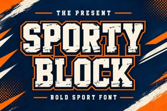
Heavy chamfered collegiate varsity block slab
Sporty Block is a classic heavy collegiate athletic slab serif built for 2- and 3-color layered jersey outlines, banners, and spirit wear.
Ideas for this font
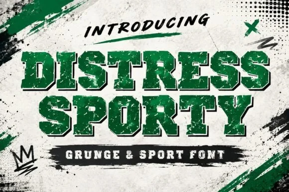
Heavy cracked-plastisol grunge varsity slab serif
Distress Sporty is a rugged collegiate varsity slab serif pre-weathered with cracked plastisol-ink splits and rough turf grit.
Ideas for this font
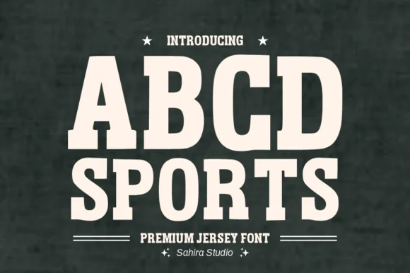
Softly rounded vintage collegiate fleece slab serif
Abcd Sports is a clean, softly rounded athletic slab serif channeling 1980s Russell/Champion reverse-weave sweatshirt lettering.
Ideas for this font
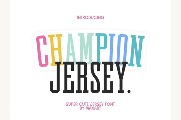
Tall extra-condensed athletic & pastel varsity slab serif
Champion Jersey is a tall, slim extra-condensed varsity slab serif packing long team names, Taylor-era tour titles, and slogans into narrow spaces.
Ideas for this font
Same independent foundry
Allow optional Google Analytics to measure visits and catalogue actions. Your search words and notes are not included. Privacy & storage