Neutral Sans Workhorse

Spooky Season + Headline
Lets Spooky Season own the focal silhouette while handling secondary copy, sizing and subheads cleanly.
Inspect Headline specimenDisclosure: MakerFileHub may earn a commission from qualifying purchases via paid links on this page. How our links work.
Retro Halloween display with drips
Spooky Season 2 is a retro Halloween display in mustard, brown and cream: bulbous rounded letters with dripping bottoms, a black outline that follows every drip, and letterforms set at uneven heights so the pair of words reads as a hand-painted seasonal sign.
Paid link
Get this fontProject & layout blueprintsAt-a-glance maker compatibility
Sturdy stroke walls and open counters weed cleanly on adhesive vinyl, HTV apparel film, and cut cardstock.
Visual anatomy & craft review
Both words are built from fat, soft shapes with stems that bulge in the middle and drip at the base, and each letter takes a different colour from a three-tone mustard palette, which is what gives the word its 1970s seasonal feel without a single illustration inside the letterforms. The outline is consistent in width and wraps every drip, so the letters read as stickers on the cream ground, and the counters are wide enough that the word stays legible at poster size. The heights vary slightly from letter to letter, and the drips pull the eye down the page, which is why the pair works as a stacked block rather than as a single line. The ground is plain cream with a web, a spider and two bats at the edges, and the caption is set in a soft serif, so the decoration is all outside the type.
Retro, playful, drippy, seasonal
Two-font hierarchy recipes
Tested contrast partners — pairing Spooky Season with grounded secondary typography.
Spooky Season + Headline
Lets Spooky Season own the focal silhouette while handling secondary copy, sizing and subheads cleanly.
Inspect Headline specimen
Spooky Season + Majestic Letters
Grounds bold display lettering with classic typographic authority on posters, badges and apparel.
Inspect Majestic Letters specimenPractical applications
Concrete hierarchy, scale and production guidance tailored to Spooky Season’s stroke geometry.
A retro drippy display sets a friendly Halloween tone that suits families, and the three-tone palette keeps a poster looking designed rather than costume-shop.
Hierarchy & layout recipe
A2 portrait: the two words at 110 mm cap height, the details in an 18 mm serif, and the web illustration in the upper left. Keep 25 mm margins so the drips have clear ground beneath them, and print three flat inks on cream.
Pre-production check
Check the drips at full size, where the outline can pinch at the narrowest point and break on a large print; thicken the outline for the format. Confirm the 18 mm details read at three metres and that no drip runs into the web illustration.
A retro Halloween face makes an October birthday card feel seasonal without the horror register of a blackletter, which matters when the recipient is a child.
Hierarchy & layout recipe
A6 card: the word at 34 pt, the name and age in a 9 pt serif beneath, and two small bats at the corners. Keep the palette to three warm tones on cream and leave 12 mm margins so the drips never reach the trim.
Pre-production check
Check the drips at 34 pt, where the outline can close the gap between two letters; separate the drips slightly for the card. Confirm the 9 pt name reads at arm's length and that the bats do not overlap the letterforms.
A retro seasonal face turns a limited candle run into a collectable, and the flat three-colour print keeps the label affordable on a short batch.
Hierarchy & layout recipe
Print a 60 mm round label: the word at 14 pt, the scent in a 7 pt serif caps, and the weight in 6 pt. Keep 4 mm of clear label inside the die so the drips are never cut, and keep the palette to three flat inks.
Pre-production check
Check the label at 14 pt on the jar's curve, where the drips can merge with the line below; raise the type size for the label. Confirm the 6 pt weight reads on the curved glass and that the outline holds on uncoated stock.
Technical & licence verification
Confirm included OTF/TTF/WOFF formats, full glyph tables and licence coverage on the live store page before batch production.
Closest visual alternatives
Matched across letterform anatomy, stroke behaviour and craft applications.
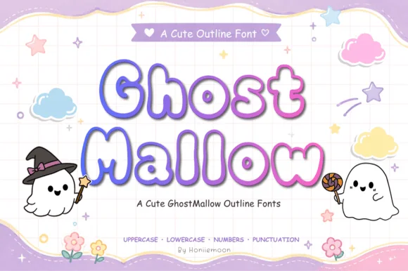
Puffy pastel marshmallow-ghost Halloween outline font (Full charset)
Ghost Mallow is a squishy, pastel-cute Halloween outline font with wavy ghost-hem bottoms across uppercase, lowercase, numbers & punctuation!
Ideas for this font
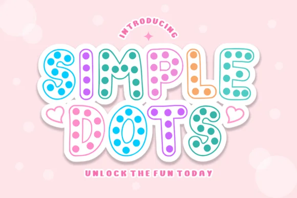
Hollow-outline polka-dot cartoon bubble display
Simple Dots fills crisp double-outlined cartoon bubble letters with cheerful polka-dot confetti for sweet stationery and party prints!
Ideas for this font
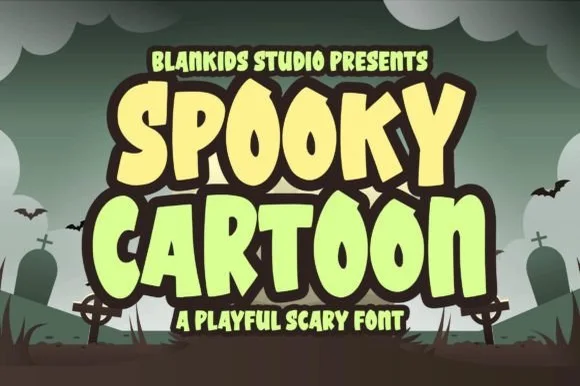
Playful cartoon display with rounded terminals
Spooky Cartoon is a playful display in cream and pale green on a cartoon graveyard: fat bouncy letters with fully rounded terminals, a heavy dark outline and a tilt, stacked as two lines with a small line beneath.
Ideas for this font
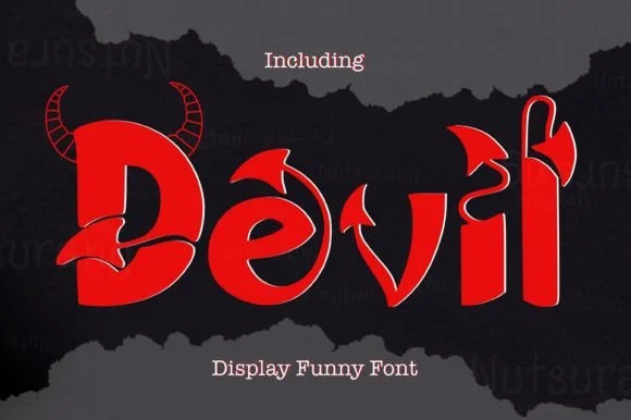
Horned & pitchfork-tailed cartoon devil display font
Devil is a bold, theatrical cartoon-horror display font sprouting curved devil horns and pointed pitchfork/arrow tails from chunky letters.
Ideas for this font
Same independent foundry
Allow optional Google Analytics to measure visits and catalogue actions. Your search words and notes are not included. Privacy & storage