Neutral Sans Workhorse

Space Invasion + Homies
Lets Space Invasion own the focal silhouette while handling secondary copy, sizing and subheads cleanly.
Inspect Homies specimenDisclosure: MakerFileHub may earn a commission from qualifying purchases via paid links on this page. How our links work.
Blocky pixel game display
Space Invasion is a blocky pixel display in brown on a peach pixel scene: letters built from square modules, stepped diagonals, uniform stroke width and tight spacing, with a caption beneath in a lighter pixel face, so the plate reads as a title screen from a sixteen-bit game.
Paid link
Get this fontProject & layout blueprintsAt-a-glance maker compatibility
Sturdy stroke walls and open counters weed cleanly on adhesive vinyl, HTV apparel film, and cut cardstock.
Visual anatomy & craft review
Two words are stacked and the drawing is a coarse grid: every stroke is two modules wide, the diagonals step in single blocks, and the counters are one or two modules across, which is what keeps the word readable at arcade distance. Spacing is tight enough that the words read as one block, and the brown ink on a peach ground gives enough contrast without a glow or an outline. The specimen builds a scene around the type with pixel trees, a sword, a hammer and a speech bubble, which shows the face in its intended context rather than on a plain plate. Because the module is large, the face needs a display size, and the caption beneath drops to a lighter weight of the same pixel family so the hierarchy stays inside the pixel language.
Pixel, blocky, retro, playful
Two-font hierarchy recipes
Tested contrast partners — pairing Space Invasion with grounded secondary typography.
Space Invasion + Homies
Lets Space Invasion own the focal silhouette while handling secondary copy, sizing and subheads cleanly.
Inspect Homies specimen
Space Invasion + Rosemode
Grounds bold display lettering with classic typographic authority on posters, badges and apparel.
Inspect Rosemode specimenPractical applications
Concrete hierarchy, scale and production guidance tailored to Space Invasion’s stroke geometry.
A pixel face names the theme in one line and the coarse module prints cleanly at card size, where a fine bitmap would smear on a home printer.
Hierarchy & layout recipe
A6 card: the phrase at 32 pt, the details in a 9 pt pixel or geometric sans, and a 4 mm border. Keep 12 mm margins and print on a white card so the stepped diagonals stay sharp at small size.
Pre-production check
Check the 32 pt phrase on a home printer, where a stepped diagonal can break into dots; keep the module at a whole pixel in the export. Confirm the 9 pt details keep a 4.5:1 contrast and that the phrase reads at half size.
A pixel face signals technology without a cliché, and the block construction reads across a hall where a fine display would disappear into the wall.
Hierarchy & layout recipe
Print 1,000 by 500 mm: the club name at 150 mm cap height, the times in a 30 mm geometric sans, and a 6 mm border. Keep the module large enough that the steps stay sharp at the printer's resolution.
Pre-production check
Check the banner at six metres, where an uneven module reads as a rendering fault; keep the grid consistent. Confirm the 30 mm times read at four metres and that the border does not cut the diagonal of the A.
A pixel mark gives a game shop a digital identity that reads on a small sticker, and the flat colour keeps a short run cheap to print.
Hierarchy & layout recipe
Die-cut a 55 mm sticker: the brand at 16 pt, the tagline in a 6 pt sans, and 2 mm clear to the die. Keep the module at least 2 mm so the blocks survive cutting and print one colour on a light stock.
Pre-production check
Check the 55 mm sticker, where a one-module counter can close; increase the module for that size. Confirm the tagline reads at arm's length and that the sticker sits flat on a curved counter surface.
Technical & licence verification
Confirm included OTF/TTF/WOFF formats, full glyph tables and licence coverage on the live store page before batch production.
Closest visual alternatives
Matched across letterform anatomy, stroke behaviour and craft applications.
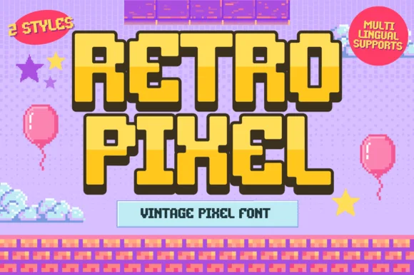
2-style 16-bit platformer video-game pixel font (Multilingual)
Retro Pixel is a cheerful 2-style retro platformer pixel font with multilingual character support and chunky 16-bit adventure charm.
Ideas for this font
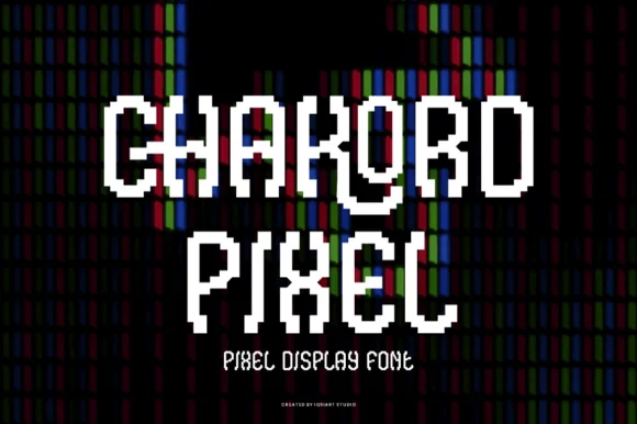
Stair-stepped 8-bit arcade pixel display
Chakord Pixel builds chunky 8-bit arcade capitals from crisp square pixel blocks with playful notched corners and ligature-like joins.
Ideas for this font
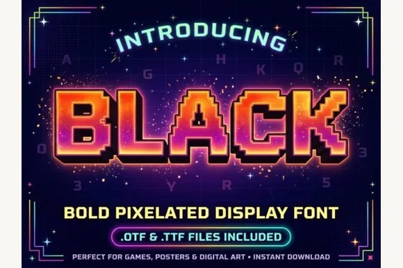
Heavy 16-bit arcade boss-screen pixelated block font (OTF & TTF)
Black (by Bluebird) is a chunky, heavy-weight pixelated arcade display font built from bold stepped 8-bit/16-bit square blocks (OTF & TTF).
Ideas for this font
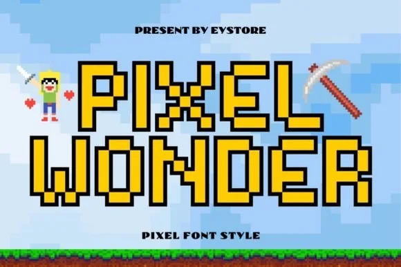
Outlined 8-bit sandbox & retro-arcade pixel block font
Pixel Wonder is an authentic, grid-locked 8-bit pixel block font framed by crisp stepped black pixel outlines for instant sandbox-game nostalgia.
Ideas for this font
Same independent foundry
Allow optional Google Analytics to measure visits and catalogue actions. Your search words and notes are not included. Privacy & storage