Modern Grotesque Body

Ironcrest + Lemon Milk Pro FTR
Creates crisp high-hierarchy contrast beneath Ironcrest headlines across menus, websites and labels.
Inspect Lemon Milk Pro FTR specimenDisclosure: MakerFileHub may earn a commission from qualifying purchases via paid links on this page. How our links work.
Heavy rounded mixed-case slabs with coarse worn fill and a pierced capital
Ironcrest shows cream mixed-case lettering against dark green-black, where the lowercase bowls stay thick and rounded, the r carries a curled shoulder, the t rises into a blunt wide crossbar and the capital I holds a small dark hole near its upper section while fine mottling roughens the fill.
Paid link
Get this fontProject & layout blueprintsAt-a-glance maker compatibility
Sturdy stroke walls and open counters weed cleanly on adhesive vinyl, HTV apparel film, and cut cardstock.
Visual anatomy & craft review
The slabs stay blunt and heavy, the bowls stay round, the terminals square off and a single capital carries a pierced hole. That punctuation is the character: the word reads as a riveted industrial plate rather than a plain slab, which is why the plaque frame and the nut motif sit around it. Those are cover graphics, and the mottling is a texture inside the fill. Keep 44 pt so the pierce stays visible, check the texture in your own file and do not rely on the frame.
Heavy rounded mixed-case slabs with coarse worn fill and a pierced capital
Two-font hierarchy recipes
Tested contrast partners — pairing Ironcrest with grounded secondary typography.
Ironcrest + Lemon Milk Pro FTR
Creates crisp high-hierarchy contrast beneath Ironcrest headlines across menus, websites and labels.
Inspect Lemon Milk Pro FTR specimen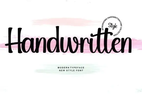
Ironcrest + Handwritten
Adds a warm human signature touch for 1-to-3-word callouts without competing against structured serif capitals.
Inspect Handwritten specimenPractical applications
Concrete hierarchy, scale and production guidance tailored to Ironcrest’s stroke geometry.
The industrial slab gives a metal workshop a hard mark, and the pierced capital gives a short name a recognisable detail.
Hierarchy & layout recipe
Print a 60 by 90 mm label: set the workshop name at 24 pt on one row, keep 10 mm of clear ground beneath before the street at 7 pt, and keep 6 mm to the die edge.
Pre-production check
The pierced hole closes under 20 pt; check the plate proof and hold the name at 22 pt or above.
The plate weight reads across a maker's hall, and the mottled fill gives the painted sign a used industrial character that a clean slab would lose.
Hierarchy & layout recipe
Print a 600 by 300 mm board: set the stall name at 56 mm on one row, keep 24 mm of clear ground beneath before the prices at 15 pt, and keep 26 mm of border all round.
Pre-production check
The mottling may be a texture layer; check the file before planning a flat one-colour print.
The blunt slabs set a manufacturing trade heading, and the rounded bowls keep a long company name readable on a pale page.
Hierarchy & layout recipe
Print a 210 by 280 mm page: set the heading at 52 pt on one row, keep 20 mm of clear ground beneath before the standfirst at 10 pt, and keep 20 mm of margin at each side.
Pre-production check
Texture inside the letters fights small text; check the page and keep the heading large throughout.
Technical & licence verification
Confirm included OTF/TTF/WOFF formats, full glyph tables and licence coverage on the live store page before batch production.
Closest visual alternatives
Matched across letterform anatomy, stroke behaviour and craft applications.
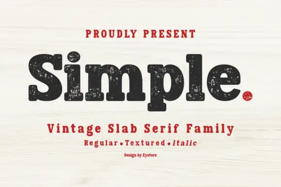
Worn soft slab family
Simple is a soft heavy slab in black on pale wood: mixed case with rounded slab endings, a large x-height and worn ink patches through the fill, with a tracked line above, a second line beneath naming the three cuts in red and a small credit at the foot.
Ideas for this font
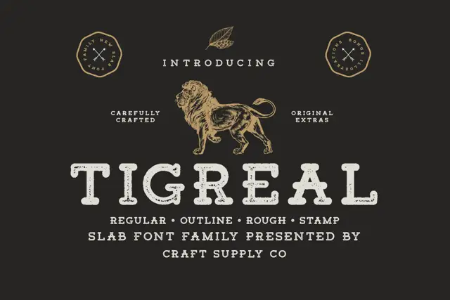
Worn letterpress slab family
Tigreal Family is a letterpress slab in cream on a dark ground: wide rounded slabs with a dotted worn fill and open bowls, shown as one word with an engraved lion above, two badge seals at the sides and a line beneath listing the four cuts.
Ideas for this font
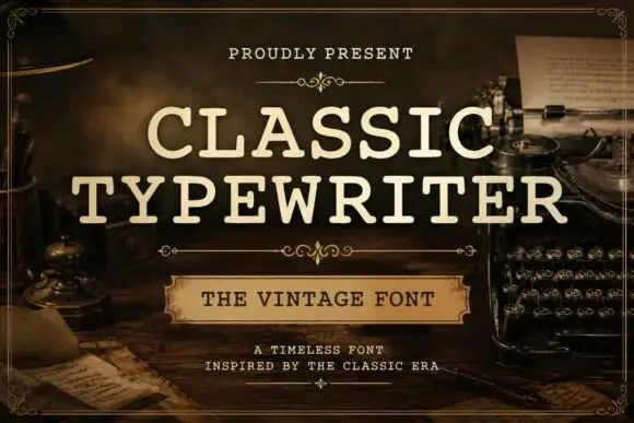
Even typed-looking capitals with rounded slab ends and open bowls
Classic Typewriter shows cream uppercase lettering in two lines over a dark writing-desk scene: the strokes stay comparatively even, the slab ends round off and the open C and P bowls leave generous white space inside the letters.
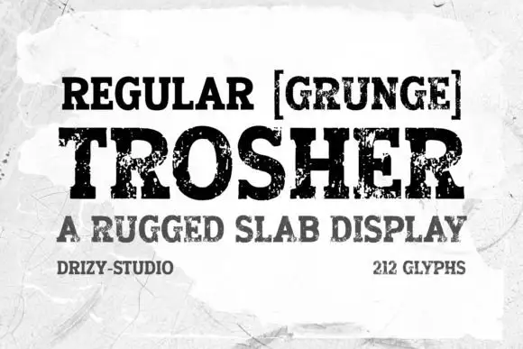
Rugged eroded slab display
Trosher is a rugged slab display in black on a mottled white ground: broad bracketed slabs with clean and heavily eroded fills, mixed case with tall ascenders and a full-width setting, with a bracketed note above, a plain line beneath and two small notes at the foot.
Ideas for this font
Same independent foundry
Allow optional Google Analytics to measure visits and catalogue actions. Your search words and notes are not included. Privacy & storage



