Modern Grotesque Body

Rough Stamp + Sailors
Creates crisp high-hierarchy contrast beneath Rough Stamp headlines across menus, websites and labels.
Inspect Sailors specimenDisclosure: MakerFileHub may earn a commission from qualifying purchases via paid links on this page. How our links work.
Distressed rounded slab
Rough Stamp is a rounded heavy slab in black on a mottled grey ground: fat stems with round slab serifs, a curled R leg and fine speckled wear across every stroke, set on two lines with tracked caps above and a subtitle beneath.
Paid link
Get this fontProject & layout blueprintsAt-a-glance maker compatibility
Fine grain and micro-texture excel in 300 DPI print, sublimation, and screen print rather than small vinyl weeding.
Visual anatomy & craft review
The two words are stacked and the drawing is a rounded slab at a heavy weight: the serifs are round rather than square, the R leg curls, and the wear is made of fine speckles rather than large chips, which keeps the letters legible while reading as a rubber stamp. That construction is why the face works at small sizes as well as large, and the plate sets it at a size where the speckles are visible as texture rather than as damage. The mottled ground is a texture test, and the black holds because the wear is even. The tracked caps above and the subtitle beneath are set in a plain serif, which keeps the slab as the only worn element on the sheet.
Slab, distressed, vintage, warm
Two-font hierarchy recipes
Tested contrast partners — pairing Rough Stamp with grounded secondary typography.
Rough Stamp + Sailors
Creates crisp high-hierarchy contrast beneath Rough Stamp headlines across menus, websites and labels.
Inspect Sailors specimen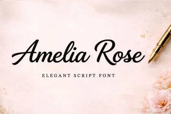
Rough Stamp + Amelia Rose
Adds a warm human signature touch for 1-to-3-word callouts without competing against structured serif capitals.
Inspect Amelia Rose specimenPractical applications
Concrete hierarchy, scale and production guidance tailored to Rough Stamp’s stroke geometry.
A worn slab reads as a stamped paper label, and the fine speckles mimic the fibre of uncoated stock instead of fighting it.
Hierarchy & layout recipe
Print a 60 by 85 mm label: the roastery at 14 pt, the origin at 8 pt, and the roast at 6 pt. Keep 4 mm inside the die and print one ink on a kraft stock.
Pre-production check
Check the 14 pt name on kraft, where the speckles can fill; keep the size above 12 pt. Confirm the 6 pt roast reads at arm's length and that the label survives a damp wipe.
A worn slab reads as a rubber stamp, which is exactly the tool a handmade parcel implies, and the round serifs stay open at small size.
Hierarchy & layout recipe
Print a 40 mm stamp: the name at 9 pt, a 2 mm border, and one ink on a kraft sticker. Keep 5 mm inside the die, keep the speckles above 0.2 mm and allow a 3 mm quiet ring around the border.
Pre-production check
Check the 9 pt stamp at 40 mm, where the wear can close the counters; use a lighter setting. Confirm the name reads at arm's length and that the stamp sits flat on a parcel.
A worn slab gives a craft book a printed cover, and the round serifs keep the title friendly at thumbnail size where a sharp slab would look hard.
Hierarchy & layout recipe
Set the title at 80 mm cap height across 195 mm, the subtitle in a 12 pt serif, and the author at 9 pt. Print one ink on a textured stock and keep the title in the upper half.
Pre-production check
Check the title at thumbnail size, where the wear can clot the word; keep the speckles fine. Confirm the 9 pt author survives lamination and that the title clears the trim.
Technical & licence verification
Confirm included OTF/TTF/WOFF formats, full glyph tables and licence coverage on the live store page before batch production.
Closest visual alternatives
Matched across letterform anatomy, stroke behaviour and craft applications.
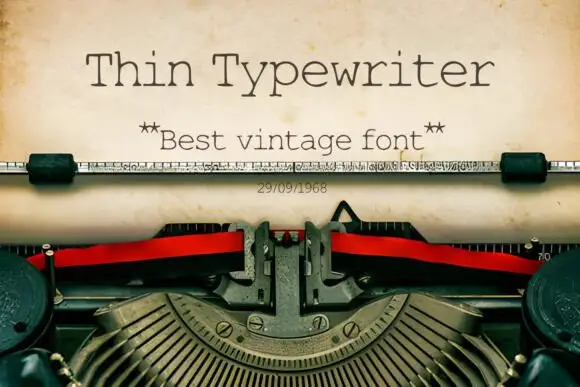
Thin typewriter monospace
Thin Typewriter is a thin monospaced slab in dark ink on aged paper, set inside a typewriter: light uniform strokes, slab serifs on every stem, a tall x-height and wide letterspacing that comes from the fixed advance, with a star-flanked subtitle and a dated line beneath.
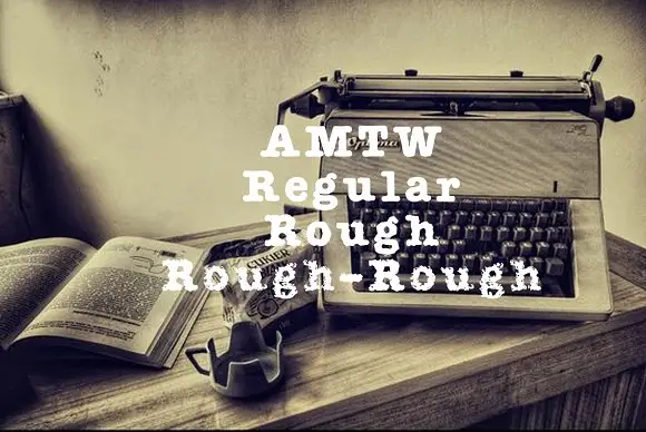
Heavy typed-looking forms shown in clean and increasingly broken treatments
AMTW is a heavy typewriter-style slab in which rounded feet and broad bowls appear in three treatments: a fairly clean regular row, a broken rough row and a much more eroded third row beneath the main initials.
Ideas for this font
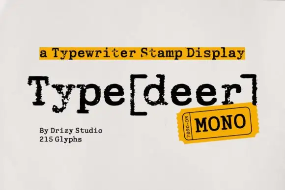
Typewriter stamp display
Typedeer Mono is a typewriter-stamp display in black on white: rough typed mixed case with square feet, uneven ink and bracket punctuation, set as one word with a yellow label above, a stamp at the lower right and two plain notes at the foot.
Ideas for this font
Worn soft slab family
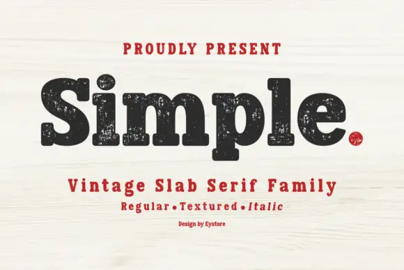
Simple is a soft heavy slab in black on pale wood: mixed case with rounded slab endings, a large x-height and worn ink patches through the fill, with a tracked line above, a second line beneath naming the three cuts in red and a small credit at the foot.
Ideas for this font
Same independent foundry
Allow optional Google Analytics to measure visits and catalogue actions. Your search words and notes are not included. Privacy & storage