Neutral Sans Workhorse

Cindigo Trades + Taught
Lets Cindigo Trades own the focal silhouette while handling secondary copy, sizing and subheads cleanly.
Inspect Taught specimenDisclosure: MakerFileHub may earn a commission from qualifying purchases via paid links on this page. How our links work.
Ragged slanted brush lettering with dry edges and uneven pressure
Cindigo Trades is expressive brush lettering that leans hard to the right, its strokes ragged at the edges and uneven in pressure, so the words look sprayed or painted rather than drawn.
Paid link
Get this fontProject & layout blueprintsAt-a-glance maker compatibility
Sturdy stroke walls and open counters weed cleanly on adhesive vinyl, HTV apparel film, and cut cardstock.
Visual anatomy & craft review
The capital C begins with a thin dry entry that widens into a heavy crescent, and the letters after it keep the same forward lean without straightening: the N, D, I, G and O each lift off at the top and land heavy at the base, so the word appears to be moving. Edges are irregular throughout, some strokes splitting into two lines where the brush ran dry, and the joins break rather than connect, which is what gives the phrase its shout. The second line repeats the construction at the same angle, and the diagonal of the first line's last letter carries the eye into the second. Weight varies constantly, from thin at the tops to heavy in the bodies. The monochrome photograph, the acid green ink and the tracked caption are presentation; the lettering is the two words.
Ragged · Slanted · Expressive
Two-font hierarchy recipes
Tested contrast partners — pairing Cindigo Trades with grounded secondary typography.
Cindigo Trades + Taught
Lets Cindigo Trades own the focal silhouette while handling secondary copy, sizing and subheads cleanly.
Inspect Taught specimen
Cindigo Trades + Auretha
Grounds bold display lettering with classic typographic authority on posters, badges and apparel.
Inspect Auretha specimenPractical applications
Concrete hierarchy, scale and production guidance tailored to Cindigo Trades’s stroke geometry.
Ragged brush lettering signals a shop that deals in printed matter made in small runs, and the uneven edges read honestly when the mark is reproduced as a stamp.
Hierarchy & layout recipe
Set the shop name at 22 cm on the window, keep the services in a narrow grotesque at 3 cm, and hold 12 cm of clearance so the trailing flicks stay on the glass.
Pre-production check
Stamped lettering on kraft loses the dry breaks at small sizes; test a 40 mm stamp impression and simplify the driest edges if the mark becomes a smear.
A ragged slanted brush gives a music cover energy without a photograph of a band, and the varying pressure keeps the line from looking like a digital effect.
Hierarchy & layout recipe
Set the cover line at 80 pt on an A4 cover, keep the coverlines in a bold condensed at 11 pt in the lower band, and leave the top third clear so the dry entries read against plain colour.
Pre-production check
A thin dry entry under 0.2 mm will disappear in offset; check the pull at final size and thicken the entries rather than reducing the size.
Brush lettering on a board reads as painted on the day rather than ordered in advance, which is the tone a relaxed celebration wants, and the heavy bodies hold up at a distance.
Hierarchy & layout recipe
Set the names at 15 cm on a 700 by 500 mm board, keep the date in the same face at 4 cm beneath, and hold 10 cm on each side so the trailing flicks stay inside the frame.
Pre-production check
A dry brush edge on rough timber can break apart; seal and sand the board and check the first pass before finishing the lettering.
Technical & licence verification
Confirm included OTF/TTF/WOFF formats, full glyph tables and licence coverage on the live store page before batch production.
Closest visual alternatives
Matched across letterform anatomy, stroke behaviour and craft applications.
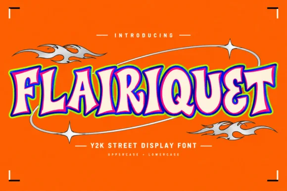
Y2K street display in rounded retro caps with an inner fill and keyline
Flairiquet is a rounded retro display alphabet in which the fat italic caps carry a white inner fill inside a coloured keyline, so the word reads as a spray-can sticker from the early 2000s rather than as plain type.
Ideas for this font
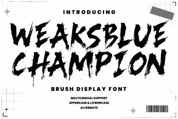
Dry brush capitals with spatter
Weaksblue Champion is a rough dry-brush display in black: heavy capital strokes with spattered edges, set on white inside printer's marks, a grid corner and a barcode.
Ideas for this font
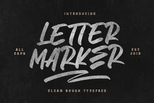
Broad slanted marker capitals
Letter Marker is a broad slanted marker capital set in chalky white on black: thick brush strokes with dry ends, a consistent forward lean and a short underline swash beneath the second line.
Ideas for this font
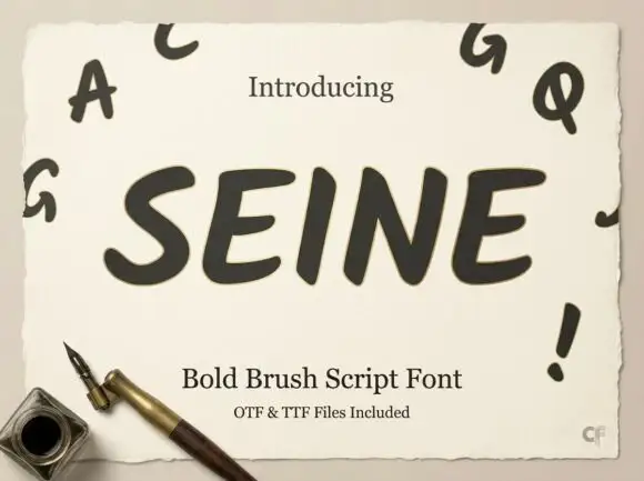
Slanted rounded brush capitals
Seine is a slanted rounded brush capital set in dark grey on a deckled cream sheet: very heavy strokes with rounded ends, a strong forward lean, and small capital letters scattered around the sheet as a specimen.
Ideas for this font
Same independent foundry
Allow optional Google Analytics to measure visits and catalogue actions. Your search words and notes are not included. Privacy & storage