Editorial Serif Anchor

Dream + Wolles Elegant Modern Serif
Anchors Dream's fluid strokes with crisp Roman proportions on wedding suites, headers and packaging.
Inspect Wolles Elegant Modern Serif specimenDisclosure: MakerFileHub may earn a commission from qualifying purchases via paid links on this page. How our links work.
Broad upright lettering with separate rounded strokes
Dream is a broad upright handwriting with blunt strokes and a small bounce: the letters stand separately on the line and the lowercase keeps nearly the same height as the capital.
Paid link
Get this fontProject & layout blueprintsAt-a-glance maker compatibility
Weld or Unite overlapping script joins into one continuous vector path before sending to the blade.
Visual anatomy & craft review
The word is set alone on a wide cream card with hanging lamps above and two potted plants at the corners, and that space is what shows the drawing: the D is broad with a straight stem and a squared bowl, the r carries a short arm that pops above the x-height, and the e and a are single-storey with a slanted bar and a blunt tail. Letters do not join, so the word reads as hand-printed rather than cursive, and the slight lift on the m keeps the line from looking ruled. Weight is thick and even with square-ish terminals, and the only flourish is the overlong arm of the r. The lamps, the plants, the light sans introducing line and the plain caption beneath the word belong to the cover rather than to the alphabet.
Upright · Broad · Quirky
Two-font hierarchy recipes
Tested contrast partners — pairing Dream with grounded secondary typography.
Dream + Wolles Elegant Modern Serif
Anchors Dream's fluid strokes with crisp Roman proportions on wedding suites, headers and packaging.
Inspect Wolles Elegant Modern Serif specimen
Dream + Headline
Keeps small-scale dates, URLs, nutrition facts and care instructions crisp and legible below script titles.
Inspect Headline specimenPractical applications
Concrete hierarchy, scale and production guidance tailored to Dream’s stroke geometry.
Separate upright letters survive a curved mug and a woven tote because no join has to stretch over the curve, and the broad strokes stay visible through the texture of the fabric.
Hierarchy & layout recipe
Set the word at 30 mm wide on a 330 ml mug, keep it within the flat window of the print area, and set any second line smaller and in a plain face so the hand-printed word stays the only drawn element.
Pre-production check
Woven tote threads eat a blunt terminal; check the printed proof on the actual canvas before approving the run.
Broad hand-printed letters read from the far side of a market table and look made on the spot, which suits a stall where the prices change with the week's stock.
Hierarchy & layout recipe
Write the prices at 40 mm on A6 cards, keep the plant names in a smaller plain hand beneath, and leave the top third of each card empty so a card can be re-used when the price is crossed out.
Pre-production check
Outside light washes out thin strokes; check the cards on the table rather than on a screen, and go one weight heavier if they read faint.
An upright, hand-printed alphabet sets a relaxed tone for an outdoor celebration and stays readable at a distance where a joined script would blur into a ribbon.
Hierarchy & layout recipe
Paint the welcome line at 90 mm cap height on an A1 board, keep the names in the same hand at 60 mm, and hold the board's border 80 mm clear so the broad letters have air around them.
Pre-production check
Wood grain and a brush both widen the stroke; test the tight counter of the D on an offcut of the same board before painting the final sign.
Technical & licence verification
Confirm included OTF/TTF/WOFF formats, full glyph tables and licence coverage on the live store page before batch production.
Closest visual alternatives
Matched across letterform anatomy, stroke behaviour and craft applications.
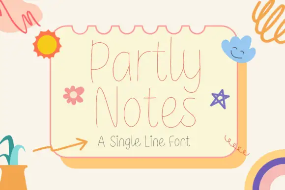
Very fine tall rounded single-line lettering
Partly Notes is a very fine tall rounded single-line lettering in coral on cream: hairline monoline strokes, very tall narrow letters with fully rounded ends, and a spacing so open that a two-word phrase fills a card.
Ideas for this font
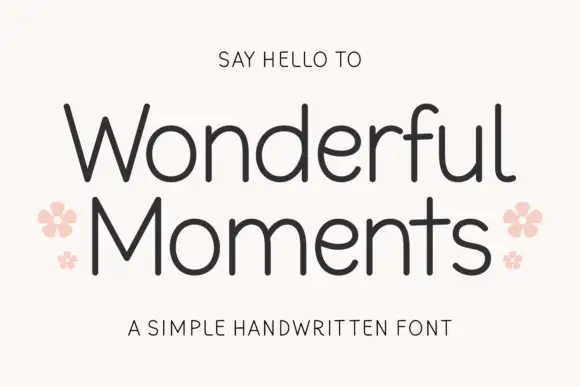
Thin rounded handwritten sans
Wonderful Moments is a thin rounded handwritten sans set in mixed caps: wide open letterforms, a light even stroke with rounded terminals and a small bounce that keeps the line from feeling ruled.
Ideas for this font
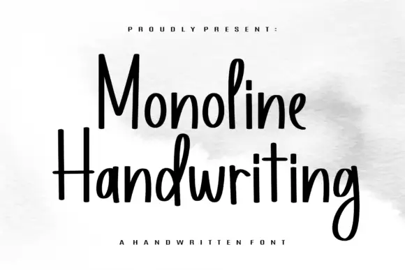
Tall narrow monoline hand
Monoline Handwriting is a tall narrow hand in black on white: fine even strokes, high ascenders, a small x-height and a quick forward rhythm that keeps an eleven-letter word inside a card.
Ideas for this font
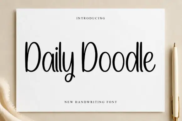
Narrow upright handwriting with tall ascenders and a soft even stroke
Daily Doodle is narrow upright handwriting in which the ascenders run tall, the stroke stays soft and even, and the letters stand apart at a gentle rhythm.
Ideas for this font
Same independent foundry
Allow optional Google Analytics to measure visits and catalogue actions. Your search words and notes are not included. Privacy & storage