Editorial Serif Anchor

Handwritten + The Simple Editorial
Anchors Handwritten's fluid strokes with crisp Roman proportions on wedding suites, headers and packaging.
Inspect The Simple Editorial specimenDisclosure: MakerFileHub may earn a commission from qualifying purchases via paid links on this page. How our links work.
Upright compact script with flared terminals and closed tight fit
Handwritten is a compact upright script in which the letters stay close together, the strokes run heavy and even, and the terminals flare slightly where the pen lifts.
Paid link
Get this fontProject & layout blueprintsAt-a-glance maker compatibility
Weld or Unite overlapping script joins into one continuous vector path before sending to the blade.
Visual anatomy & craft review
The capital H opens with two thick stems and a low crossbar, then the word runs tight: the a closes a small bowl, the n keeps a narrow shoulder, the d rises into a short stem and the double t crosses with a single bar, all at one heavy weight. The letters connect with short joins rather than long loops, so the word reads as a dense block at 40 pt without the airiness of a formal script. The terminals flare where the stroke ends, which gives the face a brush quality without a dry edge. Because the fit is closed and the x-height tall, the face works on narrow labels where a wide script would break. The white ground, the black ink, the pale watercolour washes and the round badge are presentation; the script is the word.
Upright · Compact · Flared
Two-font hierarchy recipes
Tested contrast partners — pairing Handwritten with grounded secondary typography.
Handwritten + The Simple Editorial
Anchors Handwritten's fluid strokes with crisp Roman proportions on wedding suites, headers and packaging.
Inspect The Simple Editorial specimen
Handwritten + Noar
Keeps small-scale dates, URLs, nutrition facts and care instructions crisp and legible below script titles.
Inspect Noar specimenPractical applications
Concrete hierarchy, scale and production guidance tailored to Handwritten’s stroke geometry.
The compact upright script survives a rubber stamp at 9 mm where a looping script would fill in, and the flared terminals still read.
Hierarchy & layout recipe
Order a 40 mm rubber stamp: set the name at 9 mm cap height, keep the tagline in a 3 mm sans beneath, and leave 4 mm of clear space around the word so the stamp edge does not ink the letters.
Pre-production check
Fine joins fill in on a rubber stamp; check a test impression on the actual card stock and open the two tightest joins before cutting the die.
The dense upright fit lets a long surname stay on a small jar label, and the heavy stroke reads through the glass at 10 pt where a light script would fade.
Hierarchy & layout recipe
Print on a 50 mm round label: set the names at 10 pt across the centre, set the date in a 5 pt sans beneath, and keep 5 mm inside the die so the flared terminals are not cut.
Pre-production check
Glass behind a small label reduces contrast; check one filled jar in daylight and use a lighter label stock if the script disappears.
The compact script gives a printed menu a signed top line, and the tight fit keeps that line inside a narrow column at 18 pt without a second face.
Hierarchy & layout recipe
Print on a 100 by 210 mm insert: set the company name at 18 pt, set the courses in a 9 pt serif at 13 pt leading, and hold 12 mm between the script line and the first course.
Pre-production check
A heavy script at 18 pt can outweigh the course list; check the insert at final size and drop the script to 15 pt rather than lightening the serif.
Technical & licence verification
Confirm included OTF/TTF/WOFF formats, full glyph tables and licence coverage on the live store page before batch production.
Closest visual alternatives
Matched across letterform anatomy, stroke behaviour and craft applications.
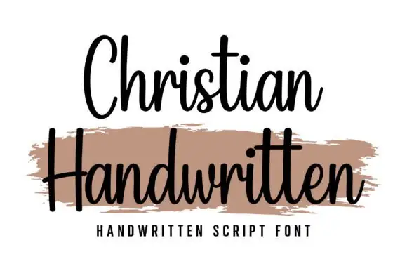
Upright compact connected script
Christian is an upright connected script with a compact rhythm, a heavy-brush companion line beneath it and no forward slant at all across the alphabet.
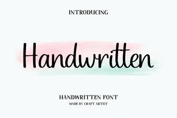
Heavy monoline script with closed loops
Handwritten is a heavy monoline script with round closed loops and blunt terminals, so a single word reads as a thick, friendly band rather than as a delicate signature.
Ideas for this font
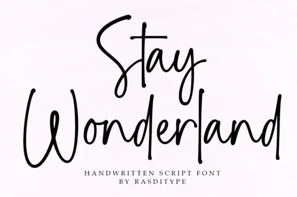
Thin monoline signature script
Stay Wonderland is a thin monoline signature script in black on white: tall narrow loops, a stem on the S that rises above the cap line, a straight-tailed y, and a spacing wide enough that the word reads as a signature written quickly.
Ideas for this font
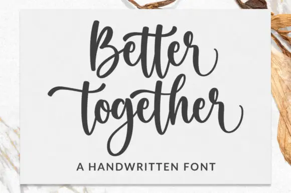
Broad bouncing script with paired cross strokes and a deep descender loop
Better Together is a broad bouncing script in which the words rise and fall, the paired t cross strokes reach across neighbours and the g drops a deep loop, so a stacked phrase reads as a warm handwritten statement.
Ideas for this font
Same independent foundry
Allow optional Google Analytics to measure visits and catalogue actions. Your search words and notes are not included. Privacy & storage