Modern Grotesque Body

Salt & Lime + Corven
Creates crisp high-hierarchy contrast beneath Salt & Lime headlines across menus, websites and labels.
Inspect Corven specimenDisclosure: MakerFileHub may earn a commission from qualifying purchases via paid links on this page. How our links work.
Narrow soft slab
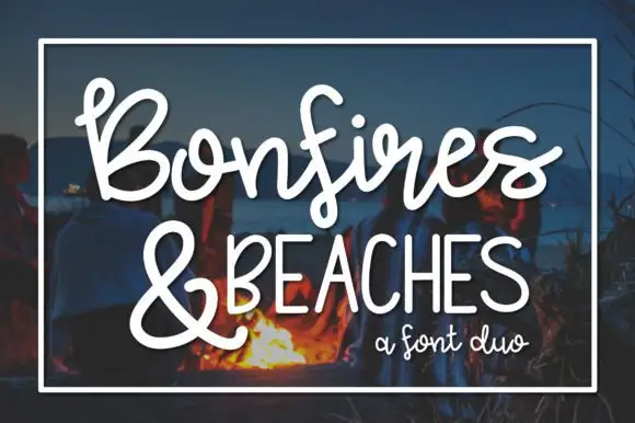
Salt & Lime is a narrow soft slab in black over a watercolour lime on white: mixed case with rounded slab endings, a tight rhythm and a large x-height, with the ampersand drawn at the same weight and a small line beneath in a tracked sans.
Paid link
Get this fontProject & layout blueprintsAt-a-glance maker compatibility
Sturdy stroke walls and open counters weed cleanly on adhesive vinyl, HTV apparel film, and cut cardstock.
Visual anatomy & craft review
The plate sets the phrase in mixed case with an ampersand, which is the useful test for a face bought for product names: the lowercase shows the rounded slab endings, the r and the t behave well at a small size, and the ampersand is drawn as a proper character rather than a fallback. The drawing is narrow with soft slabs, so a long line fits in a small space without losing weight, and the watercolour lime behind gives the sheet its subject. The line beneath is a small tracked sans, which keeps the description separate from the display. Because the strokes are moderate, the face works at label sizes as well as at display, and the plate shows both by setting a short phrase large and a caption small.
Slab, narrow, friendly, warm
Two-font hierarchy recipes
Tested contrast partners — pairing Salt & Lime with grounded secondary typography.
Salt & Lime + Corven
Creates crisp high-hierarchy contrast beneath Salt & Lime headlines across menus, websites and labels.
Inspect Corven specimen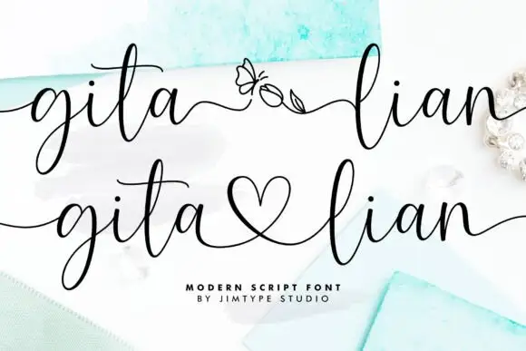
Salt & Lime + Gita Lian
Adds a warm human signature touch for 1-to-3-word callouts without competing against structured serif capitals.
Inspect Gita Lian specimenPractical applications
Concrete hierarchy, scale and production guidance tailored to Salt & Lime’s stroke geometry.
A narrow slab fits a long product name on a small label without shrinking, and the rounded endings keep it friendly rather than industrial.
Hierarchy & layout recipe
Print a 60 by 90 mm label: the brand at 14 pt, the flavour at 8 pt, and the volume at 6 pt. Keep 4 mm inside the die and print two colours on a white stock.
Pre-production check
Check the 14 pt brand on a bottle, where a narrow letter can distort around the curve; reduce the width. Confirm the 6 pt volume reads on the shelf and that the label holds in a cooler.
A friendly slab reads at market distance, and the narrow letters let a long list of flavours fit on one board instead of two.
Hierarchy & layout recipe
Paint a 900 by 400 mm board: the stall at 90 mm, the flavours at 30 mm, and the prices at 24 mm. Keep 25 mm margins and paint two colours on a light board.
Pre-production check
Check the board at four metres, where the rounded endings can soften the words; keep the contrast high. Confirm the 24 mm prices read at two metres and that the board survives a season outdoors.
A narrow slab with rounded ends reads as a friendly invitation, and the mixed case keeps a short message from looking shouty.
Hierarchy & layout recipe
A6 card: the greeting at 26 pt, the details at 9 pt, and the date at 8 pt. Keep 14 mm margins and print one ink on a cream card with a watercolour accent.
Pre-production check
Check the 26 pt greeting at home-print resolution, where the soft slabs can fill; keep the counters above 0.6 mm. Confirm the 9 pt details keep a 4.5:1 contrast and that the card folds flat.
Technical & licence verification
Confirm included OTF/TTF/WOFF formats, full glyph tables and licence coverage on the live store page before batch production.
Closest visual alternatives
Matched across letterform anatomy, stroke behaviour and craft applications.
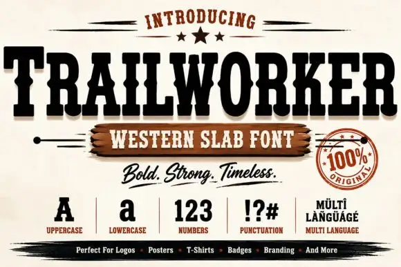
Heavy ornamental western display
Trailworker is a heavy western display in black on cream: very wide slabs with notched and inlaid strokes, spurred serifs, and a decorative centre notch on several letters, presented with a script tagline, a set of specimen glyphs and a round seal, so the sheet reads as a full western kit.
Ideas for this font
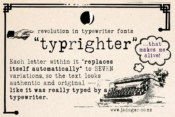
Typewriter face with alternates
Typrighter is a typewriter face in black on aged newsprint, shown inside a period advertisement: a monospaced slab with light uniform strokes and blunt serifs, surrounded by hand-lettered display copy and a printed illustration of a machine.
Ideas for this font
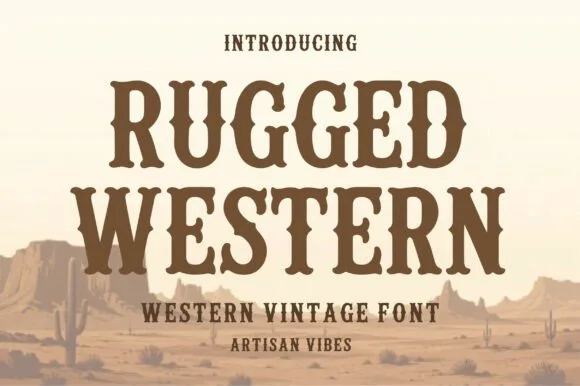
Condensed western serif with spurred stems
Rugged Western is a western display face in warm brown on a pale desert scene: condensed capitals with bracketed slab serifs, small spurs at the joins and a heavy even weight, with cacti and mesas drawn behind the words.
Ideas for this font
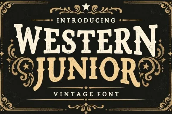
Vintage western slab with scrollwork frame
Western Junior is a vintage western display face in cream and gold on black: rounded slab capitals with small spurs and a dusty surface, set inside an elaborate scrollwork frame with stars, a rule and a banner.
Ideas for this font
Same independent foundry
Allow optional Google Analytics to measure visits and catalogue actions. Your search words and notes are not included. Privacy & storage