High-Contrast Display Serif

Bonfires & Beaches + Rosemode
Pairs sculptural editorial warmth with Bonfires & Beaches's clean modern geometry.
Inspect Rosemode specimenDisclosure: MakerFileHub may earn a commission from qualifying purchases via paid links on this page. How our links work.
Looping brush script paired with tall narrow caps
Bonfires & Beaches is a duo: a looping brush script with a swinging tail on the first capital, paired with a tall narrow uppercase that carries the second line in even, slightly condensed letters.
Paid link
Get this fontProject & layout blueprintsAt-a-glance maker compatibility
Weld or Unite overlapping script joins into one continuous vector path before sending to the blade.
Visual anatomy & craft review
The script half opens with a capital B whose entry loop folds back over the stem before the stroke drops, and the remaining lowercase letters keep round bowls and low joins so the word reads as one rapid movement. The ampersand in the middle of the sample is drawn by the script itself: a wide open loop that hangs below the baseline, and it is the widest shape in the composition. The caps half is a different animal: narrow monoline uppercase with tall straight stems, a single-storey structure and no serifs, set with generous tracking so it holds a full word without crowding. The two halves share a rounded terminal, which is what lets them sit together. The night photograph, the white frame and the small script caption at the bottom right are presentation; the two typefaces are the words.
Looped · Paired · Casual
Two-font hierarchy recipes
Tested contrast partners — pairing Bonfires & Beaches with grounded secondary typography.
Bonfires & Beaches + Rosemode
Pairs sculptural editorial warmth with Bonfires & Beaches's clean modern geometry.
Inspect Rosemode specimen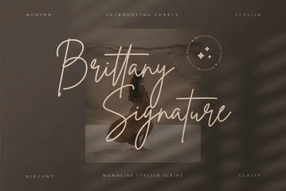
Bonfires & Beaches + Brittany Signature Script
Introduces organic movement on pull-quotes, signatures and gift tags.
Inspect Brittany Signature Script specimenPractical applications
Concrete hierarchy, scale and production guidance tailored to Bonfires & Beaches’s stroke geometry.
The duo lets one poster carry a lively event name and a calm second line without hiring two unrelated faces, and the tall narrow caps stay readable from across a beach car park.
Hierarchy & layout recipe
Set the event name in the script at 96 pt on an A2 sheet, set the date and location in the narrow caps at 36 pt beneath, and leave the bottom fifth empty for the sponsor line at 12 pt.
Pre-production check
Screen printing a 96 pt brush script with a loaded squeegee thickens the joins; check a pull at final size and open the tightest join before the screens are burned.
The loose script signals a relaxed celebration while the narrow caps keep the practical details legible at the distance people read a sign from, which is the split a formal script cannot make.
Hierarchy & layout recipe
Set the couple's names in the script at 12 cm on a 600 by 800 mm board, set the time and directions in the narrow caps at 4 cm, and keep 8 cm between the two lines so the ampersand loop does not touch the caps.
Pre-production check
Painted boards in daylight lose a monoline; check the assembled sign outdoors at the planned distance and take the narrow caps up one size if the directions start to blur.
The script gives the blend a camp-side voice while the narrow caps carry the roast and weight clearly, and the pairing keeps a small bag from needing a third typeface.
Hierarchy & layout recipe
Set the blend name in the script at 20 pt on a 90 by 140 mm bag, set the roast and weight in the narrow caps at 9 pt, and keep the script's baseline 6 mm above the caps so the descenders stay clear.
Pre-production check
Kraft bags absorb ink and the script's thin joins close; print one bag on the real substrate and hold the script at 20 pt rather than pushing it larger.
Technical & licence verification
Confirm included OTF/TTF/WOFF formats, full glyph tables and licence coverage on the live store page before batch production.
Closest visual alternatives
Matched across letterform anatomy, stroke behaviour and craft applications.
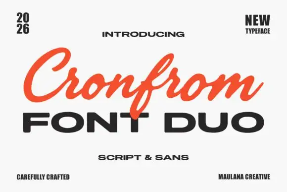
Slanted retro script paired with a wide bold sans in capitals
Cronfrom pairs a slanted retro script with a wide bold sans, so one lockup can carry a handwritten sign name and a hard-edged second line beneath it.
Ideas for this font
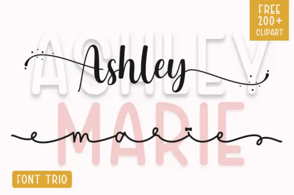
Contrasting sans and two script treatments
Ashley Marie shows tall broad sans letters set very pale behind a darker connected Ashley line and a much finer extended marie line, where the upper script swells in the middle of the word, scattered dots sit at the ends of long outer strokes and a yellow corner badge advertises a font trio.
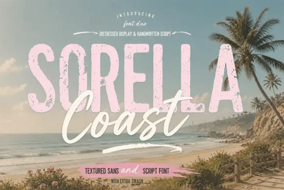
Distressed display sans and handwritten script
Sorella Coast is a duo: a tall distressed display sans in dusty pink with worn edges and speckles, and a loose handwritten script in cream that crosses the block letters.
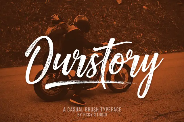
Rough brush script with a fine companion
Ourstory is a duo on a warm-toned photograph: a rough brush script in white with dry, split strokes and a long underline swash, plus a fine companion hand for smaller lines.
Same independent foundry
Allow optional Google Analytics to measure visits and catalogue actions. Your search words and notes are not included. Privacy & storage