Modern Grotesque Body

Trailworker + Bielchon
Creates crisp high-hierarchy contrast beneath Trailworker headlines across menus, websites and labels.
Inspect Bielchon specimenDisclosure: MakerFileHub may earn a commission from qualifying purchases via paid links on this page. How our links work.
Heavy ornamental western display
Trailworker is a heavy western display in black on cream: very wide slabs with notched and inlaid strokes, spurred serifs, and a decorative centre notch on several letters, presented with a script tagline, a set of specimen glyphs and a round seal, so the sheet reads as a full western kit.
Paid link
Get this fontProject & layout blueprintsAt-a-glance maker compatibility
Sturdy stroke walls and open counters weed cleanly on adhesive vinyl, HTV apparel film, and cut cardstock.
Visual anatomy & craft review
The word is set once at giant size, and the drawing is a slab pushed to display weight: the serifs are as thick as the stems, the strokes carry a decorative notch down the centre, and the spurs on the T and the R break the silhouette, which is what makes the face read as wood-type rather than as a heavy serif. The ornament is built into the skeleton rather than added as an overlay, so the counters stay open and the word holds at a distance. Beneath it, the specimen sets a script tagline in a contrasting brush face, then a block of glyph samples in the same slab, which tells a buyer what the family includes. The plate is closed by a brush rule and a round seal, and the whole composition uses two inks on cream.
Western, bold, ornamental, masculine
Two-font hierarchy recipes
Tested contrast partners — pairing Trailworker with grounded secondary typography.
Trailworker + Bielchon
Creates crisp high-hierarchy contrast beneath Trailworker headlines across menus, websites and labels.
Inspect Bielchon specimen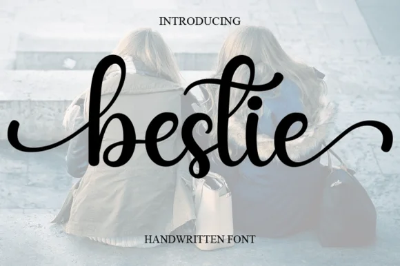
Trailworker + Bestie
Adds a warm human signature touch for 1-to-3-word callouts without competing against structured serif capitals.
Inspect Bestie specimenPractical applications
Concrete hierarchy, scale and production guidance tailored to Trailworker’s stroke geometry.
A notched western slab gives a bottle shelf presence at a glance, and the built-in ornament means the label needs no illustration to look like a heritage product.
Hierarchy & layout recipe
Print a 60 by 90 mm label: the name at 20 pt, the heat level in a 7 pt sans, and the volume at 6 pt. Keep 5 mm clear inside the die so the spurs are never cut, and print two inks on an uncoated stock.
Pre-production check
Check the 20 pt name against the die at 5 mm; pull the lockup in if a spur narrows the margin. Confirm the 6 pt volume reads on the shelf and that the centre notch still reads at label size.
A heavy western slab prints as a single screen and reads across a field, and the notched strokes keep the graphic from looking like a plain bold serif on a shirt.
Hierarchy & layout recipe
Print a 280 mm chest graphic: the phrase at 60 mm cap height, the date in a 18 mm script, and one ink on a light shirt. Keep the thinnest notch at 3 mm so the screen holds and keep the graphic 80 mm below the collar.
Pre-production check
Check the screen at actual mesh, where a notch under 2 mm fills; open it for the print. Wash-test one shirt and confirm the 18 mm script stays legible after five cycles.
A heavy western face gives a rural book a cover that looks printed rather than designed, and the specimen's script tagline shows how to pair it with a second voice for a subtitle.
Hierarchy & layout recipe
Set the title at 100 mm cap height across 240 mm, the subtitle in a 14 pt script, and the author in 9 pt caps. Print two inks on a matte stock and let a single landscape photograph run across the lower half.
Pre-production check
Check the title at 100 mm, where a thick serif can look blunt on a textured stock; proof the board. Confirm the 9 pt author survives lamination and that the title clears the trim by 15 mm.
Technical & licence verification
Confirm included OTF/TTF/WOFF formats, full glyph tables and licence coverage on the live store page before batch production.
Closest visual alternatives
Matched across letterform anatomy, stroke behaviour and craft applications.
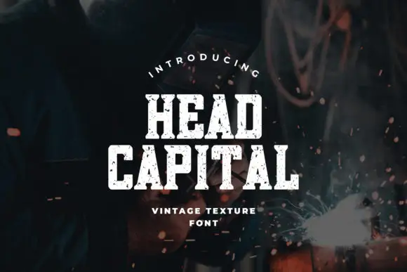
Condensed chamfered slab blocks with an irregular chipped texture
Head Capital is a condensed slab in which the blocks sit upright, the corners chamfer, the feet run broad and irregular chips erode the faces, so a short heading reads as stencilled onto workshop steel.
Ideas for this font

Condensed western capitals with stem ornaments
Saddlewick is a condensed western slab in dark brown on leather: very tall capitals, squared serifs and small nicked ornaments cut into the stems, with a spur and a star in the counters.
Ideas for this font
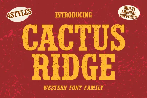
Tall notched Western slabs with small scattered erosion marks
Cactus Ridge shows yellow Western capitals on red, where pinched midsections and long broad slab ends create a tall sign shape and small dark chips interrupt the fill without any complete outline.
Ideas for this font
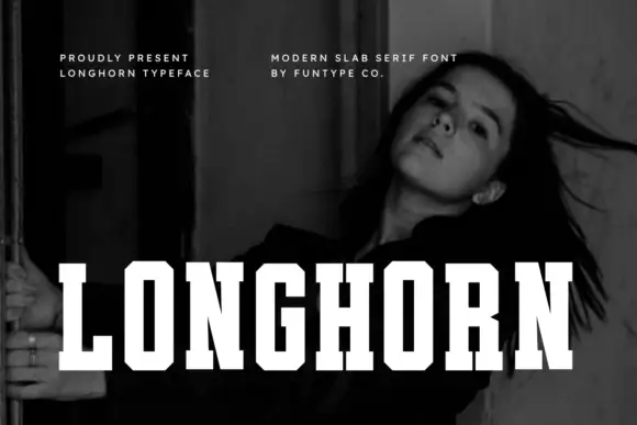
Very condensed clean slab
Longhorn is a very condensed slab in white over a black-and-white portrait: narrow capitals with thick square slabs, clipped rectangular bowls and flat terminals, set as one word across the lower third, with two small tracked notes at the upper left and right.
Ideas for this font
Same independent foundry
Allow optional Google Analytics to measure visits and catalogue actions. Your search words and notes are not included. Privacy & storage



