High-Contrast Display Serif

Coffee & Donuts + Rosemode
Pairs sculptural editorial warmth with Coffee & Donuts's clean modern geometry.
Inspect Rosemode specimenDisclosure: MakerFileHub may earn a commission from qualifying purchases via paid links on this page. How our links work.
Large looping connected script paired with narrow upright letters
Coffee and Donuts pairs a large looping connected script with narrow upright letters, so a menu can carry a warm written heading and a tight printed list in the same ink.
Paid link
Get this fontProject & layout blueprintsAt-a-glance maker compatibility
Weld or Unite overlapping script joins into one continuous vector path before sending to the blade.
Visual anatomy & craft review
The script half is drawn with fat loops: the c opens as a wide crescent, the double o and the double f close four round loops, the e finishes in a tail that crosses back over the word and the f of the second word hooks upward. The upright half is a narrow mixed-case face with even strokes and a plain skeleton, tracked tight so a long list stays in one column. That pairing is what the sample shows: the loops occupy the upper half and the narrow letters carry the words beneath without competing. Both halves hold at 11 pt on a printed menu, and the script's counters survive a chalk print. The coffee cup, the plate, the pale ground, the dark ink and the three caption lines are presentation; the duo is the two lines.
Looping · Narrow · Paired
Two-font hierarchy recipes
Tested contrast partners — pairing Coffee & Donuts with grounded secondary typography.
Coffee & Donuts + Rosemode
Pairs sculptural editorial warmth with Coffee & Donuts's clean modern geometry.
Inspect Rosemode specimen
Coffee & Donuts + Honey
Introduces organic movement on pull-quotes, signatures and gift tags.
Inspect Honey specimenPractical applications
Concrete hierarchy, scale and production guidance tailored to Coffee & Donuts’s stroke geometry.
The big loops head a printed menu at 30 pt while the narrow letters list the items, so one board carries the shop's voice and its prices without a third face.
Hierarchy & layout recipe
Print a 700 by 450 mm board: set the shop name in the script at 30 pt across the top, set the items in the narrow letters at 8 pt at 14 pt leading, and hold 14 mm between the script tail and the first item line.
Pre-production check
A script tail crossing an item line reads as a mistake; check the board at final size and keep the tail above the list rather than beside it.
The loops read on a small sleeve at 14 pt and give a plain cup a hand-lettered character, while the narrow letters fit the roast details.
Hierarchy & layout recipe
Print a 60 mm sleeve: set the shop name in the script at 14 pt, set the roast in the narrow letters at 6 pt beneath, and keep 8 mm of clear sleeve at each end so the loops are not cut by the glued seam.
Pre-production check
A glued seam through a loop shows as a hard line; check an assembled sleeve and move the script off the overlap side.
The pair gives a small card a warm heading and a legible set of terms, and both hold at 9 pt on a printed card that is handled daily.
Hierarchy & layout recipe
Print an 85 by 54 mm card: set the shop name in the script at 16 pt at the head, set the terms in the narrow letters at 9 pt, and keep 25 mm of blank card at the foot for the stamp grid.
Pre-production check
A card carried in a wallet scuffs at the corners; check a laminated sample and keep the script well inside the laminate margin.
Technical & licence verification
Confirm included OTF/TTF/WOFF formats, full glyph tables and licence coverage on the live store page before batch production.
Closest visual alternatives
Matched across letterform anatomy, stroke behaviour and craft applications.
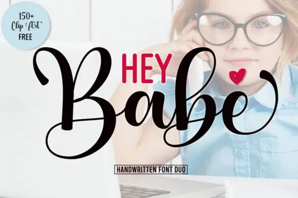
Heavy looping script paired with a smaller rounded sans in capitals
Hey Babe is a duo of a heavy looping script with tall capitals and a smaller rounded sans, arranged so a bold script line carries the design and the sans supplies the second voice.
Ideas for this font
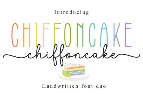
Tall narrow sans and fine looping script duo
Chiffoncake Duo pairs very tall narrow capitals, each in a different pastel tone, with a low connected script whose deep f loops drop below the baseline, and long tails extend from both sides of the lower word above a small cake illustration.
Ideas for this font
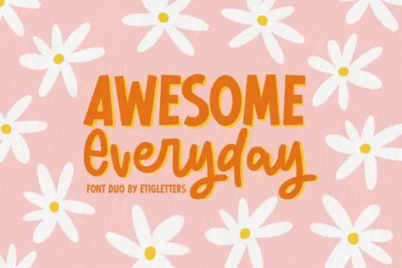
Irregular upright capitals paired with connected rounded script and long y loops
Awesome Everyday Duo places a capital row with thick narrow stems and uneven top edges above a connected rounded script whose y descenders drop into large lower loops and whose capital E begins with an open curl.
Ideas for this font
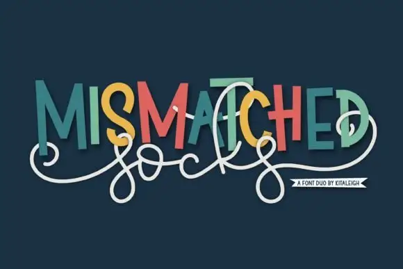
Mixed-colour caps with swash script
Mismatched Socks is a duo in teal, coral and mustard on navy: a set of upright caps in alternating colours with small stepped shadows, overlaid by a white monoline script whose loops weave across the words, presented with a small banner at the foot, so the plate reads as a playful lockup rather than a type specimen.
Ideas for this font
Same independent foundry
Allow optional Google Analytics to measure visits and catalogue actions. Your search words and notes are not included. Privacy & storage