High-Contrast Display Serif

Mismatched Socks + Auretha
Pairs sculptural editorial warmth with Mismatched Socks's clean modern geometry.
Inspect Auretha specimenDisclosure: MakerFileHub may earn a commission from qualifying purchases via paid links on this page. How our links work.
Mixed-colour caps with swash script
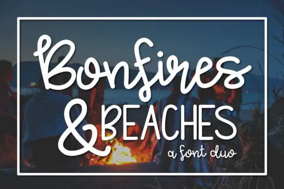
Mismatched Socks is a duo in teal, coral and mustard on navy: a set of upright caps in alternating colours with small stepped shadows, overlaid by a white monoline script whose loops weave across the words, presented with a small banner at the foot, so the plate reads as a playful lockup rather than a type specimen.
Paid link
Get this fontProject & layout blueprintsAt-a-glance maker compatibility
Sturdy stroke walls and open counters weed cleanly on adhesive vinyl, HTV apparel film, and cut cardstock.
Visual anatomy & craft review
The pairing is the design: the caps are plain, even and spaced widely, while the script is a continuous monoline that threads between the letters and throws loops over and under them, which is what gives the composition its energy. Each cap is filled with a different colour and carries a small shadow, so the words read as a row of blocks, and the script supplies the single line that ties them together. Because the script is a line rather than a fill, it can cross the caps without obscuring them, which is the trick the specimen depends on. The palette is four colours on navy, and the capacity to change the script's path is what a buyer is actually getting from a duo like this.
Duo, playful, layered, colourful
Two-font hierarchy recipes
Tested contrast partners — pairing Mismatched Socks with grounded secondary typography.
Mismatched Socks + Auretha
Pairs sculptural editorial warmth with Mismatched Socks's clean modern geometry.
Inspect Auretha specimen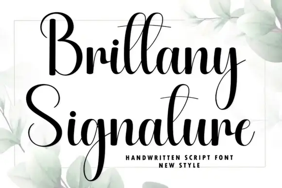
Mismatched Socks + Brittany Signature
Introduces organic movement on pull-quotes, signatures and gift tags.
Inspect Brittany Signature specimenPractical applications
Concrete hierarchy, scale and production guidance tailored to Mismatched Socks’s stroke geometry.
A coloured caps set with a script overlay reads as a hand-lettered card, and the two parts can be recoloured for any palette without redrawing the lettering.
Hierarchy & layout recipe
A6 card: the name in caps at 30 pt, the script overlay at the same size crossing beneath, and the details in a 9 pt sans. Keep 12 mm margins, limit the palette to three colours, and print on a white card so the script stays white.
Pre-production check
Check the 30 pt caps, where the script can cover a counter; move the crossing point. Confirm the 9 pt details keep a 4.5:1 contrast and that the script's loops clear the trim.
A layered duo gives a small brand a playful mark that reads at sticker size, and the flat colours keep a short run affordable.
Hierarchy & layout recipe
Die-cut a 55 mm sticker: the name in caps at 14 pt, the script overlay at 14 pt, and 2 mm clear to the die. Keep the script's thinnest line at 0.8 mm so the cut holds it and print three colours.
Pre-production check
Check the 14 pt overlay, where a 0.8 mm line can break at the die edge; thicken it. Confirm the sticker reads at arm's length and that the caps stay distinct behind the script.
A colourful caps set with an overlay draws students better than a plain notice, and the caps stay readable from a corridor where a decorative script would not.
Hierarchy & layout recipe
A4 print: the headline in caps at 54 mm, the script overlay at 54 mm, and the schedule in a 10 mm sans. Keep 20 mm margins and print three colours so the notice stands out in a corridor of plain sheets.
Pre-production check
Check the A4 at two metres, where the overlay can reduce the caps to an outline; keep the crossing single. Confirm the 10 mm schedule reads at arm's length and that the colours stay distinct on coloured paper.
Technical & licence verification
Confirm included OTF/TTF/WOFF formats, full glyph tables and licence coverage on the live store page before batch production.
Closest visual alternatives
Matched across letterform anatomy, stroke behaviour and craft applications.
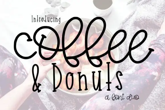
Large looping connected script paired with narrow upright letters
Coffee and Donuts pairs a large looping connected script with narrow upright letters, so a menu can carry a warm written heading and a tight printed list in the same ink.
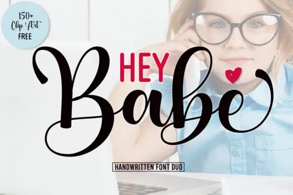
Heavy looping script paired with a smaller rounded sans in capitals
Hey Babe is a duo of a heavy looping script with tall capitals and a smaller rounded sans, arranged so a bold script line carries the design and the sans supplies the second voice.
Ideas for this font

Fine looped script with heavy playful sans duo
Shortcake Strawberry puts a fine tall-looped script above a heavy irregular sans whose bowls are almost as wide as the letters are tall, on a soft pink ground.
Ideas for this font
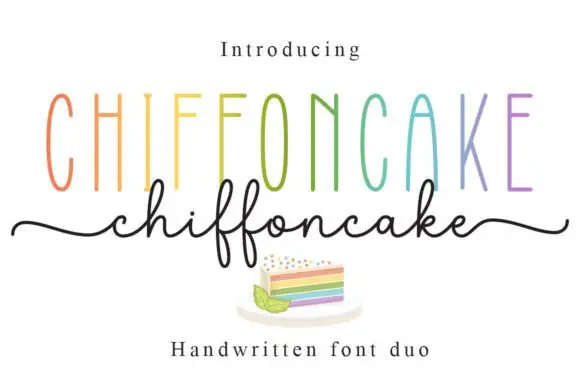
Tall narrow sans and fine looping script duo
Chiffoncake Duo pairs very tall narrow capitals, each in a different pastel tone, with a low connected script whose deep f loops drop below the baseline, and long tails extend from both sides of the lower word above a small cake illustration.
Ideas for this font
Same independent foundry
Allow optional Google Analytics to measure visits and catalogue actions. Your search words and notes are not included. Privacy & storage