Editorial Serif Anchor

Rustic Brush + The Avenue Editorial
Anchors Rustic Brush's fluid strokes with crisp Roman proportions on wedding suites, headers and packaging.
Inspect The Avenue Editorial specimenDisclosure: MakerFileHub may earn a commission from qualifying purchases via paid links on this page. How our links work.
Grunge brush caps
Rustic Brush is a grunge brush display in black on a light wood ground: heavy caps with dry, streaked edges, uneven stroke widths and small spatter where the brush ran out, so the pair reads as lettering painted onto a board with a wide brush.
Paid link
Get this fontProject & layout blueprintsAt-a-glance maker compatibility
Fine grain and micro-texture excel in 300 DPI print, sublimation, and screen print rather than small vinyl weeding.
Visual anatomy & craft review
The two words are stacked and the drawing imitates a loaded brush: the strokes are thick, the ends are blunt and ragged, and the interior carries streaks where the bristles separated, which is what makes the texture read as paint rather than as a filter. Because the strokes stay heavy, the letters hold at a distance, and the counters remain open even where the spatter is densest. Spacing is tight, so the pair reads as one painted block, and the widths vary a little from letter to letter, which is the imperfection that a hand-painted sign has. The ground is a pale wood photograph, and the two captions above and below are set in a clean grotesque, so the brush face is the only textured element on the page.
Brush, grunge, textured, bold
Two-font hierarchy recipes
Tested contrast partners — pairing Rustic Brush with grounded secondary typography.
Rustic Brush + The Avenue Editorial
Anchors Rustic Brush's fluid strokes with crisp Roman proportions on wedding suites, headers and packaging.
Inspect The Avenue Editorial specimen
Rustic Brush + Nyxar
Keeps small-scale dates, URLs, nutrition facts and care instructions crisp and legible below script titles.
Inspect Nyxar specimenPractical applications
Concrete hierarchy, scale and production guidance tailored to Rustic Brush’s stroke geometry.
A grunge brush face reads as painted lettering on timber, and the texture means a hand-painted board looks deliberate rather than roughly executed.
Hierarchy & layout recipe
Paint a 1,000 by 400 mm board: the name at 140 mm cap height, the produce in a 24 mm sans, and a 6 mm rule. Keep 30 mm margins, paint black on bare timber, and keep the strokes wide enough that the grain does not break them.
Pre-production check
Check the board at fifteen metres, where the spatter can look like damage; keep the splatter to the edges. Confirm the 24 mm produce reads at four metres and that the brush streaks stay visible after a clear coat.
A brush graphic prints as one screen and looks hand-painted on fabric, which suits a barn party better than a clean modern mark.
Hierarchy & layout recipe
Print a 260 mm chest graphic: the phrase at 60 mm cap height, the date at 16 mm, and one ink on a light shirt. Keep the thinnest stroke at 3 mm so the screen holds it and place the graphic 80 mm below the collar.
Pre-production check
Check the screen at actual mesh, where a dry streak under 2 mm fills; open the texture for fabric. Wash-test one shirt and confirm the date stays legible after five cycles.
A brush face signals making rather than marketing, and the heavy strokes read from across a hall on a poster that has to compete with printed notices.
Hierarchy & layout recipe
A3 print: the headline at 90 mm cap height, the workshop details in a 12 mm sans, and a 6 mm border. Keep 25 mm margins and print one colour on a kraft sheet so the texture reads as part of the paper.
Pre-production check
Check the A3 at two metres, where the spatter can reduce legibility; keep the letters clean. Confirm the 12 mm details read at arm's length and that the border does not crowd the descenders.
Technical & licence verification
Confirm included OTF/TTF/WOFF formats, full glyph tables and licence coverage on the live store page before batch production.
Closest visual alternatives
Matched across letterform anatomy, stroke behaviour and craft applications.
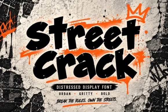
Gritty urban brush-tag & distressed street display
Street Crack is a muscular, forward-driving urban display font with chunky graffiti-marker strokes and rugged concrete-textured edges.
Ideas for this font
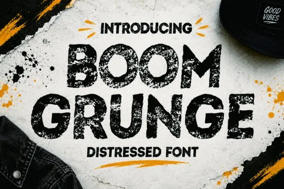
Heavy sponge-stamped & spray-speckled urban display sans
Boom Grunge is a wide, chunky urban sans-display font heavily textured inside and out with coarse asphalt and sponge-stamp grit.
Ideas for this font
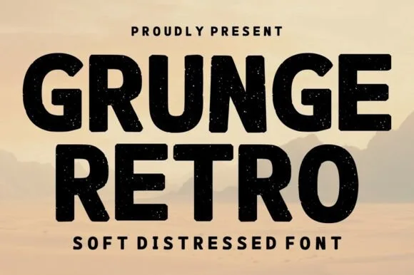
Bold soft-distressed vintage geometric sans display
Grunge Retro is a wide, bold geometric sans display font carrying rounded corners and light, tasteful vintage speckle wear.
Ideas for this font
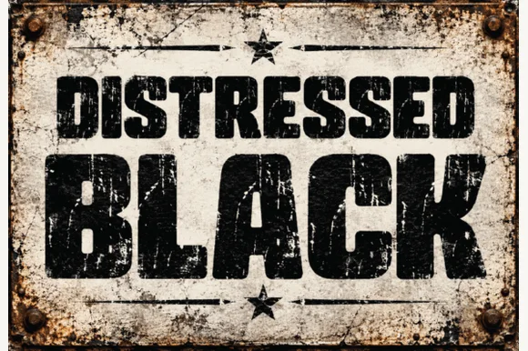
Heavy asphalt-cracked industrial grunge block sans
Distressed Black is an ultra-heavy industrial block sans (NOT delicate handwriting!) blasted with authentic scratched-paint & rusted-sign distressing!
Ideas for this font
Same independent foundry
Allow optional Google Analytics to measure visits and catalogue actions. Your search words and notes are not included. Privacy & storage