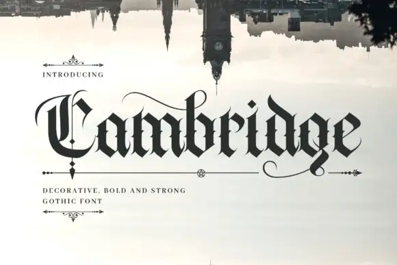
Modern Grotesque Body

Modern Serif + Sailors
Creates crisp high-hierarchy contrast beneath Modern Serif headlines across menus, websites and labels.
Inspect Sailors specimenDisclosure: MakerFileHub may earn a commission from qualifying purchases via paid links on this page. How our links work.
Display serif with ornate curled details
Modern Serif is a display serif in gold on dark marble: heavy letters with curled hairlines growing out of the stems, small flourishes at the feet and a moderate contrast, set as two stacked words with a tracked line beneath.
Paid link
Get this fontProject & layout blueprintsAt-a-glance maker compatibility
Weld or Unite overlapping script joins into one continuous vector path before sending to the blade.
Visual anatomy & craft review
Two words are stacked and the face is a display serif with craft in the details: the stems are heavy, the joins carry a moderate contrast, the serifs are small flats, and thin curls grow out of the stems of several letters, turning at the top or the foot and returning to the letter. Those curls are what makes the face ornate without making it busy, because they are drawn at hairline weight and kept to one side of each letter, and the rest of the form stays simple. The letters are fitted closely so each word reads as a coat of arms rather than a line of type, and a tracked capital line beneath names the product and its quality. The ground is a dark marble surface with pale veins, and everything is printed in a single gold. Modern Serif is a serif for packaging, certificates, editorial titles and branding with a crafted feel, and it needs a short phrase at a large size and a dark ground.
Ornate, gilded, crafted
Two-font hierarchy recipes
Tested contrast partners — pairing Modern Serif with grounded secondary typography.
Modern Serif + Sailors
Creates crisp high-hierarchy contrast beneath Modern Serif headlines across menus, websites and labels.
Inspect Sailors specimen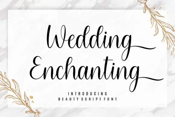
Modern Serif + Wedding Enchanting
Adds a warm human signature touch for 1-to-3-word callouts without competing against structured serif capitals.
Inspect Wedding Enchanting specimenPractical applications
Concrete hierarchy, scale and production guidance tailored to Modern Serif’s stroke geometry.
A gilded serif gives a bottle a hand-finished look, and the fine curls still read as detail at the size of a label on a shelf.
Hierarchy & layout recipe
Print a 55 by 90 mm label: set the brand at 16 pt over one line, keep 6 mm of clear ground beneath before the proof at 5 pt, and hold 4 mm of margin on all four sides.
Pre-production check
Hairline curls can break on a small label; print one on the real stock and inspect the thinnest lines.
An ornate serif titles a collection about making things, and the gold on dark gives the cover a premium feel without a photograph.
Hierarchy & layout recipe
Print a 210 by 280 mm cover: set the title at 80 pt over two lines, keep 24 mm of clear ground beneath before the subtitle at 11 pt, and hold 18 mm of margin on all four sides.
Pre-production check
Gold ink on a dark ground can look brown in cheap print; proof one cover under shop lighting.
An ornate serif works on a seal or on a hanging tag, and the curls give a short pair of initials the weight of an engraved crest.
Hierarchy & layout recipe
Print a 40 mm round seal: set the initials at 20 pt inside the disc, keep 4 mm of clear ground from the edge, and hold the disc 10 mm from the card edge.
Pre-production check
Wax will bridge the curls; order one seal in the real material and press it before the full set.
Technical & licence verification
Confirm included OTF/TTF/WOFF formats, full glyph tables and licence coverage on the live store page before batch production.
Closest visual alternatives
Matched across letterform anatomy, stroke behaviour and craft applications.

Fine serif title with large upper and lower loops
Amilea shows pale yellow high-contrast letters with fine tapered serifs and broad rounded lowercase over a dark portrait, where a thin loop curves below the capital A and a tall upper flourish crosses the central ascender before sweeping right.
Stylish display serif family
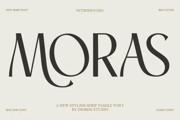
Moras is a stylish serif family in near-black on pale stone: very high contrast, hairline stems and thin flat serifs, with a curling tail on the R, a swooping S and a ligature between the O and the R, set as one wide word with tracked corner notes.
Ideas for this font
Elegance serif with swashes
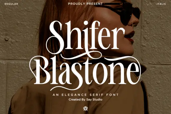
Shifer Blastone is an elegance serif in cream over a portrait photograph: high contrast, fine stems, ball terminals and long swashes that leave the first letters and curve under the words, with a small italic beneath and a flower ornament at the foot.
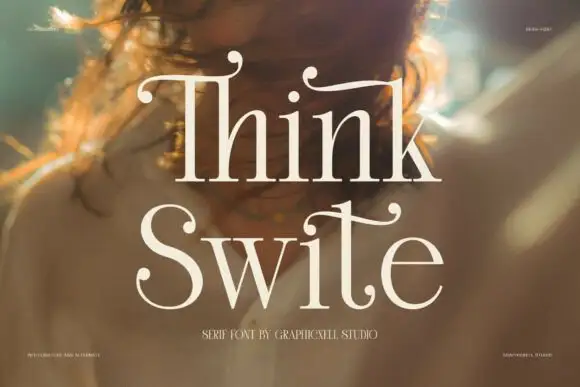
Display serif with calligraphic curled terminals
Think Swite is a display serif in cream over a warm portrait: tall letters with a strong contrast, thin stems and curled calligraphic terminals that lift off the tops of the T and the h, set as two stacked words with a small caption beneath.
Ideas for this font
Same independent foundry
Allow optional Google Analytics to measure visits and catalogue actions. Your search words and notes are not included. Privacy & storage