High-Contrast Display Serif

Strimbey + Stanza
Pairs sculptural editorial warmth with Strimbey's clean modern geometry.
Inspect Stanza specimenDisclosure: MakerFileHub may earn a commission from qualifying purchases via paid links on this page. How our links work.
Retro serif with a classic script
Strimbey is a duo on warm cream: a retro condensed serif in small capitals with tall flat-topped letters, and a classic script with fine contrast that flows above it, with small monogram marks at the top and foot of the sheet.
Paid link
Get this fontProject & layout blueprintsAt-a-glance maker compatibility
Sturdy stroke walls and open counters weed cleanly on adhesive vinyl, HTV apparel film, and cut cardstock.
Visual anatomy & craft review
The pairing is a period combination: the serif is narrow, tall and slightly worn, with flat serifs and a small cap height that makes it read as a printed label, while the script is a light connected hand with a strong slant, hairline joins and a fine contrast, set larger so it carries the name. Both share a single ink, which is what keeps a condensed serif and a flowing script from looking like two purchases, and the small monograms at the top and foot show how the pair behaves in a compact lockup. The ground is a plain warm cream with a light speckle. Strimbey is a duo for labels, packaging and editorial with a retro voice, and it works with the serif small and the script large, or the other way round for a different hierarchy.
A condensed serif beside a flowing script
Two-font hierarchy recipes
Tested contrast partners — pairing Strimbey with grounded secondary typography.
Strimbey + Stanza
Pairs sculptural editorial warmth with Strimbey's clean modern geometry.
Inspect Stanza specimen
Strimbey + Honey and Lemon
Introduces organic movement on pull-quotes, signatures and gift tags.
Inspect Honey and Lemon specimenPractical applications
Concrete hierarchy, scale and production guidance tailored to Strimbey’s stroke geometry.
A condensed serif under a flowing script gives a card the look of a printed vintage label, and the pair covers the names and the details in one purchase.
Hierarchy & layout recipe
Print a 130 by 180 mm invitation: set the names at 28 pt in the script, set the details at 9 pt in the serif with 16 mm of clear ground, and hold 16 mm of margin on all four sides.
Pre-production check
A condensed serif at nine points can look cramped; print one invitation on the intended stock and check the small text before the suite.
The pair suits a product with a heritage story, and the narrow serif fits a full ingredients line on a small label while the script carries the name.
Hierarchy & layout recipe
Print a 55 by 90 mm label: set the product at 16 pt in the script, set the specification at 5.5 pt in the serif with 5 mm of clear ground, and hold 4 mm of margin on all four sides.
Pre-production check
Small condensed serif on a curved label distorts; print one on the real bottle and check the last letters before the order.
A vintage pair gives a historical feature a voice, and the script over a small serif line is a hierarchy that reads at newsstand distance.
Hierarchy & layout recipe
Print a 230 by 300 mm cover: set the cover word at 80 pt in the script, set the strapline at 11 pt in the serif with 22 mm of clear ground, and hold 20 mm of margin on all four sides.
Pre-production check
A fine script over newsprint can fill in; print one cover on the intended stock and check the joins before the run.
Technical & licence verification
Confirm included OTF/TTF/WOFF formats, full glyph tables and licence coverage on the live store page before batch production.
Closest visual alternatives
Matched across letterform anatomy, stroke behaviour and craft applications.
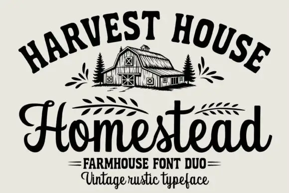
Arched rustic caps paired with a heavy farmhouse script
Homestead is a duo of an arched rustic capital alphabet and a heavy farmhouse script with curled terminals, drawn so a stacked sign reads as a hand-painted barn board.
Ideas for this font
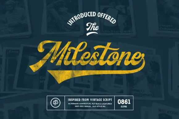
Vintage script with a heavy swash underline
Milestone is a vintage script in gold on navy: a heavy connected script with a swash that runs beneath the word and lifts into a broad tail, presented over a collage of old photographs and a badge block.
Ideas for this font
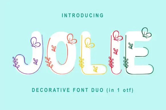
Rounded solid capitals paired with fine butterfly-and-leaf contours along their edges
Jolie places broad white capitals on turquoise with fine coloured contours following parts of the outer edges: the contours rise into small looped butterfly shapes near the upper terminals and tiny leaf sprigs grow from several lower strokes.
Ideas for this font
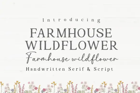
Soft upright serif caps with uneven edges paired with a loose connected script
Farmhouse Wildflower is a two-cut pair in which soft upright serif capitals carry slightly uneven edges and a lighter connected script runs low rounded joins with long strokes leaving the first and last letters.
Ideas for this font
Same independent foundry
Allow optional Google Analytics to measure visits and catalogue actions. Your search words and notes are not included. Privacy & storage