Neutral Sans Workhorse

Retro Autumn + Mansory
Lets Retro Autumn own the focal silhouette while handling secondary copy, sizing and subheads cleanly.
Inspect Mansory specimenDisclosure: MakerFileHub may earn a commission from qualifying purchases via paid links on this page. How our links work.
Groovy multi-colour display with autumn leaves
Retro Autumn is a groovy display in tan, orange, olive and cream on a cream grid: fat blobby letters with rounded ends, each one a different autumn colour with a dark outline, with two drawn leaves tucked against the block.
Paid link
Get this fontProject & layout blueprintsAt-a-glance maker compatibility
Sturdy stroke walls and open counters weed cleanly on adhesive vinyl, HTV apparel film, and cut cardstock.
Visual anatomy & craft review
Two words are stacked and the face is a groovy display: the stems swell at the middle and taper at the ends, the bowls are fat circles, the R carries a curled leg, the A keeps a flat top and a wide foot and the N and the M are drawn as soft arches, while the outline is a dark brown that holds every colour together. Each letter is filled with a different tone from an autumn palette, which gives the block the cut-and-paste look of a poster made from coloured paper, and the letters are fitted closely so the words read as two soft masses. Two drawn maple leaves sit against the block, one at the top left and one at the right, and a small capital line on a tinted band names the style at the foot. The ground is a cream grid. Retro Autumn is a display face for seasonal posters, packaging, menus and social graphics, and it needs a short phrase at a large size and a light ground.
Groovy, rounded, autumnal
Two-font hierarchy recipes
Tested contrast partners — pairing Retro Autumn with grounded secondary typography.
Retro Autumn + Mansory
Lets Retro Autumn own the focal silhouette while handling secondary copy, sizing and subheads cleanly.
Inspect Mansory specimen
Retro Autumn + Mewah
Grounds bold display lettering with classic typographic authority on posters, badges and apparel.
Inspect Mewah specimenPractical applications
Concrete hierarchy, scale and production guidance tailored to Retro Autumn’s stroke geometry.
A multi-colour groovy face sets a seasonal tone, and the dark outline keeps every letter readable against a busy fairground background.
Hierarchy & layout recipe
Print an A2 poster at 420 by 594 mm: set the title at 140 pt over two lines, keep 36 mm of clear ground beneath before the dates at 24 pt, and hold 26 mm of margin on all four sides.
Pre-production check
Multi-colour lettering costs plates; check the colour count with the printer before approving the artwork.
A groovy face suits a celebration at the turn of the season, and the letters can echo the colours of a table laid with leaves and fruit.
Hierarchy & layout recipe
Print a 400 by 600 mm board: set the greeting at 100 pt over two lines, keep 30 mm of clear ground beneath before the time at 20 pt, and hold 24 mm of border on all four sides.
Pre-production check
Warm colours on a warm board lose contrast quickly; proof one board in the actual room, under its lights, before the print run.
A groovy label gives a bottle a seasonal identity, and the outlined letters stay readable at the size of a small wrap on a shelf.
Hierarchy & layout recipe
Print a 60 by 95 mm label: set the brand at 18 pt over two lines, keep 6 mm of clear ground beneath before the strength at 5 pt, and hold 4 mm of margin on all four sides.
Pre-production check
A wrap bends the block at the seam; print one on the real bottle and check the letters near the edge.
Technical & licence verification
Confirm included OTF/TTF/WOFF formats, full glyph tables and licence coverage on the live store page before batch production.
Closest visual alternatives
Matched across letterform anatomy, stroke behaviour and craft applications.
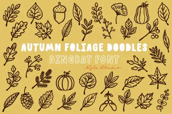
Brown autumn foliage outlines with veined leaves, acorns and a pinecone
Autumn Foliage Doodles is a typable set of botanical outlines — oak and maple leaves, a ginkgo, a sycamore, acorns, seed pods, berries, hops, a pumpkin and a squash — drawn as even outlines.
Ideas for this font
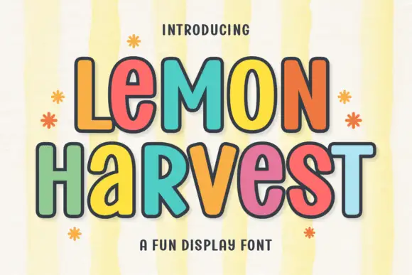
Multicolour playful caps
Lemon Harvest is a multicolour playful display in five warm colours with a dark outline on a pale striped ground: rounded caps with even strokes, a slight bounce, small flower and sparkle ornaments around the block, and a tracked caption beneath in a rounded sans.
Ideas for this font
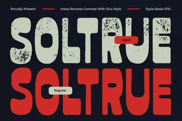
Reverse-contrast rounded display with two treatments
Soltrue is a heavy rounded reverse-contrast display on a near-black ground: fat capitals whose horizontals swell and whose uprights are slim, shown twice — once in a clean aged-cream fill and once in a solid red — with a small line at the top and two labels that name the treatments.
Ideas for this font
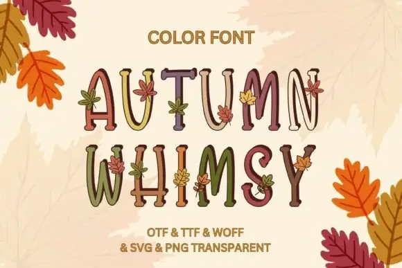
Slim uneven serif capitals with little leaves across muted fills
Autumn Whimsy sets slender rounded colour capitals in a warm autumn palette — mustard, plum, olive, cream — and grows small oak and maple leaves out of the top of each letter.
Ideas for this font
Same independent foundry
Allow optional Google Analytics to measure visits and catalogue actions. Your search words and notes are not included. Privacy & storage