Neutral Sans Workhorse

Autumn Whimsy + Bareum
Lets Autumn Whimsy own the focal silhouette while handling secondary copy, sizing and subheads cleanly.
Inspect Bareum specimenDisclosure: MakerFileHub may earn a commission from qualifying purchases via paid links on this page. How our links work.
Slim uneven serif capitals with little leaves across muted fills
Autumn Whimsy sets slender rounded colour capitals in a warm autumn palette — mustard, plum, olive, cream — and grows small oak and maple leaves out of the top of each letter.
Paid link
Get this fontProject & layout blueprintsAt-a-glance maker compatibility
Sturdy stroke walls and open counters weed cleanly on adhesive vinyl, HTV apparel film, and cut cardstock.
Visual anatomy & craft review
AUTUMN over WHIMSY fills the card on a cream ground with large painted leaves at the corners, and each letter is a tall rounded shape in a single warm colour with a fine dark contour and leaves sprouting from its shoulder: an oak leaf on the A, a maple on the U, a small spray on the H. The leaves are drawn in the same line as the letters, which keeps the whole word reading as one object, and the palette stays inside four colours so a row of letters looks composed rather than random. Three captions frame the card, naming the set, the formats including OTF, TTF, WOFF and SVG, and the season. The construction is a colour font for titles and gift products, and it holds up at invitation size because the letters themselves are simple.
Slim uneven serif capitals with little leaves across muted fills
Two-font hierarchy recipes
Tested contrast partners — pairing Autumn Whimsy with grounded secondary typography.
Autumn Whimsy + Bareum
Lets Autumn Whimsy own the focal silhouette while handling secondary copy, sizing and subheads cleanly.
Inspect Bareum specimen
Autumn Whimsy + Aureline
Grounds bold display lettering with classic typographic authority on posters, badges and apparel.
Inspect Aureline specimenPractical applications
Concrete hierarchy, scale and production guidance tailored to Autumn Whimsy’s stroke geometry.
The leaves do the seasonal work without a photograph of a wood, and the slim letters leave room for a name or a message on the same card.
Hierarchy & layout recipe
Print a 120 by 170 mm card: set the greeting at 40 pt across two rows, keep 18 mm of clear ground between the rows for the leaves, and hold 14 mm from the tallest leaf to the card edge.
Pre-production check
Leaves collide with the row above; print one card at the finished size and check the leading before the batch.
The face gives an October ceremony a seasonal note without turning the signage rustic, and the slim letters keep two names on one line.
Hierarchy & layout recipe
Print a 400 by 300 mm board: set the names at 60 pt on one row, keep 22 mm of clear ground beneath before the date at 13 pt, and hold 22 mm of border so no leaf is cut.
Pre-production check
Warm colours flatten on foam board; print one board on the intended material and check the plum before the set.
The lettering says the season before the jar is read, and one word on a small label is enough decoration for a product sold at a market stall.
Hierarchy & layout recipe
Print a 50 by 60 mm jar label: set the preserve name at 14 pt on one row, keep 5 mm of clear ground above for the leaves, and hold 4 mm from the leaf tip to the die line.
Pre-production check
Leaf tips are the first thing a die clips; print one label and cut it before ordering the batch.
Technical & licence verification
Confirm included OTF/TTF/WOFF formats, full glyph tables and licence coverage on the live store page before batch production.
Closest visual alternatives
Matched across letterform anatomy, stroke behaviour and craft applications.
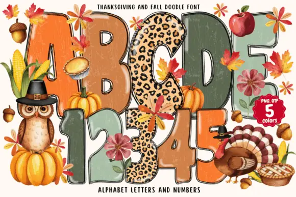
Tall rounded autumn blocks mixing weathered warm fills and spotted patterns
Thanksgiving and Fall Doodle draws fat autumn letters in five colours, fills them with knitted, plaid and leopard textures, and hangs leaves, pumpkins and a turkey around the shapes.
Ideas for this font
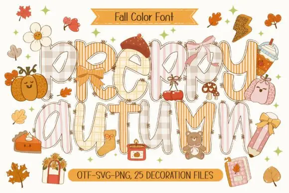
Patchwork colour display
Preppy Autumn is a tall patchwork display on a cream sheet: letters filled with checks, stripes and plaid in soft peach and cream tones, outlined in white with a warm shadow, surrounded by autumn accessories, with two ribbons that name the format list and the count of decoration files.
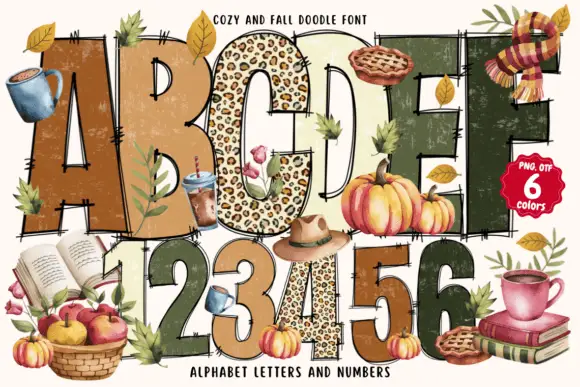
Tall rustic autumn capitals with scratched faces and loose doubled contours
Cozy and Fall Doodle fills fat block letters with autumn textures, from leopard spots to plaid and deep green, and drapes seasonal doodles over the alphabet: a mug, a pie, apples, books and a scarf.
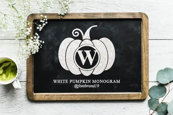
Pumpkin monogram design
White Pumpkin Monogram is a monogram design in chalk white on a framed blackboard: a broad segmented pumpkin with a curled stem, an oval frame inside the centre segment holding a serif W, and fine white lettering beneath that names the design.
Ideas for this font
Same independent foundry
Allow optional Google Analytics to measure visits and catalogue actions. Your search words and notes are not included. Privacy & storage