Neutral Sans Workhorse

Lemon Harvest + Cenura
Lets Lemon Harvest own the focal silhouette while handling secondary copy, sizing and subheads cleanly.
Inspect Cenura specimenDisclosure: MakerFileHub may earn a commission from qualifying purchases via paid links on this page. How our links work.
Multicolour playful caps
Lemon Harvest is a multicolour playful display in five warm colours with a dark outline on a pale striped ground: rounded caps with even strokes, a slight bounce, small flower and sparkle ornaments around the block, and a tracked caption beneath in a rounded sans.
Paid link
Get this fontProject & layout blueprintsAt-a-glance maker compatibility
Sturdy stroke walls and open counters weed cleanly on adhesive vinyl, HTV apparel film, and cut cardstock.
Visual anatomy & craft review
The two words are stacked and each letter is a rounded form with an even stroke, which lets each one take a different colour without the word falling apart. The dark outline is heavy enough to act as a sticker edge and consistent across every letter, and the bounce keeps the block from reading as a rigid grid. Because the shapes are simple, the face colours evenly and reproduces on a home printer, which is the practical advantage for a maker. The flowers and sparkles sit outside the letters, and the tracked caption beneath is set in a rounded sans at a fraction of the size, which keeps the plate in one friendly voice.
Playful, multicolour, rounded, cheerful
Two-font hierarchy recipes
Tested contrast partners — pairing Lemon Harvest with grounded secondary typography.
Lemon Harvest + Cenura
Lets Lemon Harvest own the focal silhouette while handling secondary copy, sizing and subheads cleanly.
Inspect Cenura specimen
Lemon Harvest + Flowsky Editorial
Grounds bold display lettering with classic typographic authority on posters, badges and apparel.
Inspect Flowsky Editorial specimenPractical applications
Concrete hierarchy, scale and production guidance tailored to Lemon Harvest’s stroke geometry.
A cheerful colour-blocked face suits a summer card, and the simple letterforms stay clean when a customer prints a batch at home.
Hierarchy & layout recipe
A6 card: the greeting at 30 pt, the details in a 9 pt rounded sans, and two small flowers. Keep 12 mm margins and print four colours on a white card so the outlines stay open.
Pre-production check
Check the 30 pt greeting at home-print resolution, where a thin outline can break; keep it above 0.6 mm. Confirm the 9 pt details keep a 4.5:1 contrast and that the flowers clear the trim.
A multicolour label reads as a fruit product, and the simple shapes let each flavour take a different palette from one lettering set.
Hierarchy & layout recipe
Print a 60 mm round label: the flavour at 14 pt, the volume in a 6 pt sans, and 4 mm inside the die. Keep three colours per label and print on a coated stock so the outlines stay crisp.
Pre-production check
Check the 14 pt flavour on a curved bottle, where the outer letters distort; reduce the width. Confirm the 6 pt volume reads in the chiller and that the outline clears the die.
A bright display reads from across a playground, and the simple shapes keep a school's in-house print run cheap in four flat colours.
Hierarchy & layout recipe
A2 print: the fair at 130 mm cap height, the times in a 20 mm sans, and a 5 mm rule. Keep 30 mm margins and print four flat colours on a white ground so the outlines stay separate.
Pre-production check
Check the A2 at five metres, where the outline can read as a blur; keep it at a fixed weight. Confirm the 20 mm times read at three metres and that the rule clears the ornaments.
Technical & licence verification
Confirm included OTF/TTF/WOFF formats, full glyph tables and licence coverage on the live store page before batch production.
Closest visual alternatives
Matched across letterform anatomy, stroke behaviour and craft applications.
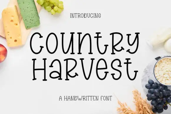
Tall hand-drawn mixed case with small feet and uneven crossbars
Country Harvest shows black two-line lettering on a white food-styled cover. Tall slim bodies mix upper- and lowercase shapes, including a narrow rounded o, an open curved y and a wide crossbar on the t, while the lower line sets a small rounded a beside a prominent capital-like R.
Ideas for this font
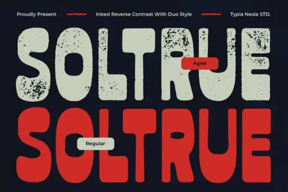
Reverse-contrast rounded display with two treatments
Soltrue is a heavy rounded reverse-contrast display on a near-black ground: fat capitals whose horizontals swell and whose uprights are slim, shown twice — once in a clean aged-cream fill and once in a solid red — with a small line at the top and two labels that name the treatments.
Ideas for this font
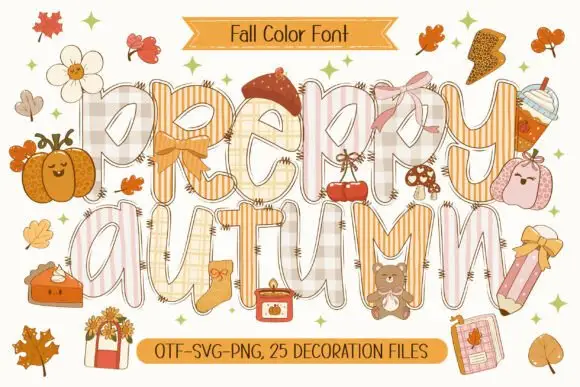
Patchwork colour display
Preppy Autumn is a tall patchwork display on a cream sheet: letters filled with checks, stripes and plaid in soft peach and cream tones, outlined in white with a warm shadow, surrounded by autumn accessories, with two ribbons that name the format list and the count of decoration files.
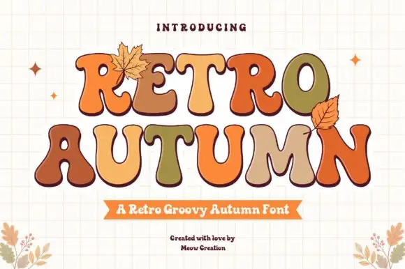
Groovy multi-colour display with autumn leaves
Retro Autumn is a groovy display in tan, orange, olive and cream on a cream grid: fat blobby letters with rounded ends, each one a different autumn colour with a dark outline, with two drawn leaves tucked against the block.
Ideas for this font
Same independent foundry
Allow optional Google Analytics to measure visits and catalogue actions. Your search words and notes are not included. Privacy & storage