Neutral Sans Workhorse

Big Alphabet Tracing + Mango Dream
Lets Big Alphabet Tracing own the focal silhouette while handling secondary copy, sizing and subheads cleanly.
Inspect Mango Dream specimenDisclosure: MakerFileHub may earn a commission from qualifying purchases via paid links on this page. How our links work.
Outlined tracing letters with directional paths
Big Alphabet Tracing shows a large outlined A with dotted paths and arrowheads, and the sample also displays outlined numerals and rounded lowercase letters for practice sheets rather than display use.
Paid link
Get this fontProject & layout blueprintsAt-a-glance maker compatibility
Sturdy stroke walls and open counters weed cleanly on adhesive vinyl, HTV apparel film, and cut cardstock.
Visual anatomy & craft review
The letters sit as open outlines, the dashed centre path marks the stroke, the arrowheads show direction and the forms stay simple enough to follow. That guided path is the character: the sheet teaches order rather than showing a style, which is why the sample pairs a large capital with numerals and a rounded lowercase. Use it at a real child's size, check that the letters your sheet needs are all present and keep the guides light enough to trace over without losing them.
Outlined tracing letters with directional paths
Two-font hierarchy recipes
Tested contrast partners — pairing Big Alphabet Tracing with grounded secondary typography.
Big Alphabet Tracing + Mango Dream
Lets Big Alphabet Tracing own the focal silhouette while handling secondary copy, sizing and subheads cleanly.
Inspect Mango Dream specimen
Big Alphabet Tracing + Flowsky Editorial
Grounds bold display lettering with classic typographic authority on posters, badges and apparel.
Inspect Flowsky Editorial specimenPractical applications
Concrete hierarchy, scale and production guidance tailored to Big Alphabet Tracing’s stroke geometry.
The outlined letters suit a classroom worksheet, and the guided paths stay clear at 48 pt on an A4 page, where the arrowheads show the start.
Hierarchy & layout recipe
Print an A4 worksheet: set the capital at 48 pt on the upper half, place four dotted repetitions 16 mm beneath, keep 22 mm of margin for the grip, and leave the reverse side blank for free practice.
Pre-production check
Guides printed too light vanish under a pencil; check the sheet and keep the dashed line at 30 percent grey.
The tracing forms suit a name card, and the outlined letters hold a first name at 40 pt on a 100 mm card, where the direction arrows stay visible.
Hierarchy & layout recipe
Print a 100 by 60 mm card: set the name at 40 pt on the guide line, keep 14 mm of clear ground beneath for descenders, and laminate it for repeated use.
Pre-production check
A laminated card needs a dry-wipe pen that lifts cleanly; check a sample before the class set.
The guided outlines suit a wall chart, and the large forms read at 60 pt across an A2 sheet, where the numerals sit beside the letters.
Hierarchy & layout recipe
Print an A2 poster: set the alphabet at 60 pt over three rows, keep 30 mm of clear ground between them, and keep 28 mm of margin so the guides stay visible.
Pre-production check
Small arrows disappear at wall distance; check the mounted poster and keep them at 5 mm or larger.
Technical & licence verification
Confirm included OTF/TTF/WOFF formats, full glyph tables and licence coverage on the live store page before batch production.
Closest visual alternatives
Matched across letterform anatomy, stroke behaviour and craft applications.
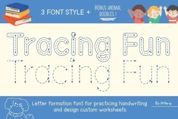
Tracing letter-formation display
Tracing Fun is a letter-formation display in blue on cream: outlined letters with dashed centre lines, arrows marking the stroke direction, and a second lower-case set with the same construction, sold with animal doodles, so the plate reads as a classroom worksheet rather than a typeface.
Ideas for this font
Tracing outline display
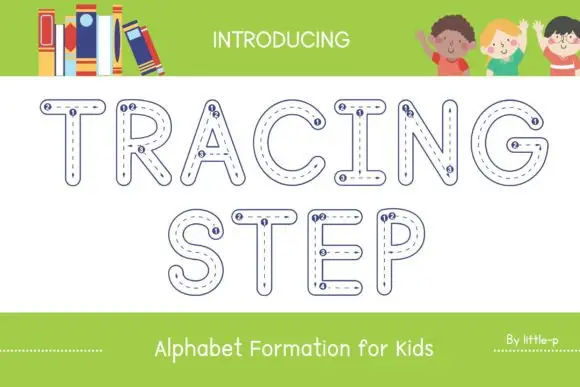
Tracing Step is an outlined display in navy on white: rounded capitals drawn as hollow shapes with a dashed path running inside each stroke and small numbered dots at the start points of the strokes, set in two lines between a plain intro line and a plain caption beneath.
Ideas for this font
Tracing paths with guides
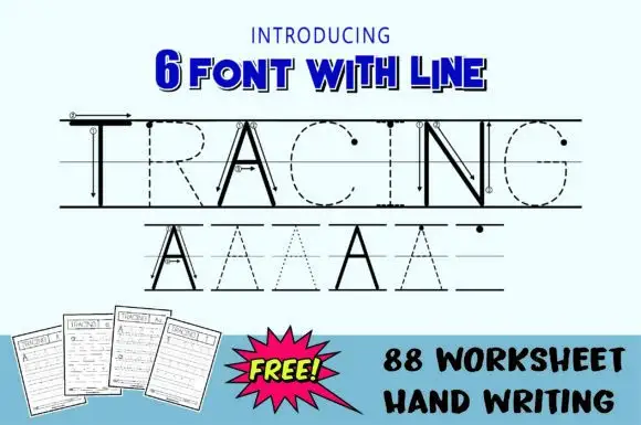
Tracing is a teaching set shown in black on a pale blue sheet: a large word drawn twice — once as solid letters with guide lines and arrows, once as dashed and dotted outlines on ruled guide lines — above three drawn worksheet pages and a plain caption block at the foot.
Ideas for this font
Rounded outline capitals
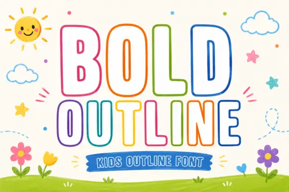
Bold Outline shows tall rounded capitals traced by a thin coloured contour on a pale field, where the B keeps small narrow counters while the L and D leave broad white interiors, and the letter widths change across the two rows so the second word runs wider than the first.
Ideas for this font
Same independent foundry
Allow optional Google Analytics to measure visits and catalogue actions. Your search words and notes are not included. Privacy & storage