Neutral Sans Workhorse

Pixel Whimsy + Inkora
Lets Pixel Whimsy own the focal silhouette while handling secondary copy, sizing and subheads cleanly.
Inspect Inkora specimenDisclosure: MakerFileHub may earn a commission from qualifying purchases via paid links on this page. How our links work.
Pixel slab display
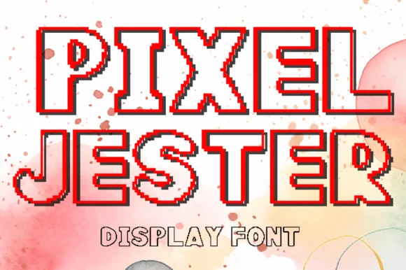
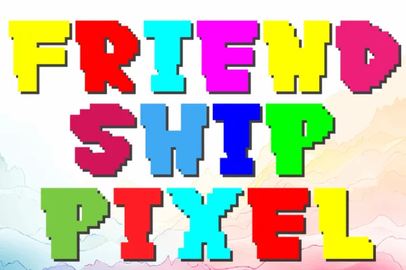
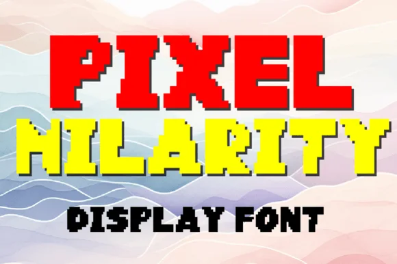
Pixel Whimsy is a pixel slab display in bright green and magenta on a pale speckled ground: letters built from square modules with slab-like feet, stepped curves and a dark pixel shadow, with a caption in a small pixel face below, so the plate reads as an arcade scoreboard.
Paid link
Get this fontProject & layout blueprintsAt-a-glance maker compatibility
Sturdy stroke walls and open counters weed cleanly on adhesive vinyl, HTV apparel film, and cut cardstock.
Visual anatomy & craft review
Two words are stacked and each letter is assembled from a coarse grid: the serifs step out as single modules, the diagonals staircase, and the counters are one or two blocks wide, which is what keeps the face readable at a distance. The colour changes line by line, which is a use of the specimen rather than a property of the face, and the dark shadow gives the letters depth without an outline. Because the module is large, the face needs a display size, and the caption beneath drops to a smaller pixel weight so the hierarchy stays inside the pixel language. The ground is a pale speckled paper, which keeps the bright fills from looking synthetic, and no third typeface appears on the page.
Pixel, slab, retro, playful
Two-font hierarchy recipes
Tested contrast partners — pairing Pixel Whimsy with grounded secondary typography.
Pixel Whimsy + Inkora
Lets Pixel Whimsy own the focal silhouette while handling secondary copy, sizing and subheads cleanly.
Inspect Inkora specimen
Pixel Whimsy + Brenco
Grounds bold display lettering with classic typographic authority on posters, badges and apparel.
Inspect Brenco specimenPractical applications
Concrete hierarchy, scale and production guidance tailored to Pixel Whimsy’s stroke geometry.
A pixel slab names the theme and prints cleanly at card size, and the slab feet make the letters read as type rather than as a screen graphic.
Hierarchy & layout recipe
A6 card: the phrase at 32 pt, the details in a 9 pt pixel or geometric sans, and a 4 mm border. Keep 12 mm margins and print two colours on a light card so the stepped curves stay sharp.
Pre-production check
Check the 32 pt phrase on a home printer, where a stepped curve can smear; keep the module at a whole pixel in the export. Confirm the 9 pt details keep a 4.5:1 contrast and that the shadow does not merge two letters.
A pixel face signals technology without a cliché, and the coarse module reads across a hall where a fine display would vanish against the wall.
Hierarchy & layout recipe
Print 1,000 by 500 mm: the club name at 150 mm cap height, the times in a 30 mm sans, and a 6 mm border. Keep the module large enough that the steps stay sharp at the printer's resolution.
Pre-production check
Check the banner at six metres, where an uneven module reads as a rendering fault; keep the grid consistent. Confirm the 30 mm times read at four metres and that the border clears the eyelets.
A pixel mark gives a game shop an identity that reads on a small sticker, and two flat colours keep a short run cheap to print.
Hierarchy & layout recipe
Die-cut a 55 mm sticker: the brand at 16 pt, the tagline in a 6 pt sans, and 2 mm clear to the die. Keep the module at least 2 mm so the blocks survive cutting and print two colours.
Pre-production check
Check the 55 mm sticker, where a one-module counter can close; increase the module for that size. Confirm the tagline reads at arm's length and that the sticker sits flat on a curved surface.
Technical & licence verification
Confirm included OTF/TTF/WOFF formats, full glyph tables and licence coverage on the live store page before batch production.
Closest visual alternatives
Matched across letterform anatomy, stroke behaviour and craft applications.
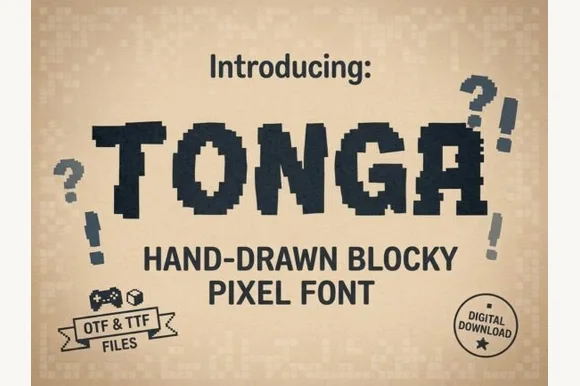
Hand-drawn blocky pixel display
Tonga is a hand-drawn pixel display in navy on a dotted tan ground: chunky capitals built from irregular square blocks, stepped edges that wobble by a pixel or two, and matching question and exclamation marks drawn in the same blocks.
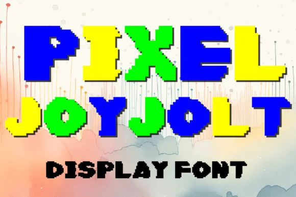
Pixel display in three flat colours
Pixel Joyjolt is a pixel display face in blue, yellow and green on a soft painted ground: chunky capitals assembled from square pixels with a fine white keyline, set as two stacked lines with a small black line beneath.
Ideas for this font
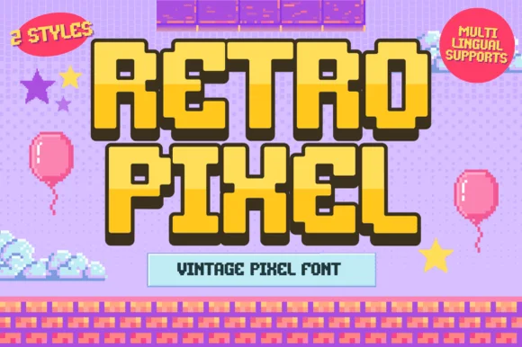
2-style 16-bit platformer video-game pixel font (Multilingual)
Retro Pixel is a cheerful 2-style retro platformer pixel font with multilingual character support and chunky 16-bit adventure charm.
Ideas for this font
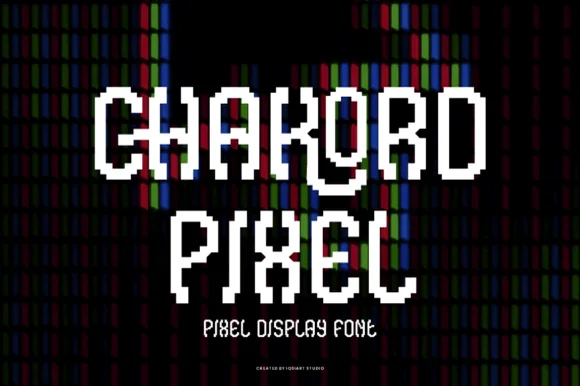
Stair-stepped 8-bit arcade pixel display
Chakord Pixel builds chunky 8-bit arcade capitals from crisp square pixel blocks with playful notched corners and ligature-like joins.
Ideas for this font
Same independent foundry
Allow optional Google Analytics to measure visits and catalogue actions. Your search words and notes are not included. Privacy & storage