Neutral Sans Workhorse

Pixel Hilarity + Cenura
Lets Pixel Hilarity own the focal silhouette while handling secondary copy, sizing and subheads cleanly.
Inspect Cenura specimenDisclosure: MakerFileHub may earn a commission from qualifying purchases via paid links on this page. How our links work.
Pixel display with stepped outlines
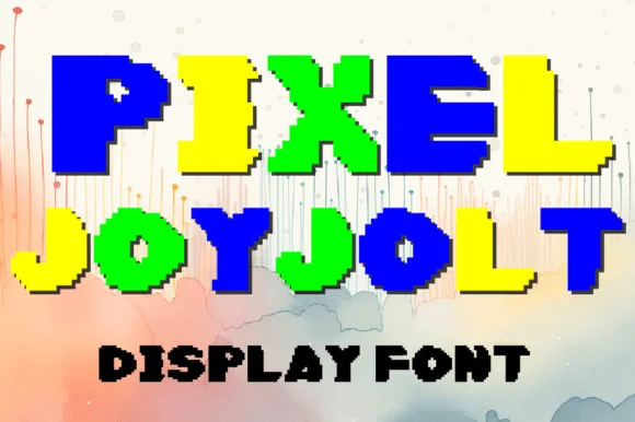
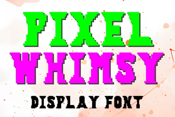
Pixel Hilarity is a pixel display face in red and yellow on a pastel ground: blocky capitals built from square pixels, with a stepped black keyline that follows every notch, set as two stacked words with a small line beneath.
Paid link
Get this fontProject & layout blueprintsAt-a-glance maker compatibility
Sturdy stroke walls and open counters weed cleanly on adhesive vinyl, HTV apparel film, and cut cardstock.
Visual anatomy & craft review
Two words are stacked and the face is built on a pixel grid: each letter is assembled from square blocks, the diagonals step instead of sloping, the bowls close in square corners, and a black keyline follows the outline in short right angles so the word looks like a sprite with a border. The grid is coarse enough that the steps are visible at any size, which is the point, and the two colours are flat with no shading, so the block reads as a printed arcade graphic. The letters are fitted tightly and the block carries no counter smaller than one pixel, which keeps a pixel face legible at small sizes as well as large. A small line beneath names the style in the same face, and the ground is a pastel marbled surface in soft blue and pink. Pixel Hilarity is a display face for game graphics, party goods, posters and social content with a retro-digital mood, and it needs capitals at a large size on a light ground.
Pixel, blocky, retro-digital
Two-font hierarchy recipes
Tested contrast partners — pairing Pixel Hilarity with grounded secondary typography.
Pixel Hilarity + Cenura
Lets Pixel Hilarity own the focal silhouette while handling secondary copy, sizing and subheads cleanly.
Inspect Cenura specimen
Pixel Hilarity + Wolles Elegant Modern Serif
Grounds bold display lettering with classic typographic authority on posters, badges and apparel.
Inspect Wolles Elegant Modern Serif specimenPractical applications
Concrete hierarchy, scale and production guidance tailored to Pixel Hilarity’s stroke geometry.
A pixel face signals the subject before the headline is read, and the stepped keyline keeps the title legible over a patterned cover.
Hierarchy & layout recipe
Print a 210 by 297 mm cover: set the title at 90 pt over two lines, keep 24 mm of clear ground beneath before the coverlines at 10 pt, and hold 16 mm of margin on all four sides.
Pre-production check
A coarse grid at large sizes needs an even keyline; proof one cover and check the corners of the outline.
A pixel face tells a young guest what kind of party it is at a glance, and the flat colours print cleanly on a cheap card.
Hierarchy & layout recipe
Print a 105 by 148 mm card: set the greeting at 30 pt over two lines, keep 14 mm of clear ground beneath before the details at 9 pt, and hold 12 mm of margin on all four sides.
Pre-production check
A pixel face on a small card needs whole pixels; keep the size a multiple of the grid and print one card first.
A pixel face reads as computing without a laptop photograph, and the heavy blocks stay visible on a noticeboard among other sheets.
Hierarchy & layout recipe
Print an A3 poster at 297 by 420 mm: set the title at 100 pt over two lines, keep 30 mm of clear ground beneath before the meeting time at 20 pt, and hold 24 mm of margin on all four sides.
Pre-production check
Printing at a non-integer scale can blur the pixel steps; scale the artwork on the grid and check one proof.
Technical & licence verification
Confirm included OTF/TTF/WOFF formats, full glyph tables and licence coverage on the live store page before batch production.
Closest visual alternatives
Matched across letterform anatomy, stroke behaviour and craft applications.
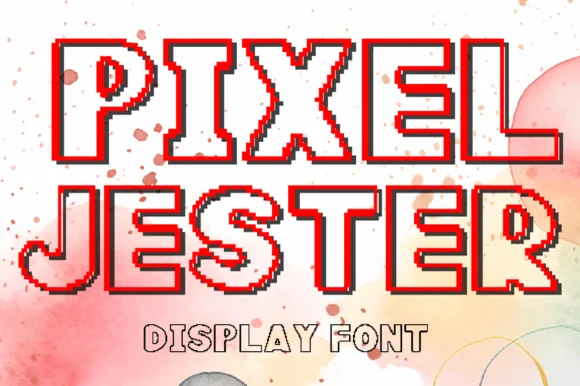
Pixel outline display with a stepped shadow
Pixel Jester is a pixel outline display in red and black on a watercolour splash: capitals drawn as a stepped outline with the paper showing through, each letter shadowed by a black pixel offset, with a solid line beneath in the same face.
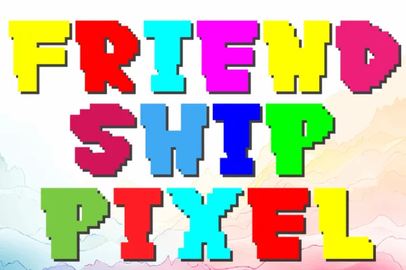
Chunky pixel display with colour blocks
Pixel Friendship is a chunky pixel display in multicolour: every capital is a solid block of one colour with stepped pixel corners, a darker shadow block offset behind it, and mixed letter heights, so the words read as an old arcade title screen.
Ideas for this font
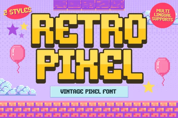
2-style 16-bit platformer video-game pixel font (Multilingual)
Retro Pixel is a cheerful 2-style retro platformer pixel font with multilingual character support and chunky 16-bit adventure charm.
Ideas for this font
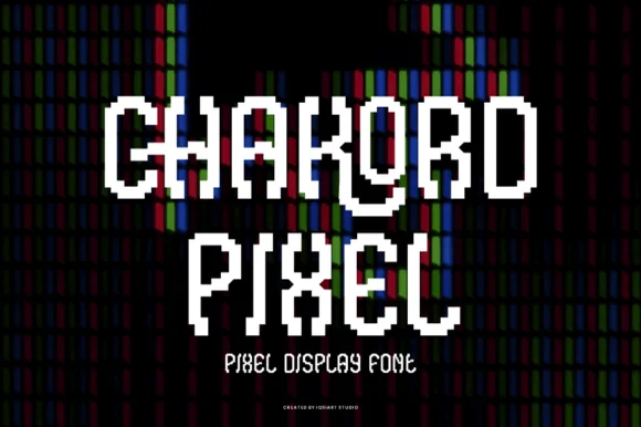
Stair-stepped 8-bit arcade pixel display
Chakord Pixel builds chunky 8-bit arcade capitals from crisp square pixel blocks with playful notched corners and ligature-like joins.
Ideas for this font
Same independent foundry
Allow optional Google Analytics to measure visits and catalogue actions. Your search words and notes are not included. Privacy & storage