Neutral Sans Workhorse

Darkpulse + Prime Nordic
Lets Darkpulse own the focal silhouette while handling secondary copy, sizing and subheads cleanly.
Inspect Prime Nordic specimenDisclosure: MakerFileHub may earn a commission from qualifying purchases via paid links on this page. How our links work.
Spiked metal-style lettering with branching tips and hanging points
Darkpulse is black metal logo lettering: tall spiked strokes, mirrored symmetry, thin blade terminals that reach above and below the baseline, and five alternate versions of the wordmark.
Paid link
Get this fontProject & layout blueprintsAt-a-glance maker compatibility
Sturdy stroke walls and open counters weed cleanly on adhesive vinyl, HTV apparel film, and cut cardstock.
Visual anatomy & craft review
DARKPULSE is drawn as a single symmetric emblem in a glowing teal on a dark ground of skulls, the letters fused by spikes that extend far above the cap height and below the foot of the word. Each stem forks into two blades, the counters close into slits, and the whole shape is mirrored left to right so the word reads as one sigil rather than as a sequence of letters. Two small captions in a plain grotesque sit above and below, one naming the studio and the other naming the style and the number of alternates, and they are deliberately quiet so the emblem does the shouting. The design is a logo treatment as much as a typeface: it needs a black ground, a large size and a lot of space around it, and it is best used for band art, merch and posters where the silhouette is the identity.
Spiked metal-style lettering with branching tips and hanging points
Two-font hierarchy recipes
Tested contrast partners — pairing Darkpulse with grounded secondary typography.
Darkpulse + Prime Nordic
Lets Darkpulse own the focal silhouette while handling secondary copy, sizing and subheads cleanly.
Inspect Prime Nordic specimen
Darkpulse + Cronelo
Grounds bold display lettering with classic typographic authority on posters, badges and apparel.
Inspect Cronelo specimenPractical applications
Concrete hierarchy, scale and production guidance tailored to Darkpulse’s stroke geometry.
The emblem reads as a band mark from across a room, and the mirrored spikes fill a poster that has no photograph, no illustration and no second graphic element behind them.
Hierarchy & layout recipe
Print an A2 poster: set the headline emblem at 340 mm wide across the upper third, keep 40 mm of clear ground beneath before the line-up at 12 pt, and hold 30 mm of margin around the spikes on every side.
Pre-production check
Thin blades break in cheap printing; print one poster at the final size and check the sharpest tip before the run.
The lettering is the subject, so a cover can carry it alone and let a plain caption block underneath explain what the book is about.
Hierarchy & layout recipe
Print a 210 by 280 mm cover: set the emblem at 180 mm wide at the top, keep 30 mm of clear ground beneath before the title block at 14 pt, and hold 24 mm from the lowest blade to the trim.
Pre-production check
Spike detail closes in matte lamination; print one cover with the finish and check the blade ends before the print run.
The emblem holds up as a screen print on fabric, and a mirrored shape reads as a logo even when the festival name is unknown to the wearer.
Hierarchy & layout recipe
Print a 300 by 400 mm back print: set the emblem at 280 mm wide, keep 40 mm of clear ground beneath before the date line at 10 pt, and hold 30 mm from the outer spikes to the print edge.
Pre-production check
Fine blades fill on a coarse screen mesh; print one pull on the actual shirt and check the tips before the run.
Technical & licence verification
Confirm included OTF/TTF/WOFF formats, full glyph tables and licence coverage on the live store page before batch production.
Closest visual alternatives
Matched across letterform anatomy, stroke behaviour and craft applications.
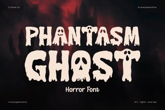
Dripping horror display with cut faces
Phantasm Ghost is a dripping horror display in cream on a dark scene: heavy rounded caps with long drips running from the baseline, faces cut into the counters of the A and the O, and rounded terminals, so the pair reads as a friendly haunted-house sign rather than a brutal metal logo.
Ideas for this font
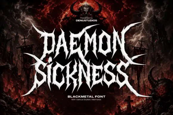
Jagged metal capitals with pointed horns and long outer blades
Daemon Sickness is death metal lettering: letters fused into a single spiked mass, blade points rising above the line and long symmetric wings sweeping out to both sides.
Ideas for this font
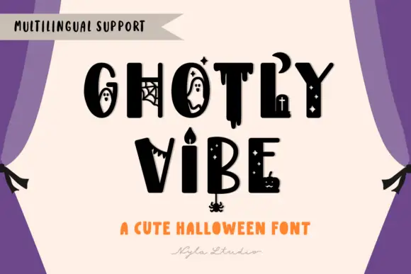
Mixed heavy capitals with distinct ghosts, webs, drips, crescent and candle details
Ghostly Vibe is a cute Halloween display face in which the caps carry little scenes inside them: a ghost in the counter of the O, a spider web in the G, a dripping stroke under the T, and a candelabra between two words.
Ideas for this font
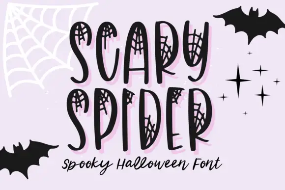
Web-inset tall narrow display
Scary Spider is a display face on a lilac ground: tall uneven narrow capitals with small spiderweb networks drawn inside their upper and side openings, a pale pink offset shadow, bats and stars around the frame, and a script line beneath in black.
Ideas for this font
Same independent foundry
Allow optional Google Analytics to measure visits and catalogue actions. Your search words and notes are not included. Privacy & storage